Look, it’s no use yelling “for the love of Jove, not more bloody pottery!” No one is forcing you to be here. Honestly, I haven’t even started yet, and here you are, giving your two penn’orth.
What ho! Wonderful readers. Welcome, welcome, welcome.
A quick one today – Part 5 of my best-selling, most talked about book of the year, Booker Prize shortlisted Guide to Bits of Old Pot. I have a brace of posts almost ready to go, but to keep you going I thought I’d publish this. Enjoy.
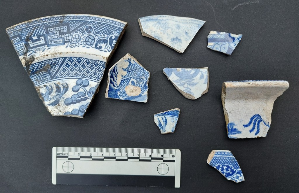
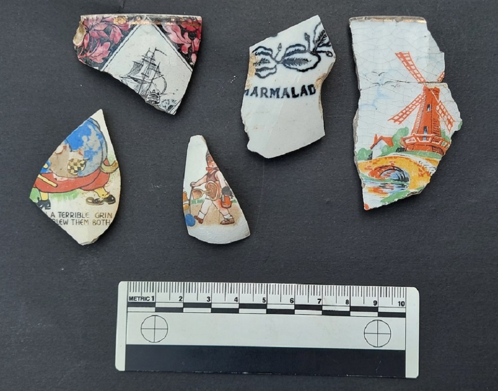
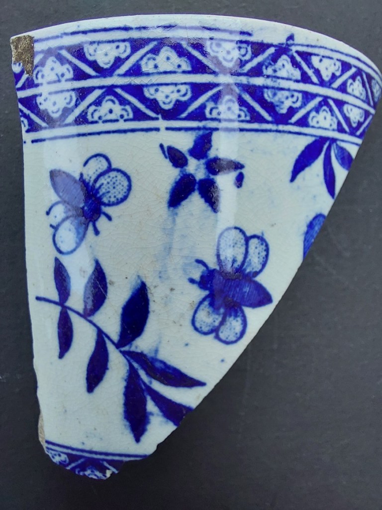
TRANSFER PRINTED WARE (aka Willow Pattern, Blue & White)
DATE: 1800 – Now
DESCRIPTION: A cobalt blue pattern or image on a white background. Also, red, brown, black, or green.
SHAPES: Any and all vessel shapes – from delicate tea cups to whacking great soup tureens – literally everything.
Ah yes… Transfer Printed Ware. If you are going to find pottery, this is the stuff you’ll find, and in particular the ‘Willow Pattern’ pottery. It dominated the 19th century, and arguably a large portion of the 20th – it is everywhere. I have actually dreaded writing this part of the guide, probably because of the quantity of material, but also I’m worried that it might not appeal to all of you (*sigh, yes I know it doesn’t appeal to you. And look here, there’s no need to use language like that… there are ladies present, and calling me a “honking tallywacker” is hardly becoming of a gentleman.”). But it turns out that it’s exactly the sort of thing appeals to (most of) my readers.
As we have covered previously, 18th & 19th century potters were trying to find the perfect blue and white decoration on a perfect white background to match the desirable Porcelain being imported from China. Tin Glazed Pottery (or Delft) certainly filled that gap, but it really wasn’t perfect. An easier form of decoration was wanted, and the idea of transfer printing began to take shape in roughly 1750, being applied to Porcelain only at this point. It was in about 1785 that the process successfully began to be applied to earthernware, being perfected by that wizard of English pottery, Josiah Spode.
The process is relatively simple if a little convoluted. Firstly, an image was engraved in a copper plate, as was done for book illustrations at the time, and applied to an oiled tissue paper using a cobalt ink – this being the only colour at the time that would survive the firing process. This is the ‘transfer’. Next, a vessel is ‘biscuit’ fired – that is fired without glaze, and at a lower temperature, to make it hard and able to take the transfer print. The transfer paper is then pressed onto the surface of the vessel, with the ink absorbed in the fabric. The pot is then fired a second time to remove oils and fix the ink into the clay body. Next, a glaze is applied, and then it is fired a third and final time. Originally applied to Creamware, then Pearlware, it became a standard decoration for White Ware, and by 1820 TPW was everywhere, and being used for all sorts of images. A brown ink was developed in roughly 1835, a green chrome ink in 1850, and a red ink at about this time, too.

Eventually a technique for multi colour printing was developed by the pottery factory F.R. Pratt, allowing full images to be put onto vessels from late 19th century on.
A technique called ‘Flow Blue’ was perfected around 1800, in which the cobalt blue transfer print was deliberately smudged or blurred. The pot is prepared as normal, but during the firing a ‘flow powder’ (a mixture of 22% salt, 40% white lead, 30% calcium carbonate, and 8% borax) was added into the kiln, giving off a chlorine gas which caused the cobalt to diffuse or blur into the glaze.

Sometimes this changed into a more purple colour, termed ‘Mulberry’, occasionally it was highlighted with gold.

Flow Blue’s popularity peaked around mid-century, and as a style lasted until perhaps 1900. The more extreme blurred examples may have been sold as cheaply as ‘seconds’, and were thus popular with the poorer market. Indeed, for many years I just thought that Flow Blue style was just really badly made TPW, and only fairly recently did I discover that it was deliberate.
In terms of decoration, I don’t know where to begin; from classical scenes to commemorative plates, souvenirs from castles, to children’s rhymes – literally anything and everything was inked onto the vessels. You may get lucky and find a name or a date, or a maker’s mark from the underside of a plate. Or it may just be a pattern from the edge. The classic is of course the ‘Willow Pattern’, with its spurious story of lovers turned into birds. This was, and still is, reproduced in huge numbers: it is everywhere. In fact, so common was this pattern that it is used – incorrectly – as a short hand for all Blue & White pottery.

Theoretically, though, given infinite time and patience, one could identify and date any sherd using the wealth of pattern books that were kept by the factories that made them, but even for a certified sherd nerd such as myself, that way madness lies!
Transfer Printed Ware began life as a prestigious and very exclusive pottery type, with the early stuff being of incredibly high quality. Once it began to be mass produced, as always happens, the quality began slipping, until the lower end of the market was cheaply produced and sold for next to nothing. This produced some shoddy designs and duff workmanship; sometimes you can see where the transfer has slipped, where bits overlie each other or don’t join in the pattern as they should. I do like these mistakes – I think it adds a human touch.
Allied to Transfer Printed Ware, although not actually transfer printed, is this stuff:
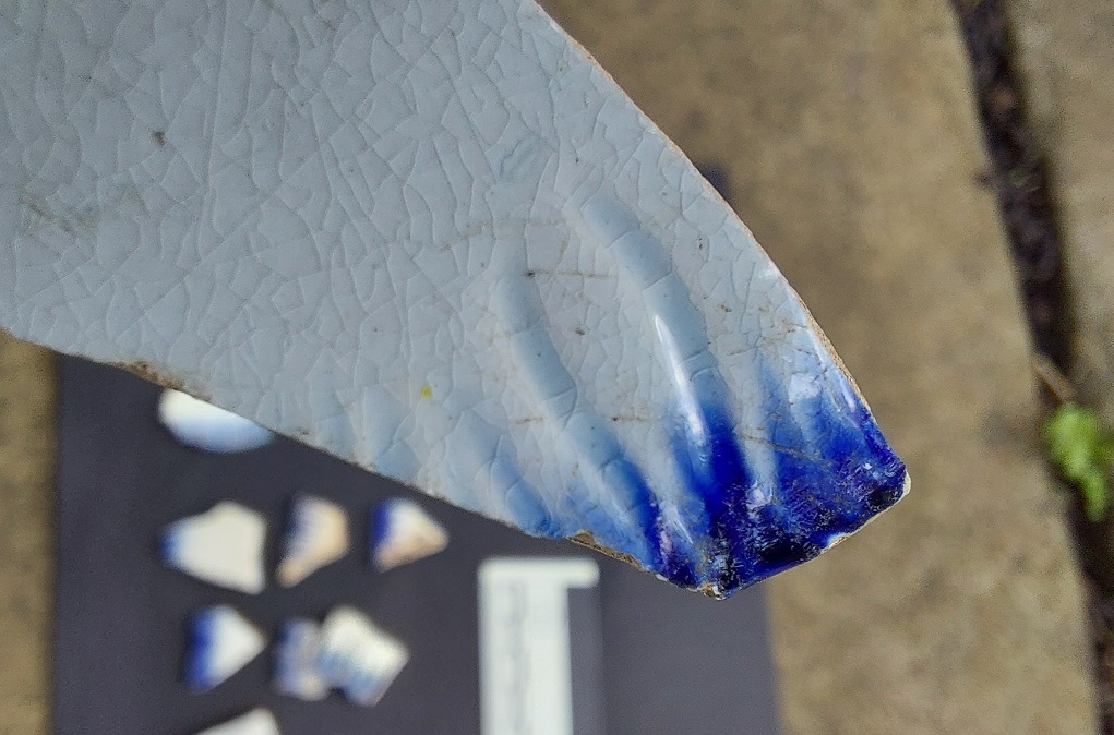
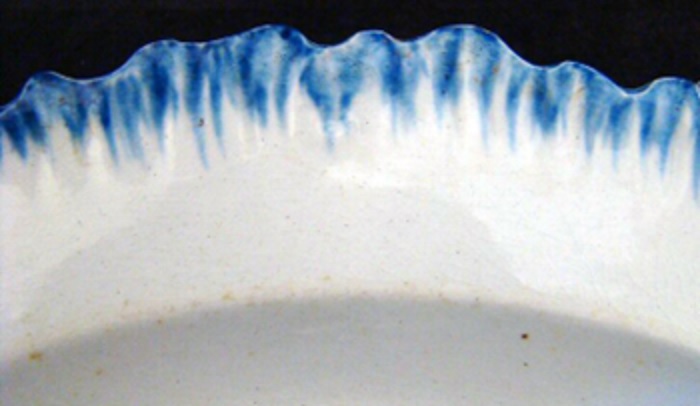
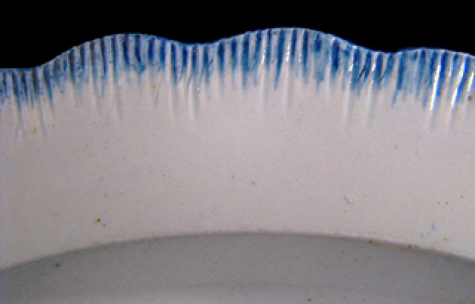
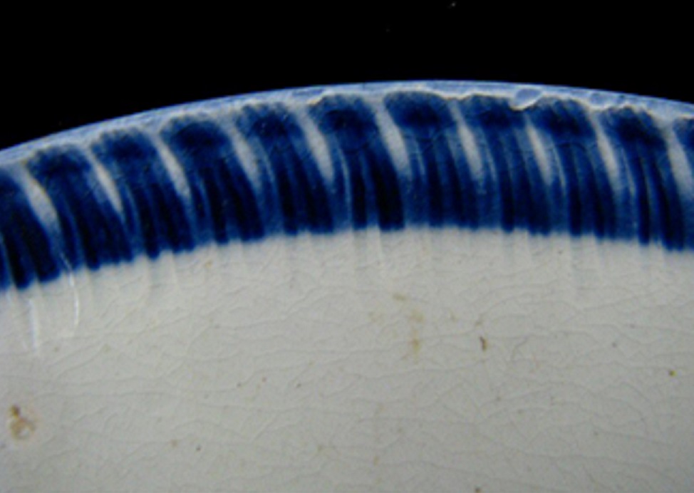
SHELL EDGED WARE (aka Feather Edged/Edge)
DATE: 1780 – 1890
DESCRIPTION: Plain white bowl or plate rim decorated with crinkly ‘feathering’ and painted blue (occasionally green).
SHAPES: Plates, wide rimmed soup bowls, tureens.
This type of decoration is very distinct, and was fairly common in the late 18th and early-mid 19th centuries making it a frequent find. Once seen, it never forgotten.

Essentially a plain white bowl or plate – Creamware, Pearlware, or Whiteware – is decorated on the rim edge with a feathered type decoration in cobalt blue or, less commonly, chrome green. The rim may or may not be undulating, and the feathering may or may not be impressed into the clay, but it is always painted to look feathered or shell-like. I seem to be a magnet for this stuff, but it’s always a welcome find.
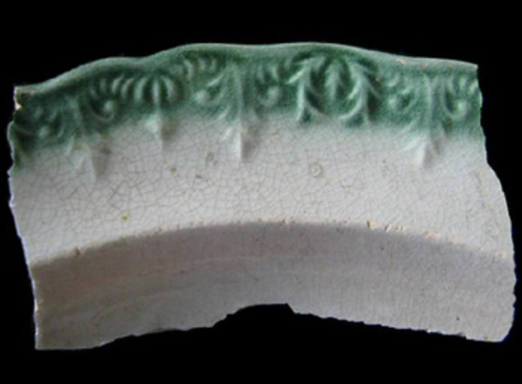
Interestingly, there seems to have been a development in the style, allowing a broad date to be given to some sherds. This is based on American data – much of this ware type was exported, and there was some serious work done on dating it – and I’m not sure how applicable it is in England. Chronologically then:
Type 1 (1775-1810)
Asymmetrical scalloped rim, impressed curved lines (not straight), blue/green edging (feathering).
Type 2 (1800-1830’s)
Symmetrical scalloped rim, impressed curved or straight lines, blue/green edging.
3) 1820’s-1830’s
Symmetrical scalloped rim, impressed curved or straight lines, embossed decoration below – garlands, flowers, wheat, feathers, etc. blue/green edging
Type 4 (1840’s – 1860’s)
Unscalloped rim, impressed curved or straight lines, normally blue edging, not green.
5) 1860’s – 1890’s
Scalloped rim, no impressed lines – the paint is applied to make it look like impressing. Blue edging.

As I say, the academic rigour is there, but whether this is a ‘true’ chronology rather than reflecting deposition dates (that is the date which the pottery was manufactured, as opposed to the date ended up in the ground – which, given I still use my grandmother’s stoneware pie dish to cook with, could be as much as 100 years or more), I couldn’t possibly comment. And here we stray into the strange realm of archaeological pottery studies; I could talk it all day, but I fear some of you may become violent, and nothing takes the shine off a chap’s day like an angry mob.
Right, I think that’s all for today. I do have more pottery to publish, but I might save that for another time – I don’t want to over-egg the pudding, so to speak.
More soon, but until then look after yourselves and each other, and I remain.
Your humble servant,
RH

Thanks Tim. Very informative.
LikeLiked by 2 people
Thank you so much for this. My little people and I have dug up so much pottery this summer converting a bit of old lawn to a veg bed. Your blog is the best place I’ve found to identify it. Shrieks of joy all round!
LikeLiked by 1 person
You’re very welcome – that’s exactly what I want to hear, and exactly why I do what I do. Glad to be of service.
Let’s see some photographs!
Cheers,
Tim
LikeLike
LikeLiked by 1 person
Hi Catharine
Love to help you, old bean! You can send me a photo either via the ‘contact’ email address on the home page (on the right, at the top, click on CONTACT) and I’ll take a look at it. Or, I think you might be able to attach it to a comment here. Possibly. Although, to be fair, I’ve only ever seen these comments from ‘my side’, rather than yours, so I don’t actually know what it will allow you to do!
Looking forward to seeing your beloved sherd.
Tim
LikeLike