Archaeology · Oddities · Whitfield

A Song of Sixpence

What ho! What ho! What ho!

The Christmas season is upon us once more, and my word it seems to have come round again very quickly… in my mind it’s only September! It’s also bloody cold at the moment, and despite the protestations of Mrs C-G, the heating is not going on… honestly woman, just put another jumper on! Anyway, kind and wonderful folk of the blog-reading variety, here’s a little offering to keep you warm.

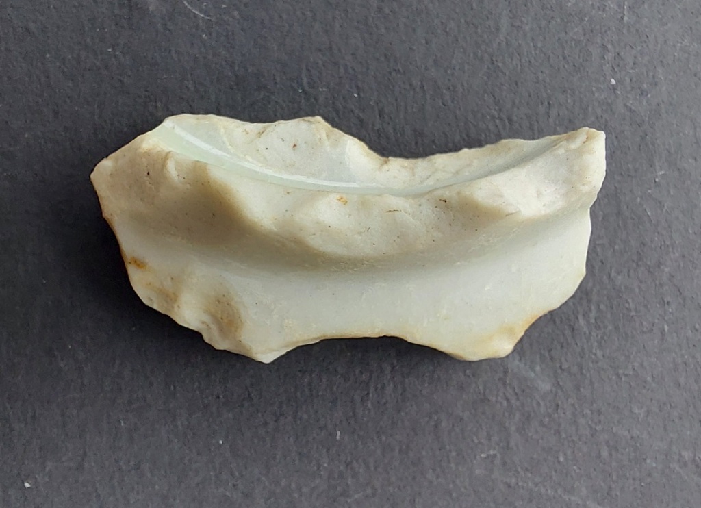
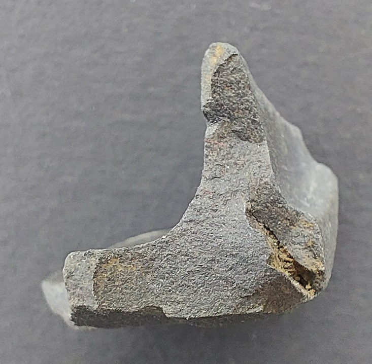
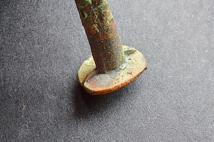
So, a number of years ago (22 July 2018 according to my records), I found this object on the footpath below Lean Town:
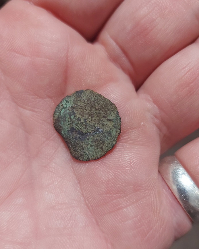
A metallic disc. And no, before you ask, I’m not deformed… I just have chunky and somewhat stubby fingers, Nor is it me holding the disc with my foot/toes either, as someone once ‘amusingly‘ commented.

A coin” I thought, excitedly. And I still think it is. Well, a trade token, perhaps, but it has no discernible features that allow identification; it is completely effaced. A closer look reveals that some of the original surface has survived, revealing the dark green of oxidised bronze – so we know what it was made from. It is very thin, and seems to be relatively poor quality metal, so I err on the side of it being a trade token of some type, rather than a coin.

A close up. The central circular worn patch is the result of wear, and it looks as though the metal has delaminated. You can see the original surface – smooth green patches – above and to the right of the circular wear patch.
Another close up. This side seems more worn, although the original surface is visible in places.

A trade token, incidentally, was a privately minted token used as small change between people, or for a specific retailer or trader. They were common in the 17th century and later when small denomination coins were rare, and often come with the name of the trader, or other information. This one… alas!

Some trade tokens – not mine, but some for sale here.

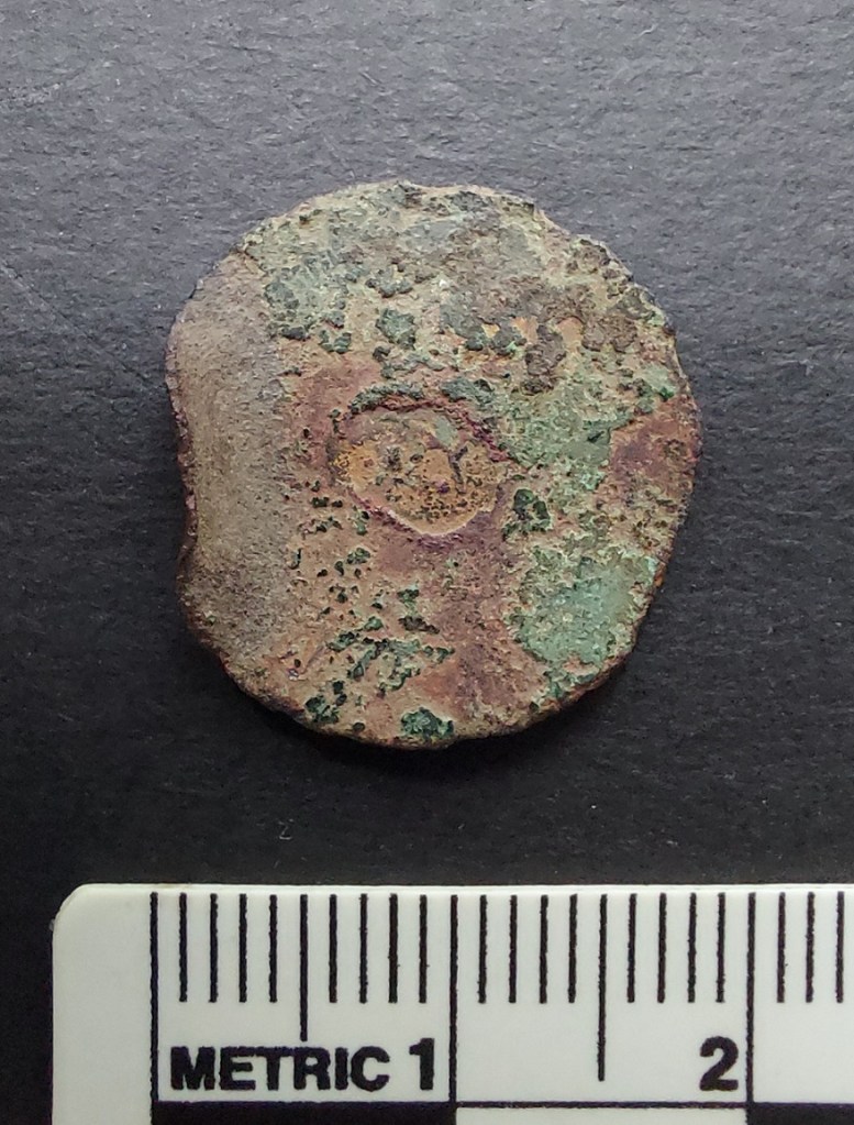
However, for me, the most interesting thing about it is that it has been bent on the edge, and this wasn’t accidental:

The bend is clearly not accidental, but instead deliberate and thoughtful.

As damage goes, it seems to be very targeted, unlike the rest of the damage which is the result of acidic ground conditions. No, this is a deliberate bend, put there by human intention, and that, dear and gentle readers, neatly leads us into an obsession of mine: the bent coin.

As you might have noticed I have a tendency to be somewhat… focused, shall we say? Yes, I know other words are available, but I was being kind to myself! In my real life, I am honestly a shambles; a veritable clown-car at times, complete with wheels that regularly fall off and an enormous horn (madam, calm yourself please, this is not that sort of website). But by Jove, when it comes to archaeology, I can tell you the what, where, and when with almost surgical precision, complete with spreadsheets, plastic bags, labels, and typologies – with archaeology, then, I am mustard, tickety-boo and, I’d venture, oojah-cum-spiff. The ability to focus on single topics in such a way means that I sometimes fall down rabbit holes (literally, as it happens, as well as figuratively) and become obsessed with certain features, topics, and objects… and so it was here with bent coins.

A number of years ago, whilst sorting the small finds at the Blackden Trust, I came across a coin that had been bent into something of an ‘S’ shape. “Hmmmmm…” thought I, and off I wandered – and wondered… why would a coin be bent like that?

A survey of what little literature there is on the subject revealed that coins bent in this manner are a relatively common find by metal detectorists. Further research revealed a fascinating history of coin bending traditions that begin in the medieval period as an important, if not official, religious function, which later shifts to encompass such concerns as love, luck, and loss.

A silver sixpence of the 1690’s bent into an ‘S’ shape. It must have taken some effort to do. I mean, perhaps not lots, but it’s not the sort of thing you can do accidentally. You can often see teeth marks in the bends, which may answer the question of how it was done.

The first account we have of coins being bent in a deliberate manner comes from the 1160’s or 1170’s. A monk from Durham had injured his testicles in a riding accident (look, I’m not making this up, I promise. And there is absolutely nothing funny about a monk with knackered knackers. Nothing at all. Nope.) Anyway, in pain and desperation, the poor chap bent a coin and dedicated it to St. Cuthbert, asking for the saint’s help, and promising to go on a pilgrimage to the shrine of the saint on Lindisfarne to make an offering of the coin. Once there, the monk made the offering and immediately began to recover. Here, then, we are presented with the essentials of the medieval practice; the idea behind the bending of the coin being one of mutually beneficial exchange designed to strike a deal with the saint. A coin is held aloft and bent in honour of that particular saint, with the hope that they will intercede on your behalf. In return you’ll undertake a pilgrimage and deposit the same coin at the saint’s shrine in order to further promote their glory.

This was a common practice in the medieval period: we hear of a William Child, a constable from Peterborough, bending a coin over his ‘dead’ child in the name of Simon de Montfort and the child miraculously recovered. When, during a storm at sea, a man amongst the crew of a ship bent coin with the words “I vow myself and this penny to my lord St. Wulftan”, the storm passed with the miracle attributed to Wulfstan. A coin bent to St. Wulfstan calmed a woman “in the grip of insanity” when it was tied around her neck, and a coin bent over a still-born child and dedicated to St. Richard of Chichester effected an immediate cure. Following an injury, a certain Alice had a suppurating foot, and her father bent a coin to St. Thomas Cantilupe, afterwards making a pilgrimage to his shrine at Hereford. Ann Plott was run over by a cart in 1485 on the Isle of Sheppey, one of her neighbours bent a coin over her body and she recovered. A certain Katherine Bailey, blind in one eye, was told by a stranger to bend a coin to Henry VI; making a mental promise to do so, she found she could see with both eyes. Somewhat bizarrely, it helped with criminals as well as the innocent; in the early 1290’s, a William Cragh was hanged for arson and 13 counts of homicide. Taken from the gallows, a coin was bent over him, and miraculously he lived, apparently for another 15 years.

A half groat of Henry VII (1485 – 1509). The coin has been bent double at some stage in its life – you can see the crease running top to bottom.

A lot can be made of the symbolism of bending a coin, and even the shape can be open to interpretation. The coin itself may have been seen as a relic of the miracle it brought about, and worn round the neck it may have acted as a talisman. Medieval ‘popular religion’ (i.e. not officially allowed by the Church, but done anyway) and magical practice are interests of mine, but I won’t go into it here (never mind yelling “thank God“. And the person bending a 20p coin asking for help in getting me to stop talking about pottery is, frankly, just being rude). Buy me a drink sometime, though, and I’ll tell you allllllllll about it!

During the reign of Henry VIII, the religious upheaval of the Reformation meant the role of saints within the Church was very much downplayed, and the practice of bending a coin lost it religious meaning. However, coins continued to be bent, only now redefined as tokens of love or remembrance. The meaning is the same – faith, promise, and devotion – but the object of this faith and devotion shifted from a saint to a person, and from the sacred to the secular.

A sixpence of William III dated 1696.

Thus we read of Alice Benden, a protestant martyr, who in 1557 gave her brother a ‘bowed shilling’ as a keepsake on the occasion of her execution. In a letter dated 1790 we read the following: “I have a bent sixpence with a hole through it, which was given by my only brother as a keepsake”. More commonly, though, they were given as love tokens by one, or both, of the partners as a way of promising their faithfulness, and showing their devotion to one another, and references to this activity are found in literature. Indeed, the giving of a coin was a similar gesture to giving an engagement ring, and was often understood to be a statement of betrothal or marriage. In 1715, Lady Bridget Osbourne, eldest daughter of the 2nd Duke of Leeds, gave the Reverend William Williams half a gold coin “which she had almost bent double with her teeth” as a way of announcing her intention to marry him. The ensuing clandestine marriage produced a scandal that was played out in court, with the coin figuring quite prominently within the case. It is interesting that here the protagonists are educated middle and upper class individuals, suggesting that all elements of society understood the gesture.

A silver shilling of George III (1816) that has been bent into an ‘S’ shape. What is interesting about this coin is that it has obviously been kept for a long time – the coin is very worn along the bend. Was it a treasured possession and kept in the pocket?

Bent coins were also considered lucky, and people carried them on their watch chains, or around their necks, and were often referred to as ‘touch pieces’. George Eliot in Silas Marner writes “You’ve got the beauty, you see, and I’ve got the luck, so you must keep me by you for your crooked sixpence; you’ll never get along without me”. They were also used to protect against witchcraft; milk that wouldn’t churn properly had a bent coin dipped in it to reverse the spell that was assumed to be the cause of the problem. We also read about more direct action against alleged witches, animals believed to be the witch in disguise were shot with a bent coin to lift a curse.

As a practice, coin bending seems to have ceased by the early Victorian period, although examples are known from as late as 1860’s. After this period, and into the early 20th century, coins were still used as keepsakes and love tokens, but were inscribed with names, verse, dates, and pictures instead.

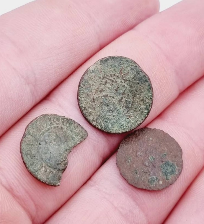
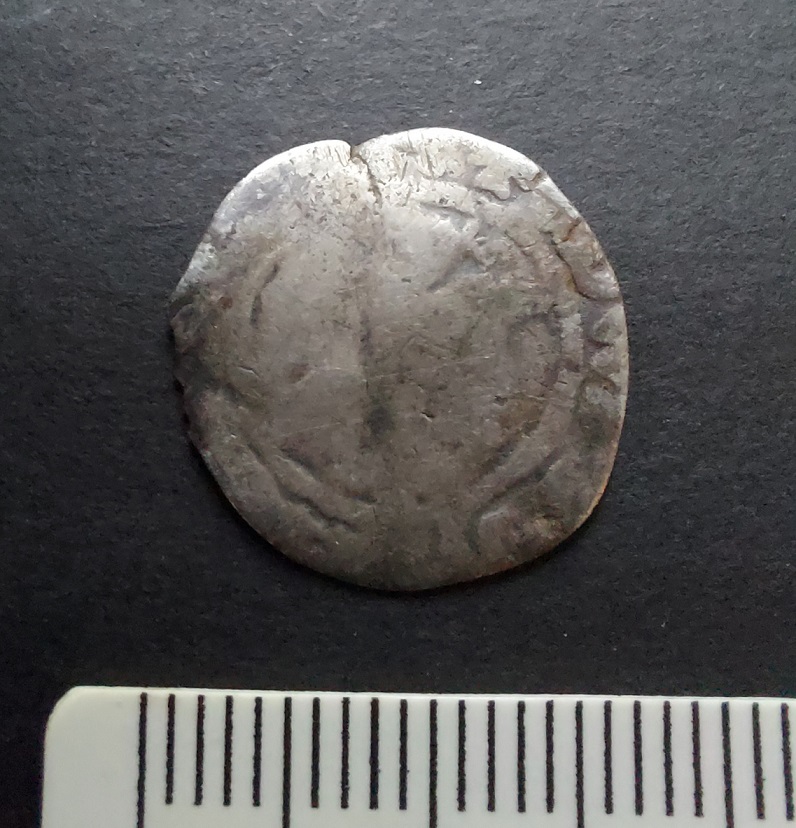
It’s quite a story from a little disc of metal I almost overlooked as it lay in the mud. Makes you wonder what else is there… And as you can see I have collected a number of bent coins over the years (actually, quite a number. In fact, I’m not going to lie to you, I have many. Just don’t tell Mrs C-G, she has no idea! Bloody rabbit holes). Some of this blog post was extracted from a dense academic paper I have written on the subject – complete with references and soooo much more information. If anyone is interested, I will happily send you a copy – drop me an email. In fact get in touch anyway, wonderful blog reading folk, even to tell me you want more pottery posts. What’s that? Of course you do!

In other news, I have written a story for the Glossop Winter Story Trail organised by the incredible people of Glossop Creates. The idea is 24 creative types (myself included) have written short stories that are displayed in shop windows dotted all over Glossop town centre – follow the trail to read them all and uncover a hidden poem. Mine, obviously, is the story of a sherd of pottery and can be read in the window of The Bureau on Henry Street, Norfolk Square. You can also listen to it being read here.

Right then, I’m off to clean some pottery in preparation for the next instalment (which may happen before the New Year). In the meantime, have a wonderful Christmas, and as always, take care of yourselves and each other. I remain, Your humble servant.

TCG

Archaeology · Pottery · Pottery Guide

The Rough Guide to Pottery Pt.6 – Porcelain & Bone China.

What ho, wonderful folk, what ho!

We have today yet another instalment of that momentous work The Rough Guide to Pottery – it truly is the gift that keeps on giving. Try to contain your excitement, but I know it is difficult. Mrs Hamnett herself commented only the other day, as I was explaining the process of making a 17th century slip ware bowl, how lucky she was to have married me. And Master Hamnett runs and hides from me screaming “go away!” whenever I show him a lovely piece of stoneware… the playful scamp.

So then… Porcelain.

A modern Spode porcelain teacup and saucer – stolen shamelessly from their website here.

Here we stray into the realm of real ‘collectors’ and people who spend hundreds of thousands of pounds on a cup. Fair play to them I say, but to be honest, to me and you the minute details of rare and collectible porcelain don’t matter that much.

A Victorian pair of tea/coffee cups – £13 on ebay here (and no, they are not mine!)

True Porcelain was developed in China in the 9th century, and is essentially a very refined stoneware. It is often delicate with very thin walls – so thin that you can see light through them – yet is very hard wearing and tough. Its development was due to an aesthetic search to find a substance that was as hard and cold as jade, and yet gave a ringing tone when struck, like bronze. True Porcelain is made from a mixture of the mineral feldspar and kaolin, a type of clay, and fired to a very high temperature (1400°) which vitrifies (melts) it into an almost glass-like state. It was exported to Europe from 1500s onwards, and was hugely different to the coarse earthernwares that made up European pottery then; this stuff was incomparable (that thing your 3-year-old made using Playdoh versus the finest China).

The genuine thing; late 17th/early 18th century Chinese porcelain. A mere snip at £38,000!

Porcelain became very popular in the 17th and 18th centuries, particularly due to tea and coffee consumption among the wealthy being fashionable – essentially they wanted something similarly exclusive to drink out of. It honestly amazes me how much of history is driven by fashion and the need to be different and ahead of the crowd – something that isn’t going to change any time soon. 

Now, being imported from China meant it was hugely expensive, and many factories began to try and make it. However, no one really knew how it was done. Meisson in Germany began producing very similar pottery in the 1710’s, and others in Europe and the UK had early successes, often involving adding glass dust to fine clays. A significant breakthrough came in the mid 1790’s when Josiah Spode perfected what became known as Bone China. Here, a very fine clay is mixed with about 25% crushed burnt bone, and fired. This produced an almost identical porcelain, and it allowed the mass production of the pottery which is still going today. Also, as it became affordable, it was no longer an exclusive product despite still having a ‘classy’, even snobbish, image. Personally, I prefer an earthernware mug, but my grandparents generation would have scowled at my choice of cup. Now, at the risk of incurring the wrath of Porcelain experts, I’m lumping true imported Porcelain with Bone China here.

Does exactly what it says on the bottom on the early 20th century teacup

There are no perceptible differences at the level at which we are working, nor is it vital that we pinpoint a date of something – we are simply having fun (admittedly some of us take our fun more seriously than others who, for example, don’t clean their pottery. Or who use an egg as a photographic scale. I’m not naming names, you know who you are.). If you do want to go down that rabbit hole, there are dozens of books on the subject that allow you to explore dates, patterns, shapes, types, names, etc. However, for our purposes, it all goes under the heading PORCELAIN. I expect a visit from the heavy thugs of the porcelain collecting world within moments of publishing this.

PORCELAIN (aka Bone China, China)
DATE: Realistically c.1800 – Now. Theoretically, but unlikely, 1500 onwards.
DESCRIPTION: Thin walled vessels, delicate, with many different decorative motifs and colours, occasionally with gilding.
SHAPES: Most shapes, but very commonly tea/coffee cups, saucers, small plates.

Very thin walls, but is very hard, especially when compared with ‘normal’ pottery. The fabric is white or very pale grey, with perhaps a hint of blue, and with no inclusions – it is pure. The texture is very glassy, and is grainy with tiny voids – it reminds me of cauliflower heads, or snow. See this comparison with earthernware, for example:

Porcelain left, earthernware right (my bare foot, bottom right… it’s probably for the best we move on, really). The difference in the fabrics is very noticeable, it’s almost wet(porcelain) versus dry (earthernware).

It also breaks like glass or flint, rather than pottery, with tiny flattish flakes and sharp edges.

It’s odd stuff! You can see how it breaks into flakes, and I remember reading about Australian Aboriginal tribes using telegraph wire insulators to make stone tools. Makes sense.

Banging sherds together, they make a high ringing sound – a ‘tink’, rather than a ‘thunk’ if you see what I mean (don’t look at me like that…). Also, if you hold a sherd up to a light, you should be able to see through it – try moving a finger between the sherd and the light source. The surface is very shiny with the glaze visible in the section as a clear white line, often with the paint of the decoration bleeding into it. Decoration is fine hand-painted images, normally in blue, though other colours are found, and normally of naturalistic scenes – flowers, landscapes, trees, etc. The start of the obsession with ‘Chinese’ decorations (including ‘Willow Pattern’) can be traced to the original porcelain vessels. Shapes are largely bowls, delicate teacups, plates and saucers, though teapots, milk jugs, and other shapes do occur. Other decoration can be painted over the top of the glaze. Later examples of Porcelain/Bone China can be very colourful, and very fine, too, often with a gold leaf gilding.

A random selection of Glossop found sherds of porcelain showing a range of decoration. I have to say, it’s all a little gaudy for my tastes.
This is more like it – a flowing, living, painted decoration – fluid lines, almost jazz-like in improvisation. Lovely stuff. I found this tiny sherd in the River Thames a few years ago, and it is one of my favourite sherds. Blimey, now there’s a phrase I never expected to type!

Now, because I love you so much, and I know how much you enjoy my ramblings about pottery (I’m ignoring you – you don’t have to be here, you know), I thought I’d add another related ware type.

Whilst searching for an easy Porcelain recipe, Wedgewood made numerous innovations in pottery (including the famous Jasper Ware), one of which was Basalt Ware. Although it is rare, I love this stuff.

Some Black Basalt Ware. As I say, I really like this stuff.

BLACK BASALT WARE (aka Basalt Ware or Basaltes)
DATE: 1770-1820
DESCRIPTION: It is characterised by a black surface, thin walls, and impressed – not painted – decoration. Very classical Greek and Roman influenced motifs and designs.
SHAPES: Cups, Bowls, Tea & Coffee Sets, Vases, Busts, Plaques, Figurines, and Relief Medallions.

A red clay is mixed with manganese oxide, which gives it its black colour, and it is fired to a very high temperature to make a refined stoneware. It is hard-wearing, and, like porcelain, doesn’t break like ‘normal’ pottery, but more like glass, with straightish sharp edges. The fabric is very hard and very dense, as you would expect, and is totally uniform – there are no inclusions – but it is quite grainy, again, like porcelain. The gloss surface can be dull or shiny, though never a brilliant shine, and there is no glaze or surface; the fabric is the pot, which seems odd.

Here is the fabric – hard and grainy, but there is no surface. You can also see the voids that are formed by gasses produced during firing.
Impressed decoration, very Classical in inspiration.
More impressed decoration – this time the base of a tree or shrub.

Thin walled, it has impressed and embossed decoration – rouletting, geometric shapes, naturalistic scenes with classical motifs and flora. It looks vaguely Roman, and is very heavily influenced by the Greek, Roman, and Egyptian antiquities that were being unearthed at that time, and which were fuelling the Georgian neo-classical obsession in all aspects of life. As a pottery type it’s not common, but you can occasionally find it here and there.

Well then, excitement over. That’s all for this time.

There is lots in the pipeline – both Glossop related, and further afield – so watch this space, and as always I have several large posts ready written – so perhaps two this month? You lucky people, you!

I also have a thing coming up – one of this public speaking things that I can’t seem to stop doing! This one is in Chester, and is a folklore/archaeology ‘discussion’ with the wonderful Elizabeth Garner, and called ‘The Gold In Your Back Yard‘. It’s free, but do book through Eventbrite here. It will, of course, be amazing… I think. But if not, you can just sit at the back and ask awkward questions! I’ll also shamelessly plug Liz’s book, Lost and Found (buy it here). It is a wonderful collection of folktales, beautifully told. She also mentions this archaeologist bloke, Tim Campbell-something-or-other. Honestly though, it is well worth buying.

More soon, I promise. But until then, look after yourselves and each other. And I remain,

Your Humble Servant,

TCG

Archaeology · Pottery Guide

The Rough Guide to Pottery Pt.5 – Blue and White Bits.

Look, it’s no use yelling “for the love of Jove, not more bloody pottery!” No one is forcing you to be here. Honestly, I haven’t even started yet, and here you are, giving your two penn’orth.

What ho! Wonderful readers. Welcome, welcome, welcome.

A quick one today – Part 5 of my best-selling, most talked about book of the year, Booker Prize shortlisted Guide to Bits of Old Pot. I have a brace of posts almost ready to go, but to keep you going I thought I’d publish this. Enjoy.

TRANSFER PRINTED WARE (aka Willow Pattern, Blue & White)
DATE: 1800 – Now
DESCRIPTION: A cobalt blue pattern or image on a white background. Also, red, brown, black, or green.
SHAPES: Any and all vessel shapes – from delicate tea cups to whacking great soup tureens – literally everything.

Ah yes… Transfer Printed Ware. If you are going to find pottery, this is the stuff you’ll find, and in particular the ‘Willow Pattern’ pottery. It dominated the 19th century, and arguably a large portion of the 20th – it is everywhere. I have actually dreaded writing this part of the guide, probably because of the quantity of material, but also I’m worried that it might not appeal to all of you (*sigh, yes I know it doesn’t appeal to you. And look here, there’s no need to use language like that… there are ladies present, and calling me a “honking tallywacker” is hardly becoming of a gentleman.”). But it turns out that it’s exactly the sort of thing appeals to (most of) my readers.

As we have covered previously, 18th & 19th century potters were trying to find the perfect blue and white decoration on a perfect white background to match the desirable Porcelain being imported from China. Tin Glazed Pottery (or Delft) certainly filled that gap, but it really wasn’t perfect. An easier form of decoration was wanted, and the idea of transfer printing began to take shape in roughly 1750, being applied to Porcelain only at this point. It was in about 1785 that the process successfully began to be applied to earthernware, being perfected by that wizard of English pottery, Josiah Spode.

A random selection of Blue & White Transfer Printed pottery.

The process is relatively simple if a little convoluted. Firstly, an image was engraved in a copper plate, as was done for book illustrations at the time, and applied to an oiled tissue paper using a cobalt ink – this being the only colour at the time that would survive the firing process. This is the ‘transfer’. Next, a vessel is ‘biscuit’ fired – that is fired without glaze, and at a lower temperature, to make it hard and able to take the transfer print. The transfer paper is then pressed onto the surface of the vessel, with the ink absorbed in the fabric. The pot is then fired a second time to remove oils and fix the ink into the clay body. Next, a glaze is applied, and then it is fired a third and final time. Originally applied to Creamware, then Pearlware, it became a standard decoration for White Ware, and by 1820 TPW was everywhere, and being used for all sorts of images. A brown ink was developed in roughly 1835, a green chrome ink in 1850, and a red ink at about this time, too.

Various coloured Transfer Printed plates. And of varying quality.

Eventually a technique for multi colour printing was developed by the pottery factory F.R. Pratt, allowing full images to be put onto vessels from late 19th century on.

Pratt’s development meant that anything could be printed in any colour. These date to very late Victorian and early 20th Century.

A technique called ‘Flow Blue’ was perfected around 1800, in which the cobalt blue transfer print was deliberately smudged or blurred. The pot is prepared as normal, but during the firing a ‘flow powder’ (a mixture of 22% salt, 40% white lead, 30% calcium carbonate, and 8% borax) was added into the kiln, giving off a chlorine gas which caused the cobalt to diffuse or blur into the glaze.

Flow Blue. For some reason, I just couldn’t take a good photograph of this. I must have spent 20 minutes getting more and more frustrated, taking endless shots of just this scene. To be honest, even looking at it now makes me angry.

Sometimes this changed into a more purple colour, termed ‘Mulberry’, occasionally it was highlighted with gold.

My only piece of Mulberry Flow Blue.

Flow Blue’s popularity peaked around mid-century, and as a style lasted until perhaps 1900. The more extreme blurred examples may have been sold as cheaply as ‘seconds’, and were thus popular with the poorer market. Indeed, for many years I just thought that Flow Blue style was just really badly made TPW, and only fairly recently did I discover that it was deliberate.

In terms of decoration, I don’t know where to begin; from classical scenes to commemorative plates, souvenirs from castles, to children’s rhymes – literally anything and everything was inked onto the vessels. You may get lucky and find a name or a date, or a maker’s mark from the underside of a plate. Or it may just be a pattern from the edge. The classic is of course the ‘Willow Pattern’, with its spurious story of lovers turned into birds. This was, and still is, reproduced in huge numbers: it is everywhere. In fact, so common was this pattern that it is used – incorrectly – as a short hand for all Blue & White pottery.

The actual Willow Pattern – image from Wikipedia.

Theoretically, though, given infinite time and patience, one could identify and date any sherd using the wealth of pattern books that were kept by the factories that made them, but even for a certified sherd nerd such as myself, that way madness lies!

Transfer Printed Ware began life as a prestigious and very exclusive pottery type, with the early stuff being of incredibly high quality. Once it began to be mass produced, as always happens, the quality began slipping, until the lower end of the market was cheaply produced and sold for next to nothing. This produced some shoddy designs and duff workmanship; sometimes you can see where the transfer has slipped, where bits overlie each other or don’t join in the pattern as they should. I do like these mistakes – I think it adds a human touch.

At first glance, quite attractive – bees and flowers, what’s not to love. But look closely – it’s blurred, there are smudges, blobs, lines stop and start, patterns don’t meet. This is budget pottery of the lowest order. I love it!

Allied to Transfer Printed Ware, although not actually transfer printed, is this stuff:

SHELL EDGED WARE (aka Feather Edged/Edge)
DATE: 1780 – 1890
DESCRIPTION: Plain white bowl or plate rim decorated with crinkly ‘feathering’ and painted blue (occasionally green).
SHAPES: Plates, wide rimmed soup bowls, tureens.

This type of decoration is very distinct, and was fairly common in the late 18th and early-mid 19th centuries making it a frequent find. Once seen, it never forgotten.

A varied selection of Shell Edged Ware. You can see the blue-tinged Pearlware of some of these sherds, dating them to roughly pre-1830. I also realised I don’t have any green edged sherds.

Essentially a plain white bowl or plate – Creamware, Pearlware, or Whiteware – is decorated on the rim edge with a feathered type decoration in cobalt blue or, less commonly, chrome green. The rim may or may not be undulating, and the feathering may or may not be impressed into the clay, but it is always painted to look feathered or shell-like. I seem to be a magnet for this stuff, but it’s always a welcome find.

Lovely shot. You can see the cobalt blue edge, and impressed decorative ‘feathering’ that here has been filled with the blue tinged glaze that makes up Pearlware. I improved the shot by cropping out my gnarled bare feet that were visible at the bottom of the photo.

Interestingly, there seems to have been a development in the style, allowing a broad date to be given to some sherds. This is based on American data – much of this ware type was exported, and there was some serious work done on dating it – and I’m not sure how applicable it is in England. Chronologically then:

Type 1 (1775-1810)

Asymmetrical scalloped rim, impressed curved lines (not straight), blue/green edging (feathering).

Type 1. I must add that I don’t own the rights to this, or any of the following images, and cannot now recall from where I stole them, shamelessly as always. Apologies if it is your image.

Type 2 (1800-1830’s)

Symmetrical scalloped rim, impressed curved or straight lines, blue/green edging.

Type 2

3) 1820’s-1830’s

Symmetrical scalloped rim, impressed curved or straight lines, embossed decoration below – garlands, flowers, wheat, feathers, etc. blue/green edging

Type 3

Type 4 (1840’s – 1860’s)

Unscalloped rim, impressed curved or straight lines, normally blue edging, not green.

Type 4

5) 1860’s – 1890’s

Scalloped rim, no impressed lines – the paint is applied to make it look like impressing. Blue edging.

Type 5

As I say, the academic rigour is there, but whether this is a ‘true’ chronology rather than reflecting deposition dates (that is the date which the pottery was manufactured, as opposed to the date ended up in the ground – which, given I still use my grandmother’s stoneware pie dish to cook with, could be as much as 100 years or more), I couldn’t possibly comment. And here we stray into the strange realm of archaeological pottery studies; I could talk it all day, but I fear some of you may become violent, and nothing takes the shine off a chap’s day like an angry mob.

Right, I think that’s all for today. I do have more pottery to publish, but I might save that for another time – I don’t want to over-egg the pudding, so to speak.

More soon, but until then look after yourselves and each other, and I remain.

Your humble servant,

RH

Archaeology · Graffiti · Stones of Glossop

Naked Ladies… and a Quarry

Well that got your attention! What ho, wonderful people! What ho!

Up by Coombes Edge lies Cown Edge quarry. This quarry, long disused, contains a number of interesting, and oddly well executed, carvings on the walls. I have heard about this particular place – and its carvings – many times, and from many different people, but had never managed to get up there. No reason, simply that there are so many places to see, and so little RH. A few months ago, a friend (my thanks to Andy T) suggested a walk up that way and, well, I thought, let’s have a look.

What I like about this place is not just the ‘historical’ history, which is visible and tangible, but the ‘personal’ history which is similarly visible, but often better felt than seen. The quarry seems to be one of ‘those places‘; a destination, a space in the landscape that attracts; a shelter, an asylum, a place of freedom, and perhaps decadence. In particular, it’s place where ‘youths‘ go and be ‘youthful‘, frolicking, feeling, fumbling, and… well, you get the picture. I didn’t grow up in Glossop – I’m a ‘comer-inner‘, so to speak – but if I could take you to Cheadle Hulme where I did grow up, I could show you a few such places from my youth. Every town & village has them – and the similar stories they could tell of the first time drunk, illicit substances consumed, virginities lost, love discovered, best friendships forged, fights fought, and the always difficult transition from child to adult negotiated – often on the same evening. But perhaps most importantly, memories are made. To quote Wordsworth “Bliss it was in that dawn to be alive, but to be young was very heaven“. I have recently turned 47 (young for some of you, old for others… it’s all relative), and have been marvelling at the swift passage of time, so forgive the nostalgia. Now on with the show.

Cown Edge Quarry seems to have been started sometime in the early 19th Century, probably as a source of roofing stone. Geologically, the stone is Rough Rock – a type of sandstone of the Peak District and southern Pennines, and the most commonly occurring of the Millstone Grit group.

Incidentally, and as a rule of thumb, you can roughly date the buildings of Glossop by what the roof is made from. Prior to c.1850 roofs were made from stone taken from local quarries such as these. However, once the railway arrived (c.1850) Welsh slate could be imported on trains. Not only was slate cheaper, but it also weighed less so the roof could be constructed using less timber, and so roofs after 1850 tend to be made of this. A rule of thumb not an absolute guide, but useful nonetheless.

Anyway, the quarry is located here:

Thank you Google for the image.

And here it is in 1898:

And thanks to the National Libraries of Scotland for this image.

If you use the What Three Words app, the reference for the quarry entrance is: tribal.workers.crossword

Now, as subjects go, it isn’t perhaps the most interesting, but then as we know on this site more than most, ‘interesting’ is a veeery subjective word. However, it was deemed important enough to have its own Historic Environment Record – MDR10021. Largely overgrown now, and with none of the urgency and noise that would have marked it out as a place of work when it was operating, it is peaceful and still.

The view looking north from the quarry mouth
Looking west. Interesting, and a little odd, to think that the roof of my house, where I type these words, was almost certainly quarried from this place.

However, the walls are full of interesting graffiti, carved over the years since the place was abandoned. Some is more worthy than others, but all is a record of people, humans being, well… human. I have said elsewhere that there is something universal about the need to leave a mark on the environment, almost a way of achieving immortality, your name living on past you, perhaps. And hats off to those who did it before the invention of spray paint… if you wanted to put your name up in the past, you had to mean it – with a hammer and chisel. Here follows a sample of the carvings – mundane, as well as the more creative.

AKW 1942 – presumably there is no reason to lie about the date, so this is interesting… and asks further questions.
“Tim. Joey. Glossop”?
“.D” – quite modern, I suspect, and a worn hole.
“BEAN”? and some pock marks. These overlay – and are later than – the painted anarchy sign.
“DUF, LEZ, ANT, GUS” 1994. “KEV” at the bottom is even probably even more modern.
“DAN”, “SID”, “LES”, “LYNN”, and some symbols. These seem to have been carved and re-carved.

Talking of symbols, there are what seems to me an unusual number of Christian crosses carved here:

“BUZZB” and “JB 23.9.69” I love this one – the date is so specific. The cross is also very prominent.
An ancient Egyptian Ankh symbol – quite old (filled with slow-growing lichen), and odd to find on the rock face.
Another lichen-filled cross.

Perhaps it’s the crosses that give the quarry its reputation for Satanism and witchcraft? Anyway, the ‘religious’ iconography culminates in this, what the HER calls “a potential Calvary figure” – that is, Christ on the crucifix:

Well executed, and subsequently highlighted in paint.

This is a weird one – is it one figure, or two – a smaller, more feminine and naked, between the Christ-like figure’s legs? Or is it three? The more I look, the less I know. Is that the point? Is there a point? Even down to the almost-altar like outcrop of stone in front of the figure, this is very good.

It seems that this is a modern(ish) rendering, done by a known person – I have heard several different reasons and accounts – and people – but the story is not mine to tell, nor is it for me to name names. That I will save for the comments section, should anyone wish to do so.

However, it looks like it was the same hand that carved this naked lady, as well, so I’m not sure about any religious motivation as such:

It’s carved with skill, too.

There’s also this lower half of a person on their hands and knees.

Not sure what I can say about this… so I’ll say nothing!

Moving away from carvings, and back onto the safer territory of history and archaeology, there are traces of the original purpose to which the quarry was put here and there amongst the more modern intrusions.

The rough dressing is visible in the dark area of the quarry face.

Here we can see the rough dressing of the stone, done prior to it being broken out of the rock face. This provides it with a flat-ish surface before it is smoothed properly elsewhere. This was probably the last thing that was done in this quarry before it was shut down, as it is part of the quarrying process, but was never finished. I like that.

The quarry road, with spoil piles on the left.

The quarry road is very nicely preserved, but if you look closely at the stone at the bottom of the above photograph, you can see a groove worn into the rock there, running top to bottom. This is the track of a sledge repeatedly being drawn over the stone, day in, day out, for decades. A horse-drawn sledge is easier to use, more stable, and less likely to cause accidents, than a cart, and were often used in these remote quarries.

I also found also a concretion in the rock face of the quarry. Essentially, a concretion is a small boulder of one type of rock which is formed naturally, and which becomes trapped within the matrix of a surrounding rock when it was laid down as sediment millions of years ago.

I love that the concretion looks like an eye, the ‘eyelid’ accentuated by the red paint.

The concretion erodes at a different rate from the surrounding material, and so they stick out quite clearly. They’re fairly common in this type of Rough Rock, as indeed are plant fossils, apparently, but I didn’t see any of those… I need to go back.

Right, there you have it. More soon – including more pottery, you lucky, lucky, people. I’ve got so many ideas – walks, books, tours, blogs posts, pottery workshops, YouTube shenanigans, surveys, excavations, art, creativity, etc. – and so much I’d like to do. For now though, stay in touch and follow me here, or on Twitter (@roberthamnett), or even on Instagram (timcampbellgreen). Or just come up to me and say “What ho, Robert Hamnett!”.

But until next time, please look after yourselves and each other.

And I remain, your humble servant,

RH.

Archaeology · Pottery · Pottery Guide

The Rough Guide to Pottery Pt.4 – Creamware, Pearlware, & Whiteware.

What ho, dear and gentle readers, what ho!

How are we all? I hope everyone is well. Or, at the very least, not actively unwell. Well, all except you, that is. Yes you… you know who you are. The “all pottery is dull as dish soap” chap… Mr Shouty-Outy. I hope you stub your toe really hard.

Anyway, with such unpleasantness out of the way, we can move on to the subject of today’s article. Ladies and gentlefolk, may I introduce to you… Creamware, Pearlware, and Whiteware.

Now, even for a certifiable pottery nerd such as myself, this is far from a riveting subject. I mean, it’s less ‘edge of your seat’, and more slump down the back of the sofa in a fashion that causes people to enquire as to whether one is alright, and mutter concernedly about ‘strokes’ and ‘comas’. But before you agree with Mr Shouty-Outy, and start tying a noose, pause, crack open a bottle of the stuff that cheers, and have a read, as the above three pottery types will form a large part of any pottery you find, and is an important part of the development of British pottery.

The history of British pottery since roughly the mid 17th century can perhaps be characterised as the pursuit of white. Once imports of Chinese porcelain began, with their pure white fabrics and background, and blue painted patterns, we Brits fell in love with the design. But the problem was that it was very, very, expensive, and far out of the price-range of the developing aspirational middle classes, who were seeking to copy the upper classes. We copied the designs and colouring in beautiful Tin Glazed or Delft wares, and made some incredibly fine pottery in what is called Fine White Stoneware (you’ll be pleased to note that both of these will feature in future pottery guides; oh look, that woman over there is so excited about that, she is literally screaming with joy). But with the mid 18th century explosion in tea and coffee consumption, there was increasing demand for a cheaply produced white background upon which decoration might be painted or printed.

The following three types – Creamware, Pearlware, and Whiteware – were developed as these backgrounds. It is unlikely that you will come across them on their own (though not impossible), it is more likely you will say “What ho! I say, that looks like blue and white transfer printed decoration on a Pearlware background” which should, if you use the guide the right way, give a date for your sherd, and make you feel warm, fuzzy, and happy. And a little smug that you know things. Unfortunately, though, it will make other people angry and beg/threaten you to stop talking. No? Just me? Ahem… anyway.

CREAMWARE (aka Queen’s Ware)
DATE: 1760’s – 1820’s
DESCRIPTION: A pale cream colour ‘white’.
SHAPES: A huge number of shapes – from the plain bowl and plate, to wonderful pierced vases, decorative vessels, and truly strange designs.

Developed by, among others, Josiah Wedgewood – the great 18th century potter – in the 1760’s, and by the 1780’s was so popular that it essentially killed off both White Stoneware and Tin-Glazed pottery production. Wedgewood attained royal patronage by supplying a tea set to Queen Charlotte, wife of George III, who later commissioned a 925 piece dinner service; he renamed his Creamware ‘Queen’s Ware’ in her honour. Shape wise, it occurs in every conceivable pottery type – from regular plates and bowls, to rare and fancy shapes – pierced vases, delicate jugs, salt and sugar shakers, ice buckets, etc. Some of the vessels were also moulded with ornate naturalistic shapes – leaves, plants, etc.

Fancy pierced shapes. Courtesy of Salisbury Museum.

It is also very decorative. Commonly with a blue and white transfer print, but also hand painted with pictures, words, and designs.

A two-handed loving cup, hand painted. Courtesy of Wikipedia.
Two sherds of Creamware. The one on the right is particularly nice – a lid to a jug or similar with a moulded leaf design on the top.

Because the shape of the vessel is moulded, it means that it has very thin walls (the nice stuff does at least), but it also means that it can be very decorative, with all sorts of complex applied designs.

The fabric is a pale creamy white, achieved by mixing Kaolin, a very fine white clay, into the regular earthernware clay. This already pale clay base is then coated in a lead glaze mixed with copper, and fired producing the pale butter colour. Where the glaze has pooled whilst drying before being fired – usually on the base – you can sometimes see a greenish tint (the copper), which is a tell-tale sign of Creamware.

The greenish hue of the glaze can be seen where it has pooled in between the leaves.

It is also noticeably cream-coloured when compared with other white sherds. Creamware’s popularity waned after 1800, when it was overtaken by Pearlware, a cheaper, more pure white version of it.

PEARLWARE (aka Pearl White, or China Glaze)
DATE: 1780’s – 1820’s
DESCRIPTION: A blusish ‘white’.
SHAPES: Seemingly more utilitarian than the Creamware, but still a large range; so plates, bowls, dishes, jugs, cups, tankards, & goblets.

Pearlware is a refinement of Creamware, developed again by Wedgewood, in the 1780’s. It is almost like a less fussy, less fine, and more robust version, and there seems to be far fewer of the pierced vessels, ornateness, and incredibly detailed moulding. It does occur moulded, especially in tankards and Feather-Edged dishes, but it is less common than in Creamware. This may reflect the fashion of the time – a move toward simplicity – but equally it could be that Pearlware was conceived as more utilitarian.

The blueish tint of the glaze is obvious against the black background, and especially compared with the white clay.

The whiteness in Pearlware was achieved by adding cobalt – a blue mineral – to the lead glaze, giving an almost blue glow to the pottery – a sort of trick of the eye. Again, the blueness is particularly noticeable where the glaze has pooled, often on the underside.

Here you can see the cobalt blue colouring to the glaze where it has pooled on the underside of this mug. This is a badly made mug, and the glaze has over-fired in places.

In terms of decoration, it could be hand painted – either as a pattern, or just the edges in Feather-Edged Ware (see the example in the photo above). However, it is more commonly encountered as a base for transfer printed decorative motifs – willow pattern and the like. It was also commonly used as a base for Industrial Slipwares (discussed here in Part 3 of the guide). Pearlware began to fall out of favour in the 1820’s, and was superseded by the development of Whiteware.

WHITEWARE
DATE: 1820’s – Now
DESCRIPTION: White fabric, with a white glaze.
SHAPES: Quite literally every shape.

Characterised by a very white fabric, with a white glaze, upon which all sorts of patterns and motifs were put; this is essentially the stuff that we eat from now. If you are uncertain, go into your kitchen, get a plate from Ikea, break it, and have a look at the break. That’s Whiteware.

Cobalt use declined in the early 1800’s, perhaps due to difficulty and expense of obtaining it, but this coincided with the process of chemically refining the clay to produce a purer white becoming easier. And this, combined with better glazes, meant that a perfect white background colour could now be achieved. And not much has changed 200 years later. Well, apart from the fact the glaze now has less lead in it… which is nice. Decoration is, well, everything we can think of – painted, sponged, transfer printed – and is pictures, patterns, or words. This stuff is very, very, common, and largely boring even by my standards, but sometimes, precisely because it was used for all sorts of things, it throws up a gem or two.

A selection of 19th and early 20th century printed sherds on Whiteware. This stuff is always a joy to find.

HOW TO TELL THEM APART.

Should you want to know which sherd is of what type, for whatever reason (and we don’t judge on this website), then it would be very helpful to put them on a plain white piece of paper under a bright light. In this environment, Creamware will appear pale cream coloured, Pearlware will appear blue-ish tinged, and Whiteware will simply blend in – like so:

The three types together: from left, Creamware, Pearlware, Whiteware.

So now you know.

Now, I admit that this wasn’t the most fascinating article (look it’s no use sobbing… I don’t force you to read the blog), but it is an important one in that it builds a more complete picture of post-medieval pottery, and means that you now know what I mean when I say Pearlware. I’ll leave it to you to decide whether that is a good thing or not.

That’s all for now. I have about another six half-finished articles which I will get around to completing very soon, including ‘magical protection‘, ‘quarries‘, ‘holed stones‘, ‘tracks‘, ‘updates‘, and your favourite and mine… some more pottery, but I’ll spare you that until later.

Right, until the next time, look after yourselves and each other, and I remain.

Your humble servant,

RH.

Archaeology · Pottery · Whitfield

A Green-Fingered Garden Grab*

*Ok, so I couldn’t think of a better title.

What ho, what ho, what ho!

So, right now, as we hurtle toward the solstice, is my favourite time of the year. Spring into summer – the days are long, my birthday is hoving into view (19th July, if anyone is interested… and a dark fruity red, if anyone is feeling flush). It also means time spent in the garden, planting and preparing the soil. Hamnett Towers is blessed with a small back garden (utterly destroyed by chickens… honestly, it looks like the Western Front), and a slightly larger front garden where the vegetables are planted. Both of these forces of nature – chicken and man – excavate all sorts of goodies. Predictably, I have kept everything I have found, and kept them separate; Hamnett Towers was at one point two separate ‘back-to-back’ terraced houses, so the archaeology of either side might tell a slightly different story (old archaeological habit). And so far, this year has produced some very interesting bits.

So, please join me in the garden. Ah, sorry, no shorts or baseball caps please – this is an English gentleman’s abode; t-shirts I can just about cope with, but I mean, a chap has to have standards dash it!

Here’s the day’s findings from the front garden:

A selection of the history of the land the garden has decided to show us this year… so far.

Let’s start with the nail – a Victorian, hand-made, copper roof nail, to be precise. I’m something of a magnet for these things, and they seem to find me wherever I go. They are truly mundane – the nail that holds on a roof tile – and yet are such lovely and tactile things (I’ve blogged about them before – here – FIVE years ago… blimey!). Copper was used as it is largely resistant to corrosion, and their square section is a dead giveaway of age.

Lovely green verdegris competes with rust (the result of it lying next to something iron based) on the surface.

They are made relatively simply, but by hand. Each nail is cut via a press from a long flattened strip of copper (thus the square body of the nail). It is then placed into a small mold or former, point down, and the exposed top is hammered by hand until it flattens out, forming the nail head. Close-up you can see the two flashing strips formed as the soft copper is driven between the halves of the mold.

A close up of the underside of the nail head, clearly showing the copper flashing.

The nail may have come from my house roof, which is a great thought.

Next to the nail is a sherd of spongeware, probably from a large bowl or shallow dish. I find a lot of this particular vessel in the garden, and I might have to try and reconstruct it sometime (follow the link above, 3rd photograph down, on the right for more of the same bowl).

Next row, a sherd of marmalade/preserve jar (here, for more information), and then two thoroughly uninspiring sherds of white glazed pottery. Then, this beauty!

Super. An amazing chance find whilst whilst putting in some pea and bean plants… half of which were eaten on the first night by what can only be imagined as a biblical plague of famished slugs – honestly, I swear I could hear a very slow moving rumbling sound. If you’ll pardon the French… Bastards!

Wonderful! A small bone button, and almost certainly Victorian in date. Delicate, handmade, and slightly off-centre, it is lovely. Again, something so mundane – every item of clothing would have had a dozen of these; will people be cooing over the zips in our trousers in 100 years? And yet, here we are, admiring it’s beauty. Bone was such a common substance in the pre-20th century, and we tend to shy away from it as a material now – how many of us would brush our teeth with a bone toothbrush? Or use bone game pieces? I think we have become a little squeamish. Yet, it was a major resource in history – so many animals, so much bone. Bone preserves very well in the right conditions, and although this has cracked with age, I bet it could be sewn on and used again.

Right then, the image of the Somme, c.1916, that is the back garden. There’s always something that turns up here, not all of it interesting, but usually worth a look. And this year is no exception, with a couple of very nice finds.

A rather motley looking collection, I must admit.

So then… top left we have bonfire glass. Essentially glass that has been melted in a fire. This may have been accidental, or just the result of rubbish disposal. Often Victorian and later rubbish dumps were set on fire to keep the rat population down, and bonfire glass can be quite pretty. This one… not so much.

It’s quite a cool object, but not particularly pretty.

Ignore the next sherd for the moment, and move onto the cream coloured stoneware sherd, possibly from a flask or other oval shaped vessel. Then we have some glass – it is quite chunky, which indicates it is old, but isn’t that lovely green colour, nor full of bubbles, that would indicate a Victorian date. Probably Early 20th century, and likely from a small bottle – perhaps medicine or similar.

Ignoring the other reddish coloured sherds, again for the moment, we have this beauty:

You can see the striations caused by wiping the red under-glaze slip with a wet rag – the marks of the potter preserved for eternity in clay. Lovely stuff!

This is often called Pancheon Ware, after the large (50cm+) pancheon bowls that were extremely common from the 17th century to the early Victorian period. The correct term should be Post Medieval Redware, but that covers a multitude of pottery types and shapes from c.1550s to the Victorian period, of which this is just one.

Essentially a large mixing bowl, bread proving bowl, or vessel to allow cream to separate from milk. This is a lovely antique example, the image of which was stolen from this website which sold it for £195.

They often occur in huge chunks up to 2cm thick, and are usually glazed only on the interior to make it waterproof. I’ve talked about them before, but this is a nice example, showing the red slip on the surface, and then the dark brown glaze, made by adding iron oxide to a lead glaze, producing the deep shiny colour. The glaze on this, as with many, has been allowed to slop over the side and stop just below the rim, producing a messy natural decoration (the example above shows the glaze stopping on the rim, but you can see the effect they are going for).

Below and right of this sherd there are 4 sherds of standard Victorian to mid 20th century whitewares nothing inspiring, or even particularly worth writing about, although there is a rim of a bone china cup. Below and left is a single fragment of a clay pipe stem. Again, nothing exciting – the hole, or bore, through the middle of the stem is narrow which tells us that it is Victorian in date (broadly, a wide bore = 17th to early 18th century, a narrow bore = late 18th to 19th century). Still, it’s a bit of social history… I just wish I could find a bowl!

Then there was the treasure! Occasionally, certainly not often, I find something made of metal. And a few weeks ago, as those who follow me on twitter will know, I found a metal button.

Tiny, just 1cm in diameter, and very delicate. Amazing it survived, to be honest. And even more amazing it was seen.

Well, no… credit where credit’s due – I didn’t find it, Master Hamnett did, with his six year old eagle eyes. A lovely little 2 eye brass button, probably Victorian in date. It’s probably from a child’s dress, probably something like this:

A heavy linen dress for a child. It is beautifully decorated with hand-made edging.

And if you look closely using a decent magnifying glass, rather than the dodgy macro setting on my phone, you can see the remains of the original cloth that would have covered it:

Amazing that the cloth has been preserved, trapped between the two sides of the button’s lip.

It would have looked like this when new:

Small and delicate, and lovingly sewn on.

The thing I love about this is that the child must have lived and grown up exactly where Master Hamnett is now, and doing many of the same things. There is real sense of connection to the past through a single, small and dirty, seemingly uninspiring object. By the way, the story of the Victorian child’s dress (one of several, I hasten to add) is for another time, but it is from a probable apotropaic cache that was donated to me for safekeeping. One of two I now curate. I really don’t have enough time to write all this up, so if someone want to donate a stack of cash to allow me to write, please feel free!

And now this, the real treasure. Quite literally, for once.

Gnarled is the word. I had no idea what it was when I picked it up.

I know at first glance it looks like something has blown it up, but look beyond that, and it’s a wonderful, if completely knackered, piece Victorian costume jewellery brooch. It’s missing just about everything, including the central glass stone, but would have been very pretty – probably looking something like this:

Picture stolen from this website… the brooch is still there. Honest, guv.

I didn’t know what it was when I picked it up, but it was that greyish green that indicated a copper alloy (brass or bronze, for example), and is something I always pick up. It was only when cleaning it that I noticed the paste stones.

You can see the cut paste stone in it’s setting, and all the other setting missing theirs. There are three stones still on the brooch, and very little else.

Amazing, really. And this was just a small amount of time poking around, getting really close and personal with the soil in my garden. And my garden is not unique by any stretch, not even close. I guarantee, every garden in Glossop – no, the country – will produce some treasure – whether it’s early Victorian annular ware from a house near the station, a broken bottle rim from a former pub, a pipe stem from a current pub, or a piece of Victorian child’s plate from a modern garden in Simmondley (all examples from experience). Obviously, I realise that not everyone is lucky enough to have a garden, but we all can access some green space. As an experiment, this evening, pour yourself a drop of the stuff that cheers, and go and sit on what ever patch of earth is closest to you. This may be your garden, or it might be a park, or someone else’s garden, a playing field, or public footpath, or whatever. Now sit down and take a deep breath, listen to the sounds – birds or traffic – tune in, and simply look around you. If you can, dig about a bit, and don’t be frightened of getting your hands dirty, either. With enough time, something will turn up. And please, mail me the results.

Right, that’s about it I think. Next time more pottery – essentially a part 2 to this post, looking at the pottery I told you to ignore above. A competition! If you can get back to me and tell me what they are, and why they are not our type of thing, before I can post the next article, you can win those bits of pottery. Woohoo! (Now look here, Mr Shouty… some people like pottery, you know. And no, I’m not “having a laugh“).

More very soon, but until then, look after yourselves and each other.

And I remain, your humble servant,

RH

Archaeology · Pottery · Pottery Guide

The Rough Guide to Pottery Pt.3 – Industrial Slipware

What ho! What ho! And, if I may be so bold… What ho!

Well, as promised, here is the second post in the month of May. At this rate, I might make three posts… but let’s not tempt fate.

And also as promised, it’s a pottery one! Now, I know, I know… pottery is not to everyone’s taste (I say! Look here… calling me a “pottery obsessed hobbledehoy” says more about you than it does me), but it is important. And besides, it’s my blog!

Part 3 of the guide looks at ‘Industrial Slipwares’ – a broad group of commonly encountered Late Georgian and Victorian pottery (roughly 1780 to perhaps the 1850’s, and later). The term Industrial here refers both to the method used to make them – in factories, and often employing machines – but also in order to distinguish them from the earlier handmade 17th and early 18th century ‘Staffordshire’ type slipwares (which I’ll cover in a later post… you lucky folk, you). Originally called ‘Dipped’ wares, the process employed in making them involves dipping the formed clay vessel into a coloured slip – essentially a thin solution of clay suspended in water – and firing it. It is then glazed and fired for a second time to produce a hard-wearing pot. In terms of fabric, it is a fine earthernware with thin walls, in a clean white fabric – originally a Creamware or Pearlware, but later (1830’s onwards) a standard Whiteware.

Fabric. Ahhhhh… fabric. Creamware, Pearlware, and a plain Whiteware.

Originally very fashionable amongst the elite, by the early 19th Century Slipware begins to lose its social status, until eventually it becomes a utilitarian ware of the commoner, very much associated with pubs and taverns.

I have to say, some of this stuff looks decidedly modern – particularly the stripey stuff – and their bright colours and bold slick designs must have been a welcome antidote to the often drab creams and endless blue and white transfer printed stuff that dominated the period. The emphasis is on natural, earthy, almost pastel-coloured slips – brown, blue, green, orange, yellow, grey, and violet are favoured. I have to say, though, that some of this stuff is a tad on the garish side, and wouldn’t look out of place in a Wild West Bordello. Not that I would know what that would look like. Or indeed have any knowledge of such places. At all. In fact, I don’t know why I said that. Anyway… moving swiftly on.

Ahem… the pottery, then. Broadly speaking, there are 5 types that can be readily identified, although there is some crossover between them, as you’ll see.

  1. Multi-Coloured (aka Variegated) (1780 – 1820)

Patterns of slip are made from multiple colours and smudged (the correct term is Joggled), giving a psychedelic effect that you either love or hate. Common patterns are the Cat’s Eye, Earthworm, Fan, and a nightmare-fuelled, migraine inducing, all-over slip. The crucial identifier is the joggled coloured slip.

An ‘earthworm’ design on a Variegated bowl. You can see how the slip decoration was applied in three colours, and then ‘joggled’ to make the wormlike decoration. These sherds are courtesy of The Blackden Trust, where I work. An amazing place where history and creativity collide… well worth checking out.
The nightmarish ‘all over’ decoration.

2. Mocha (aka Dendritic) (1780 – 1890)

Here, the slip is applied, and a substance – boiled tobacco juice, or urine, for example – was applied whilst still wet. This diffused producing the characteristic treelike (dendritic) decoration in a dark blue or black colour. Commonly associated with banded decoration (Annular, below) and in a brown or cream slip. Popular, but largely of early to mid-19th century, and less common later in the century. 

Two sherds of Mocha or Dendritic pottery. It’s difficult to get an understanding of what the whole looks like, so here is a shamelessly stolen photo from ebay…
You can buy this tankard for a mere snip of £125 here. You can get an idea of how it looks, though.

3. Engine Turned (1790 – 1880)

This looks particularly 20th century. Here the slip is applied one over another, and the vessel is turned on a lathe, with the upper slip removed by machine, revealing the contrasting colour below. Vertical stripes, horizontal bands, and patterned geometric designs are all common. Painted designs were also applied using a machine, creating complex linear bands. Mainly early 19th century in date, and particularly associated with Pearlware, so is much less common later. 

Sherds of Engine Turned, showing the patterns created by machine – putting the ‘Industrial’ into industrial Slipware.
An excellent example of the complex painted and turned designs found on Engine Turned pottery. Sherd is not mine, alas. It belongs to a friend, Helen D.
Good close-up of a sherd showing where the slip removed to create the pattern.
Another close-up showing the grooves… groovy! Sorry, that was terrible – although I think I got away with it as no one seems to read these captions.

4. Banded (aka Annular) (1780 – 1890’s)

Simple horizontal bands of slip are painted on using a lathe in the manner of Engine Turned above, producing precise clean lines. Commonly contrasting blue and white, but also in browns, yellows, and creams. The banded decoration is also a large part of the decoration of the above three types, particularly Mocha, so there is considerable overlap. Also, the simple basic theme of bands continues into the 21st century, particularly in Cornishware pottery. 

A selection of Annular pottery. The stripes were applied using a lathe, rather than by hand, hence their precision and uniform nature. This photo also gives us a sample of the kinds of colours that Industrial Slipware used.
The distinctly modern looking blue striped pottery, a predecessor to the Cornishware type you can still buy.

Date wise, it’s difficult to distinguish. My feeling, based on some evidence, is that prior to about 1840 Banded Ware used the browns, yellows, blues, and greys seen above. After that date however, banded decoration was confined largely to blue banding. Now, this is not absolute; the date is flexible; date of deposition is different to date of manufacture; ‘absence of evidence’ is not a strong argument; and it may even depend on such variables as availability, and even personal taste. But as a rule of thumb, I think it stands.

5. All Over (1780 – 1890’s)

The vessel is slipped, inside and out, in a single colour of the earthy colours common in Industrial Slip Ware, and then fired, producing a surface that is uniform in colour and treatment. Common in the 19th century, but less so as the century went on.  

Lovely stuff! The plain, All Over pottery.
The rim of a delicate tankard or mug. Beautiful colour, fantastic detail – this would have been lovely.

In terms of shapes, Industrial Slip Ware is exclusively a tableware, and very much liquid focused, so elegant mugs & tankards are common, as are jugs, and more rarely bowls.

Right then, armed with this new found knowledge, go forth and find! Honestly, this stuff shows up everywhere, in particular the banded Annular ware (very common in blue and white). Don’t forget to email/tweet/post any examples you find. I’d actually like to start posting finds that other people have found – a community of sherd nerds, if you will! So please, get in touch.

Honestly though, my life of late has been very busy, and increasingly I have started to realise that I am very bad at multi-tasking – meaning I can focus on only one big thing at a time – hence the lack of blog activity. I recently lead a Wan.Der (a curated historical walk, in association with the Glossop Creates mob). I thoroughly enjoyed it (despite the public speaking terror), and it seemed to be successful, which is nice – watch this space for news of others coming up, both more of the same, and new ones, too.

I’ve also started to upload some video onto the Glossop Cabinet YouTube account – there isn’t a huge amount on it at the moment, but more is coming soon. You can check it out here.

Right, that’s all for now. More later… I’m on a roll! But until then, look after yourselves and each other, and as always, I remain,

Your humble servant.

RH

Dinting · Mason's Marks

Mason’s Marks at Dinting Arches

What ho, kind and gentle folk of the Glossop-based blog reading world!

Firstly, please accept my apologies for the lack of activity on the blog as of late. I have been surprisingly busy in both my work life and my actual life, and have somewhat neglected the blog, which is frankly not on. I will atone for my sins by posting twice this month – this post, and another part of the “Guide To Pottery”. (What’s that…? Hmm? Look, it’s no use shouting “Dear God, spare us the pottery“, and no, I won’t “curl my hair with it“, thank you very much. No one is forcing you to read the blog, you know. Honestly, the nerve of some people.)

There is all sorts of exciting blog related news, more about which soon, but for now on with the show, so to speak.

As regular readers will know I do love a good carved stone or two, and from graffiti to bench marks, I am always interested. However, one category of carving in particular holds a fascination for me, and that is the mason’s mark. I have blogged about them previously, and regularly post them on Twitter when I see them around and about, as there is something about them I find captivating.

Briefly, mason’s marks are the unique signature of an individual stonemason, made using a chisel onto the stone they had finished carving or shaping. The reason for this was ostensibly two-fold. Firstly, the stonemason was hired on a piecework basis – he was paid for each stone he finished, so it was important that ownership was established.

A quarryman of the Victorian period.
Some more Victorian quarrymen.

Secondly, it acted as a form of quality control; each stone was inspected and finished by the mason, with any flaws or issues noted, their reputation, and thus livelihood, being based on their work. It also meant that substandard work could be traced to an individual. But beyond this, I suspect also that making their mark was important to the masons themselves – a sense of pride in their work, to be able to stand back and say “I made that”, and being able to point it out to their children or grandchildren. It gave a sense of agency to the stonemason, allowing them ownership in both senses, and making them feel as an individual, rather than simply a cog in a much larger machine. This is a hugely important point, and the reason for my fascination with them: these are the personal signatures of the men who carved those stones, men who almost certainly couldn’t read, and most of whom couldn’t sign their name beyond an ‘X’. Indeed, it is entirely likely that, sub-contracted by a foreman, their names wouldn’t be recorded elsewhere either. Thus, these simple geometric shapes are all that remains of the men who built Dinting Arches, testament to their skill and backbreaking labour; this is them signing their work in the way an author does their book, or an artist does a painting. The silent stones speak for them.

Quarrymen in the Victorian period. Image taken from the very interesting Valley of Stone website that looks at the stone quarrying and masons of Rossendale – it tells a fascinating story of the men and their lives. Well worth a visit by following this link

Because I am that kind of person, I have a larger project in mind. Between 1841 and 1847 (ish) the line between Broadbottom and the Woodhead Tunnel, and including the branch line to Glossop, was completed. A massive undertaking, costing enormous amounts of money, and involving huge numbers of men, in that 6 year period, millions of tonnes of stone would have been blasted, shaped, finished, transported, and fitted into place. At some stage, most of the stone would have a mason’s mark put onto it. Not all survive – they might be placed with the mark facing inside the construction, or it might have been removed during the final finishing once the stone was in place. However, dotted around the railway lines – the bridges, underpasses, tunnels, retaining walls, as well as the two viaducts – some marks are still visible. I thought it might be a fun* – and worthy – thing to do to survey all the remaining railway stonework to see what is there, and to make a note of the mason’s marks before they disappear, and the lives of the men with them. We could also see how many match at different points along the track, indicating that the same men were working in different locations. I’d also like to see if any records exist of the men – quarrymen, rough shapers, or finishers – and see if it would be possible to put a name to a mark. Highly unlikely, I know, but you never know.

(* yes, I am painfully aware that ‘fun’ is a very subjective concept… as is Mrs Hamnett)

One has to start somewhere, and so I thought I’d give Dinting Viaduct a go.

An early image of Dinting Arches – taken before 1914 when the brick pillars were inserted. Interestingly, you can also see the track at Adderley Place that originally ran under the arches at the far end, but which is now filled in.

The technique is relatively simple; using eyes and binoculars, I surveyed all the stone I could see, taking a drawing of all the different marks I could make out, and taking photographs, where possible, of good examples of marks (I need to go back and highlight some in chalk). This is not rocket science, or indeed any kind of science, it’s a bloke with some binoculars and notebook. I compiled all the data, numbered each mark, uploaded the photographs, et voila… you are reading the result. Please enjoy. Or don’t, as you wish.

Some broad observations. By and large, the marks are placed centrally in the stone block, only occasionally toward the edges. It seems that only the more ‘natural’ looking blocks contain a mark, and particularly those on the lower courses. The other blocks seem to have been roughly dressed, a process which may have removed a mark, were one present. As expected, the marks are largely constructed from straight lines, with marks D1, D19, and D23 being the exceptions – straight edges are easy to carve, circles less so. The execution of the carving is often poor, with little precision shown – one wonders if they were done with speed before moving on to the next stone, after all, time is money for these men. It must also be remembered that, talented though they undoubtedly were, it is unlikely that these were the fine master-craftsmen who were carving scrollwork and lettering. Rather, they were focused on shaping the stone – accurately and with skill – so that it would fit.

So then, these are the marks, and in a sense these are the men. It is important to note that I have not included inverted example as separate – for example, mark D5 occurs both with 2 points up and with 1 point up, but as the mark was carved prior to it being installed, which way up it is depends entirely on which way up the stone was installed. Conversely, marks D1 and D19 might be the same stonemason’s mark, but the fact that D18 is off-centre in that the lines aren’t paralell to the rectangular edges as they are in D1, suggests they are two different men (unless he was carving it at an angle). It is also possible that some of the different marks noted here are actually the same mark which has been worn or damaged, leaving only the partial mark that I have transcribed – D6, D9, D13, and D15 for example.

So then, what did I see? A selection…

A type D1 carved into the stone.
Types D8 and D19 amongst others. This image makes me feel distinctly weird… I hate looking up under there.
D2 & D6
D15
The fantastically complex D14 – impressive! And another above it.

I could go on, but you get the picture. The whole of Dinting Arches are covered in mason’s marks, and it is well worth a trip down – it’s a fascinating bit of architecture, and of Glossop’s history. Below is the page of marks in my notebook, and I feel certain more are waiting to be discovered.

Here are the 25 marks so far identified. As I say, this is an ongoing project that will theoretically start at Broadbottom, and continue to Hadfield and along the Longdendale Trail to the Woodhead Tunnel.

I will move on to another section of the railway soon, and if anyone fancies joining me, drop me a line – many hands make light work! I’ll post the results, and see if we have any matches.

Right ho, another post soon… I promise. Until then, look after yourselves and each other, and I remain,

Your humble servant.

RH

Archaeology · Pottery · Pottery Guide

The Rough Guide to Pottery Pt.2 – Spongeware.

What ho, dear and gentle readers! Well, here we are again… pottery time! The second part of the Pottery Guide has hoved into view, and what a treat we have for you. I am going to go ahead and apologise in advance – it is heavy on pottery, but useful and fun, I hope. (Can anyone else hear that groaning and wailing… and gnashing of teeth. And no, no I don’t care about your “sainted aunt”, whoever is shouting).

SPONGEWARE
DATE: 1830’s – 1900’s
DESCRIPTION: Colourful repeated patterns printed with a sponge on a white background.
SHAPES: Bowls are very common, cups, mugs, tankards, small plates, larger plates, and jugs.

Wonderful, cheerful, simplistic, and yet incredibly attractive (not me, madam, but thank you). I have an almost childlike obsession with this pottery type, and it always makes me happy when I find some. Spongeware is characterised by shapes made with a natural sea sponge dipped into a coloured slip and dabbed onto a white background. The pot is then glazed and fired. The sponge is either applied all over, or it is cut into geometric shapes (diamonds, concentric circles, spirals, stars, zig-zags, swirls, etc.) or naturalistic forms (flowers, leaves, shamrocks, etc.), and dabbed in repeated patterns around the vessel.

20220211_141443
1. Spongeware. Lovely stuff, in pastel colours and very pleasing designs.

These patterns and shapes are fuzzy at the edges (the result of the sponge effect), are sometimes combined with hand-painted decoration (bands, blobs, leaves, etc.), with colours of a limited and pastel palette – light purple, blue, light green, yellow, pink, light red, etc.

2. In addition to the sponged designs, we can see here painted flourishes and designs.
3. The designs can be printed all over, rather than in discrete patterns. The grey painted sherd, bottom left, is an example of what is sometimes known in America as ‘Spatterware’.

The pottery itself is normally of a fairly poor quality Pearlware (pre-1850) or Whiteware, with a earthernware fabric that is white or off-white.

4. Fabric – white or off-white bog standard earthernware. You can see the painted decoration in section here, overlaid by the glaze.

Sherds can sometimes be found broken with jagged rather than smooth edges, indicative of a low temperature firing and poor quality clay. Lovely though it is, it is Spongeware is not high quality, but it is the very essence of cheap and cheerful. 

5. The poor quality of the glaze is very clear here.
6. One of my favourite sherds, up close. You can see the way the decoration has been applied. You can also the jagged edges that indicate poor quality pottery, and the crazed glaze, possibly the result of heat, or more likely, a poor glaze.

Spongeware is often associated with Scotland where it was made in great quantities, but there were also manufacturing centres in Stoke on Trent and other parts of the Midlands. These vessels were mass produced – probably ‘sponged’ as piece work at home (and thus probably by women) – and supplied to a ready market that wanted a more colourful, and cheaper, pottery than the transfer printed material that dominated the market.    

American studies indicate there are broad chronological variations within the ware group. America and Canada were huge export markets for Spongeware, and given the relative newness of their country in terms of European material, a lot of research has been conducted on even the smallest and most common bits of pottery that would be overlooked here. The three variations within Spongeware are:
All-Over:
Densley packed, the natural random patterning of the sponge is used to cover the whole vessel, or dabbed in distinct areas – the upper part of bowls for example. Spatterware is the American name for this type of pottery, as it looks as though the paint has been spattered on randomly, occasionally in several colours one over another. Looking closely, it is possible to see the tell-tale repeated patterns of holes in the unshaped natural sponges (Photo 3 above). This type appears to have been most popular up to the 1860’s.   
Cut Sponge
Here the sponge was shaped into neat geometric and naturalistic forms, and the patterns repeated. Starts in the 1840’s, and is popular until the 1880’s. The addition of painted decoration to this form seems to appear in the latter part of the 19th century and last into the early 20th century (Photos 1 & 2 above).
Open Sponge
Similar to Cut Sponge, but the shapes are more natural and less regular, rigid and geometric. This type seems to have been most popular from c.1850 to c.1900 (the blue sherds in Photo 3 above).

This stated, there is a lot of overlap between styles, and I’m not convinced the chronology is as straightforward as that. Also, does the American market reflect what was happening here? As I say, it is a broad guide, use it as you will.

Spongeware, in it’s modern incarnation, is still a popular design for plates, and Hamnett Towers has a dinner service decorated with designs made using this very attractive style. I should invite you all for cocktails and a slap up feed, and you can have a look (black tie, of course… I have standards).

Right ho, that’s it for this week. I have a few, less pottery focused articles in the pipeline (what do you mean “praise be”? Honestly, some people.) which I’ll get on asap. My life is fairly jam packed with Glossop related archaeology and history at the moment, which is great, if a little scary! I am working with the good folk of Glossop Creates developing a walk that involves history and bits of pot… watch this space. I was also recently in the Glossop Chronicle (read it here – the edition is dated 3/2/2022, and it’s page 11), and the Glossop Creates blog, too. The organisation, based in the historic gasworks on Arundel Street, has some wonderful and big ideas for the town, and deserves to be lauded from the rooftops for their vision. So there!

More about this, and other exciting things, next time, but until then, look after yourselves and each other, and I remain.

Your humble servant,

RH

Archaeology · Pottery

What Larks, Pip!

What ho, Glossop!

I was going to do another installment of the Pottery Guide, but one doesn’t want to over-egg the doodah, if you know what I mean… too much of a good thing can be a bad thing. So today’s quick post will be a visual record of a short mudlark I did at Harehills Park on the way to the shops the other day. A crisp and clear, but very cold, day, with a lovely winter sun for company, I noticed a piece of pottery gleaming white against the mud.

The sherd in its natural habitat. Shhhhh, don’t frighten it!

Hell-lo!” I thought, and dove in lightning fast in case someone else beat me to it. You know how people are for pottery round here, you have to be quick, I can tell you. I once nearly lost an eye in a tussle with an old lady over a piece of feather-edged ware… knitting needles are ferocious weapons when wielded by the highly trained and woolly hatted. But I won the day, the sherd was mine… and I still wear one of the bounder’s ears on a chain around my neck as a memento. But I digress…

So, ninja-like, I pounced on the pottery. Victory!

Lovely blue and white stripes.

Ooh nice, a sherd of Annular Ware. Probably late Victorian in date, or even early 20th century, this stuff looks almost modern thanks to TG Green’s Cornishware which continues the tradition of banded decoration in blue and white.

I looked ahead, and lo!

Classic mid – late Victorian annular ware, the brown stripes in particular give it away.

Some more Annular Ware, this time brown, blue and white, and very definitely mid-late Victorian. A rim sherd, so I can get a shape and size – almost vertical, and with a rim diameter of c.10cm, it was a mug or tankard like this one:

Rather lovely. The photograph is stolen from this antiques dealer’s website – here – and you can buy it for the snip of £380. A pity the Victorians never threw these things away whole.

Could there be more along the path edge?

On either side of the path, I could see sherds.

On I walked. The earth had opened, and I’d be a fool not to continue – “something… something… gift horses… something” as the saying goes. But indeed, something was happening, something I had not planned for, but which the fates had thrust upon me… and impromptu mudlark. I’d only popped out for a loaf of bread, a bottle of wine and an aubergine (which is an intimate, and possibly over-sharing snapshot of my life), and here I was… larking. What would the neighbours think? What would Mrs Hamnett think? Oh the shame! And yet on I went, pulled by the invisible force that binds the sherd to the nerd.

Another.

The white straight edges against the grey-brown earth is quite striking.
The moment of excitement… what’s on the other side? I’ve been doing this all my life – I would drive my parents to distraction finding bits like this – but it still gives a little thrill.
Willow pattern, part of the fence that forms the background to the main ‘story’. I like the colours in this photograph – the blue, pink and grey are visually pleasing.
The willow pattern plate – Blue and White Transfer Printed Pottery, technically. I’ve circled where the sherd came from in the spurious story that is portrayed on the plate – you can read all about it in a fascinating article here.

And another.

The unmistakeable colour of Derbyshire Stoneware (follow the link for more)
I wonder if I always have dirty hands when I go shopping?

Some glass, peeking, shimmering, calling.

A bottle. Broken, but still interesting.
Just the top, but enough.

The bottle top/neck (or ‘finish’) is one which is called an ‘applied finish’ – it’s a solution to a problem of how do you make a clean neat break on a bottle that is hand blown into a mould? The answer is to make the lip and neck separately, and then ‘weld’ them together whilst the glass is still soft and malleable. If you look closely, you can see the join.

The arrow indicates the slightly bulbous join and groove where the bottle top (left) was joined to the bottle body (right). Often the joins are very obvious, with drips and messy welds, this is quite a good quality join.

This dates the bottle to the Victorian or very early 20th century, as does its light bluey-green colour, and rectangular shape. It is small, so is probably a lemonade syrup bottle or something similar.

I walked on.

Beautiful, wonderful, pieces of archaeology, tiny fragments of history, of people, were throwing themselves at me. And who was I to argue?

Lurking amongst the mud and mulch, a lucky dip.
You can make out the pattern, but what is it?
A soup dish and a saucer. For once, it’s not my photography! The transfer print itself is blurred and poor quality. Yes, I know, I know, a bad archaeologist blames his sherds.

Eventually I reached the end of the path, and on I went to the shop, vowing to come back that way, and walk in the other direction to see what else I could find. But, such is the way of the world, I needed to be elsewhere in Glossop and other chores distracted me, and with such mundanities crowding out the treasure, I didn’t come home that way. Who knows what I missed? Who knows what tiny fragments from the past await discovery, waiting for a person such as yourself, gentle reader, to pluck it from the ground and marvel over it, celebrating its form and colour, and invoking the past and the people who once used it. But beware… if you see an angry old lady with one ear, run.

The above shown sherds cleaned up.

The willow pattern in particular was interesting in that once cleaned I could make out knife marks that had scratched into the glaze.

A hard sharp knife has made these marks in the poor quality glaze. They were likely made in a single sitting, as they are all going in broadly the same direction. Perhaps cutting a particularly tough piece of meat from a bone?

Who knows what conversations were had when those marks were made, or what the person was eating. Questions like that keep me doing archaeological things like this.

Sherds not featured above, but found at the same time.

Nothing hugely interesting here, but all a bit of history. Top row, left, is a piece of porcelain that has a transfer picture on it – possibly of a woman (they’re quite predictable pictures – the golden brown bit could be hair or a gown). Next to that is a fragment of a stoneware ink pot. I wish I could show you how I know that, but from a photograph and using words it is difficult to describe – pottery is so tactile, so alive, you need your senses to ‘get’ it. Let’s just say size, shape, glaze, and feel, is what makes it so. Tell you what, I’ll film myself talking about it and put it on the YouTube channel, you’ll be able to see what I mean then. And I’m ignoring whoever it is that’s muttering “cure for insomnia” and “medical coma inducing nightmare“… bloody cheek. Bottom row, left, is a piece of moulded lead, with possible spokes coming from the outer rim. I have no idea what it is, but any suggestions would be welcome. All the other bits are fairly standard Victorian or early 20th century pottery.

Harehills Park (aka the ‘Sandhole’, or ‘People’s Park’) was for a long time prior to the 1920’s a tip for the local houses, so it’s not surprising this stuff comes to the surface after a good rainfall. It’s always produced something for me, and I’ve blogged about it before (here), but have a good look next time you are passing through. And post whatever you find to me – I’ll put it up on the website.

Right, that’s your lot for this post! More soon, I promise. But until then look after yourselves and each other. And I remain, your humble servant.

RH