What ho, dear and gentle readers, what ho!
How are we all? I hope everyone is well. Or, at the very least, not actively unwell. Well, all except you, that is. Yes you… you know who you are. The “all pottery is dull as dish soap” chap… Mr Shouty-Outy. I hope you stub your toe really hard.
Anyway, with such unpleasantness out of the way, we can move on to the subject of today’s article. Ladies and gentlefolk, may I introduce to you… Creamware, Pearlware, and Whiteware.
Now, even for a certifiable pottery nerd such as myself, this is far from a riveting subject. I mean, it’s less ‘edge of your seat’, and more slump down the back of the sofa in a fashion that causes people to enquire as to whether one is alright, and mutter concernedly about ‘strokes’ and ‘comas’. But before you agree with Mr Shouty-Outy, and start tying a noose, pause, crack open a bottle of the stuff that cheers, and have a read, as the above three pottery types will form a large part of any pottery you find, and is an important part of the development of British pottery.
The history of British pottery since roughly the mid 17th century can perhaps be characterised as the pursuit of white. Once imports of Chinese porcelain began, with their pure white fabrics and background, and blue painted patterns, we Brits fell in love with the design. But the problem was that it was very, very, expensive, and far out of the price-range of the developing aspirational middle classes, who were seeking to copy the upper classes. We copied the designs and colouring in beautiful Tin Glazed or Delft wares, and made some incredibly fine pottery in what is called Fine White Stoneware (you’ll be pleased to note that both of these will feature in future pottery guides; oh look, that woman over there is so excited about that, she is literally screaming with joy). But with the mid 18th century explosion in tea and coffee consumption, there was increasing demand for a cheaply produced white background upon which decoration might be painted or printed.
The following three types – Creamware, Pearlware, and Whiteware – were developed as these backgrounds. It is unlikely that you will come across them on their own (though not impossible), it is more likely you will say “What ho! I say, that looks like blue and white transfer printed decoration on a Pearlware background” which should, if you use the guide the right way, give a date for your sherd, and make you feel warm, fuzzy, and happy. And a little smug that you know things. Unfortunately, though, it will make other people angry and beg/threaten you to stop talking. No? Just me? Ahem… anyway.
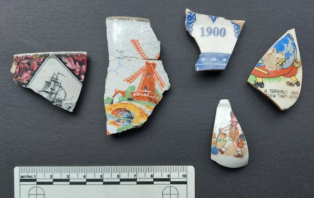
CREAMWARE (aka Queen’s Ware)
DATE: 1760’s – 1820’s
DESCRIPTION: A pale cream colour ‘white’.
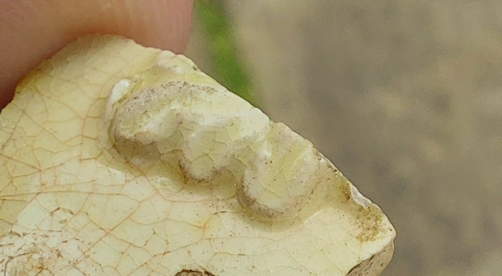
SHAPES: A huge number of shapes – from the plain bowl and plate, to wonderful pierced vases, decorative vessels, and truly strange designs.
Developed by, among others, Josiah Wedgewood – the great 18th century potter – in the 1760’s, and by the 1780’s was so popular that it essentially killed off both White Stoneware and Tin-Glazed pottery production. Wedgewood attained royal patronage by supplying a tea set to Queen Charlotte, wife of George III, who later commissioned a 925 piece dinner service; he renamed his Creamware ‘Queen’s Ware’ in her honour. Shape wise, it occurs in every conceivable pottery type – from regular plates and bowls, to rare and fancy shapes – pierced vases, delicate jugs, salt and sugar shakers, ice buckets, etc. Some of the vessels were also moulded with ornate naturalistic shapes – leaves, plants, etc.

It is also very decorative. Commonly with a blue and white transfer print, but also hand painted with pictures, words, and designs.

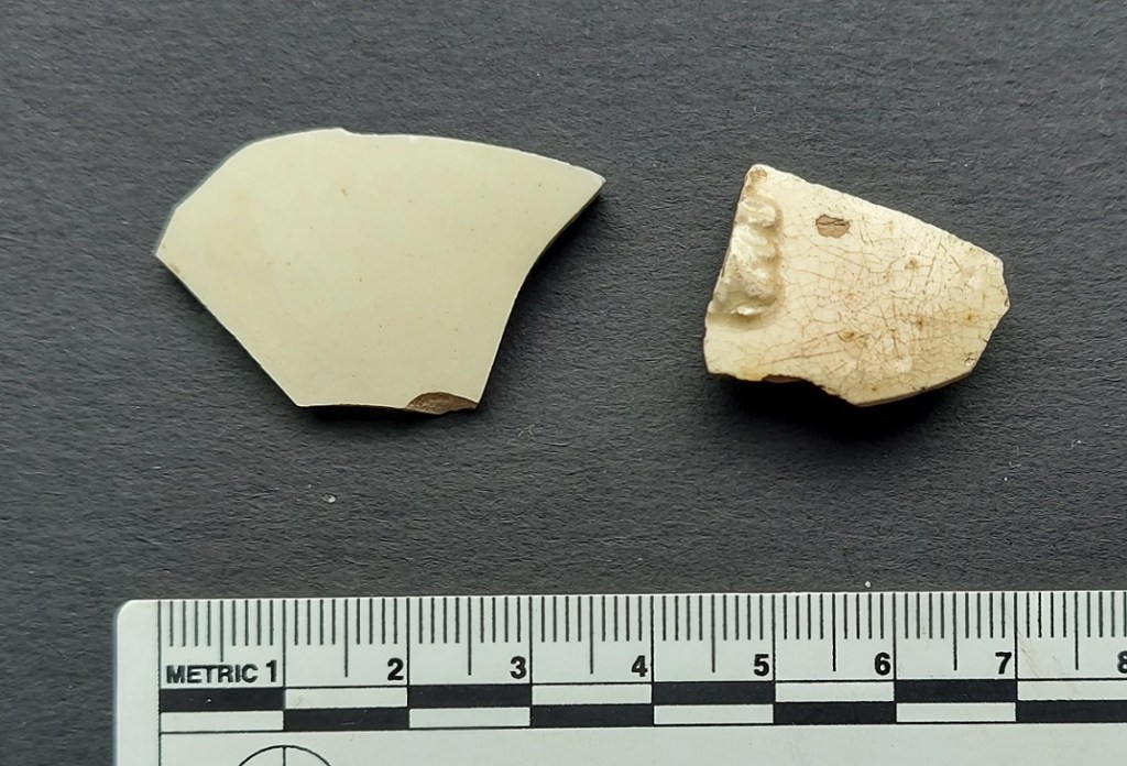
Because the shape of the vessel is moulded, it means that it has very thin walls (the nice stuff does at least), but it also means that it can be very decorative, with all sorts of complex applied designs.
The fabric is a pale creamy white, achieved by mixing Kaolin, a very fine white clay, into the regular earthernware clay. This already pale clay base is then coated in a lead glaze mixed with copper, and fired producing the pale butter colour. Where the glaze has pooled whilst drying before being fired – usually on the base – you can sometimes see a greenish tint (the copper), which is a tell-tale sign of Creamware.
It is also noticeably cream-coloured when compared with other white sherds. Creamware’s popularity waned after 1800, when it was overtaken by Pearlware, a cheaper, more pure white version of it.
PEARLWARE (aka Pearl White, or China Glaze)
DATE: 1780’s – 1820’s
DESCRIPTION: A blusish ‘white’.
SHAPES: Seemingly more utilitarian than the Creamware, but still a large range; so plates, bowls, dishes, jugs, cups, tankards, & goblets.
Pearlware is a refinement of Creamware, developed again by Wedgewood, in the 1780’s. It is almost like a less fussy, less fine, and more robust version, and there seems to be far fewer of the pierced vessels, ornateness, and incredibly detailed moulding. It does occur moulded, especially in tankards and Feather-Edged dishes, but it is less common than in Creamware. This may reflect the fashion of the time – a move toward simplicity – but equally it could be that Pearlware was conceived as more utilitarian.
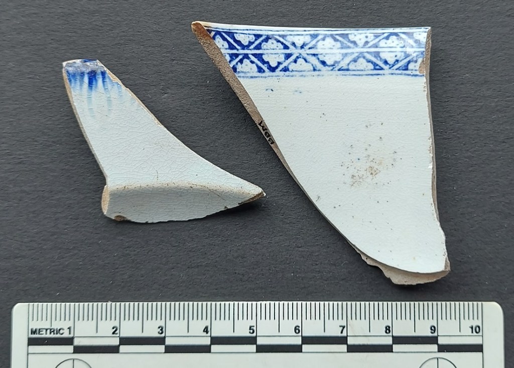
The whiteness in Pearlware was achieved by adding cobalt – a blue mineral – to the lead glaze, giving an almost blue glow to the pottery – a sort of trick of the eye. Again, the blueness is particularly noticeable where the glaze has pooled, often on the underside.

In terms of decoration, it could be hand painted – either as a pattern, or just the edges in Feather-Edged Ware (see the example in the photo above). However, it is more commonly encountered as a base for transfer printed decorative motifs – willow pattern and the like. It was also commonly used as a base for Industrial Slipwares (discussed here in Part 3 of the guide). Pearlware began to fall out of favour in the 1820’s, and was superseded by the development of Whiteware.
WHITEWARE
DATE: 1820’s – Now
DESCRIPTION: White fabric, with a white glaze.
SHAPES: Quite literally every shape.
Characterised by a very white fabric, with a white glaze, upon which all sorts of patterns and motifs were put; this is essentially the stuff that we eat from now. If you are uncertain, go into your kitchen, get a plate from Ikea, break it, and have a look at the break. That’s Whiteware.
Cobalt use declined in the early 1800’s, perhaps due to difficulty and expense of obtaining it, but this coincided with the process of chemically refining the clay to produce a purer white becoming easier. And this, combined with better glazes, meant that a perfect white background colour could now be achieved. And not much has changed 200 years later. Well, apart from the fact the glaze now has less lead in it… which is nice. Decoration is, well, everything we can think of – painted, sponged, transfer printed – and is pictures, patterns, or words. This stuff is very, very, common, and largely boring even by my standards, but sometimes, precisely because it was used for all sorts of things, it throws up a gem or two.
HOW TO TELL THEM APART.
Should you want to know which sherd is of what type, for whatever reason (and we don’t judge on this website), then it would be very helpful to put them on a plain white piece of paper under a bright light. In this environment, Creamware will appear pale cream coloured, Pearlware will appear blue-ish tinged, and Whiteware will simply blend in – like so:

So now you know.
Now, I admit that this wasn’t the most fascinating article (look it’s no use sobbing… I don’t force you to read the blog), but it is an important one in that it builds a more complete picture of post-medieval pottery, and means that you now know what I mean when I say Pearlware. I’ll leave it to you to decide whether that is a good thing or not.
That’s all for now. I have about another six half-finished articles which I will get around to completing very soon, including ‘magical protection‘, ‘quarries‘, ‘holed stones‘, ‘tracks‘, ‘updates‘, and your favourite and mine… some more pottery, but I’ll spare you that until later.
Right, until the next time, look after yourselves and each other, and I remain.
Your humble servant,
RH.

I AM that ‘woman screaming with joy’! 🤭
LikeLiked by 1 person
Thank you for an informative brilliant article.
LikeLike
Thank you very much fort this blog series about ceramics. As a fellow archaeologist I enjoy every bit of it. We find many of these english ceramic types in the Caribbean! My interest goes to the historic period. So this blog of yours is candy to me. I learn and enjoy it a lot! Thank you.
LikeLike
Hi Amy. Fantastic – that’s exactly what I want to hear – that my sherd-nerdery is actually useful! I love the Caribbean connection – the export of English pottery to the wider world amazes me, especially when I read reports from North America and their pottery assemblage is almost identical to one from my own garden here in England. Crazy! So hello to the Caribbean from rainy Glossop! Stick around, more Rough Guides are in the brewing.
Cheers, TCG
LikeLike