What ho! Autumn is here… it was cold this morning, and leaves are already turning, and hopefully this article will be published on the Autumn Equinox. Probably. I mean to say… that’s what I’m aiming for*. It’s been a very weird and stressful week or two for a variety of reasons too complicated to go into here, but in the spirit of hopefully moving on, I present this short(ish) offering, which I hope satisfies at least the craving for pottery.
*Ok, so I failed… but only by two days.
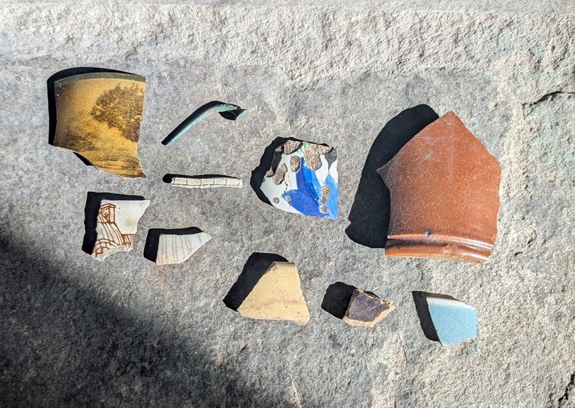
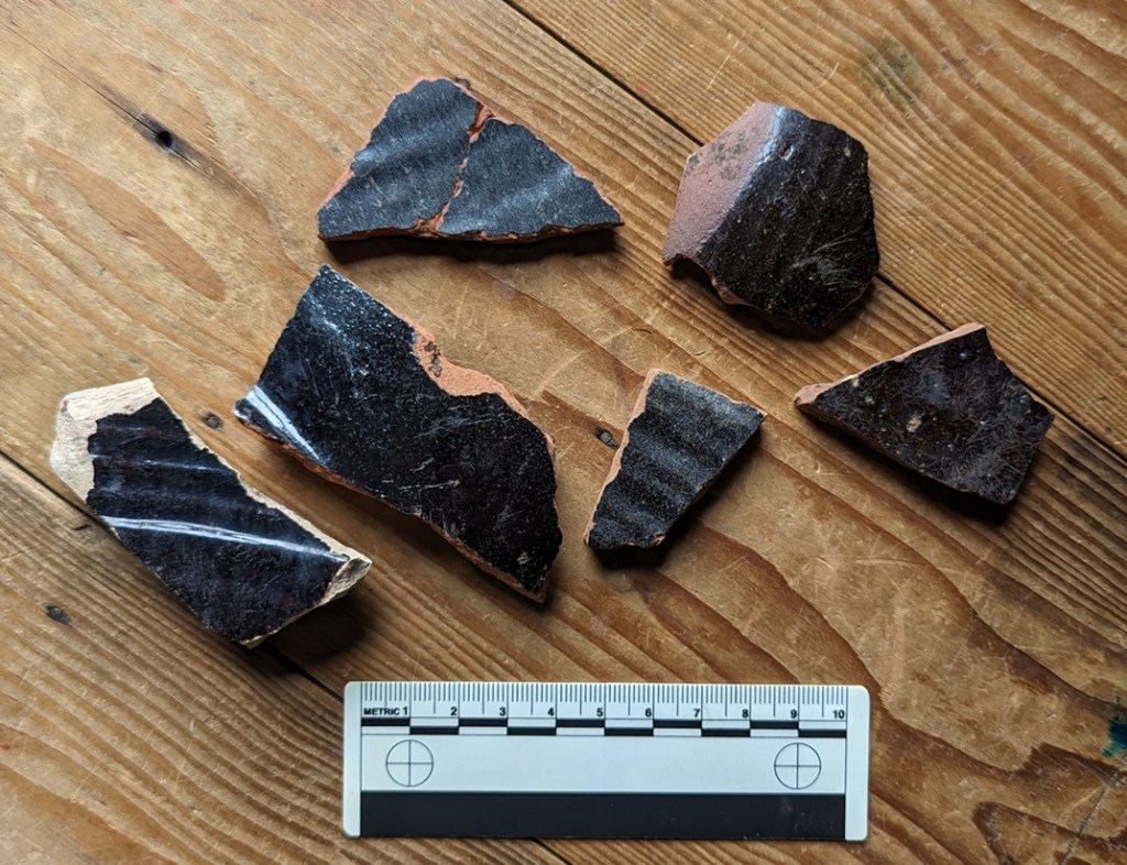
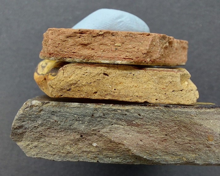
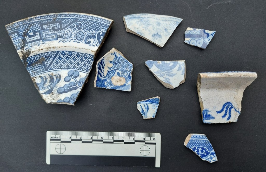
So, I have a large inglenook style fireplace in my house, and the hearthstone in front of the wood burner in said fireplace has, much to the annoyance of Mrs CG, become something of a drying and sorting zone for the bits and pieces I have found along the course of my normal life! And precisely because the nights are getting colder, and the burner might need to be used soon, I am forced to clear up the archaeology. Well… hold my glass of stuff that cheers, as the saying goes, the challenge has been accepted.
There they are, on the hearthstone.
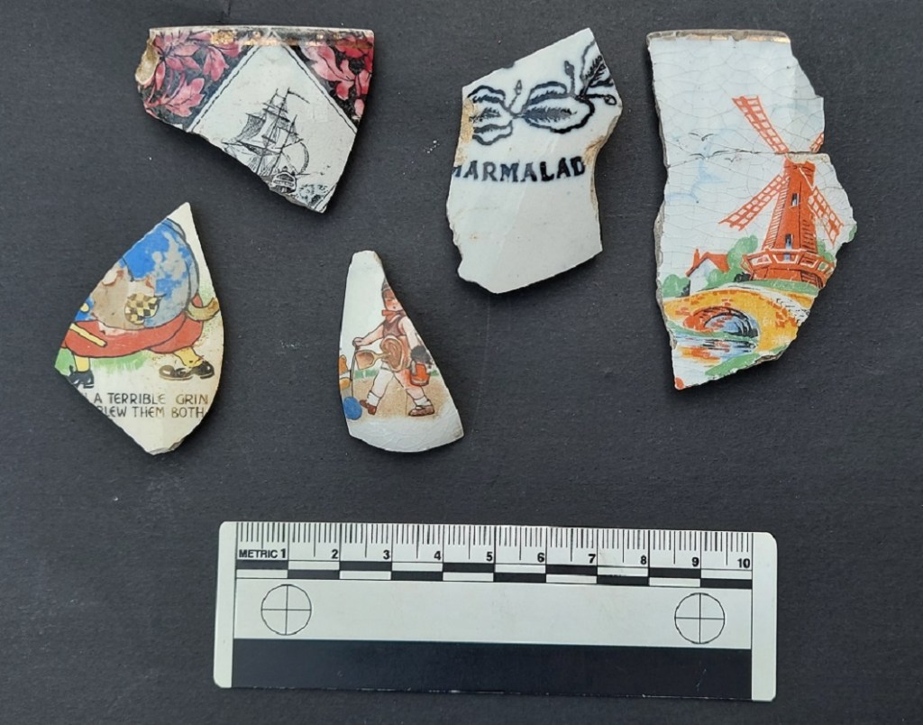
It’s interesting in that it represents a sort of snapshot of the kinds of things I have found very recently, and actually from all over, too, not just Glossop. I’ve also tried to keep to my new rule of only keeping things that I find interesting, or that you might find interesting – so no more simple and plain Blue and White Transfer Printed Ware or similar. And in all honesty, I won’t keep some of this, and I’ll return it. Anyway – here we go.
Lovely stuff.
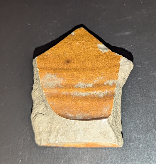
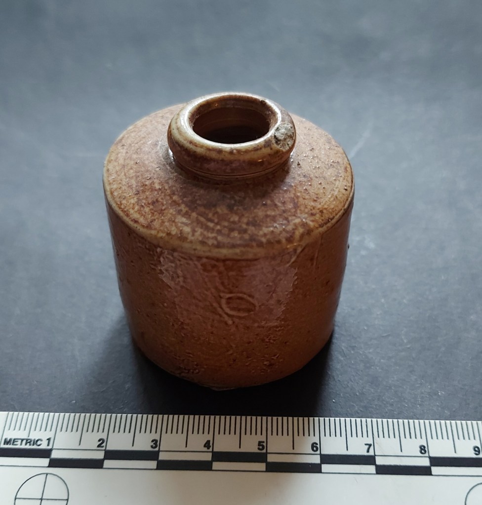
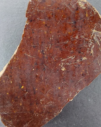
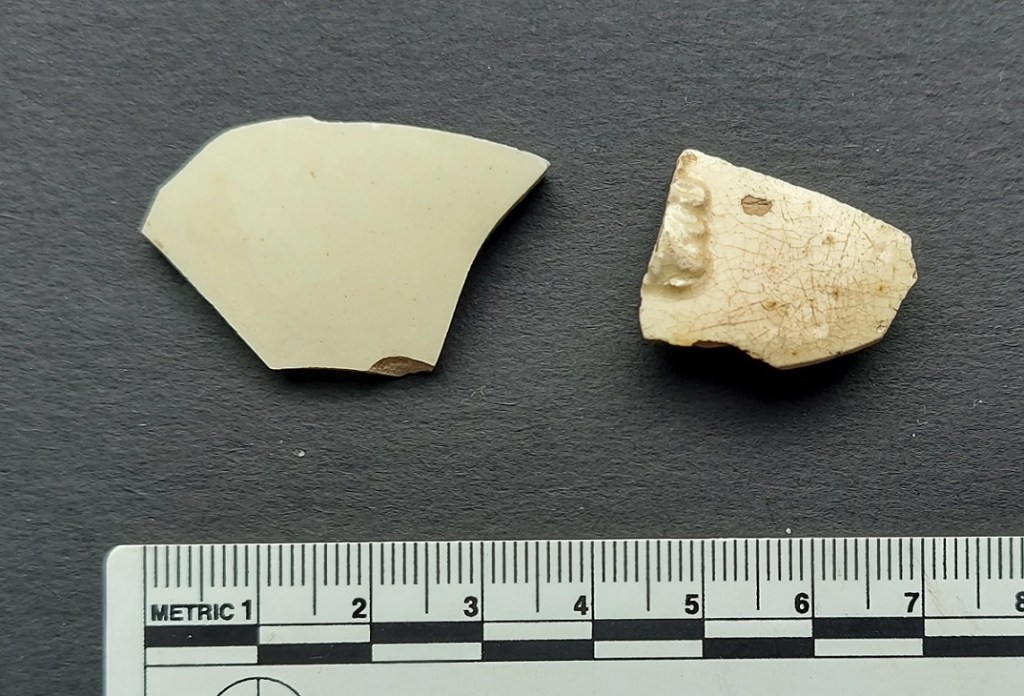
First up, a Derbyshire Salt Glaze Stoneware bottle base, with a diameter of 8cm – you can see the ‘orange-peel’ effect of the salt glaze on the exterior. It probably contained some form of drink, perhaps alcoholic, and although they often contained ink, too, I think it would have been to nice for that, with the fancy groove running around the bottom. The interior is also glazed, and has wonderful grooves, evidence of how the bottle was hand made on a potter’s wheel.
The rising of the grooves on the inside, showing where the potter pulled the clay into the bottle shape.
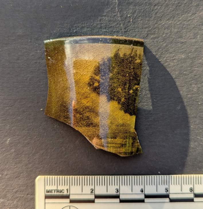
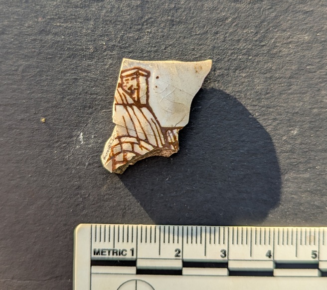
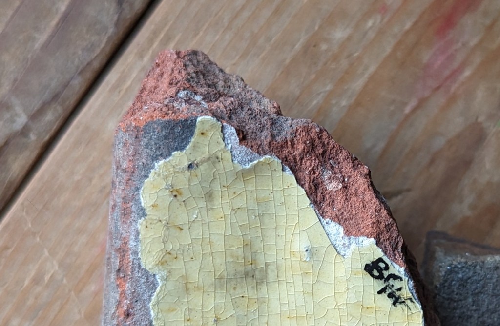
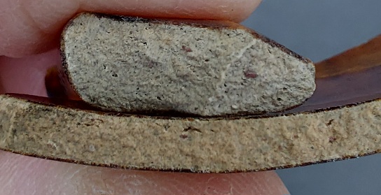
Next up is this lovely teacup sherd in an unusual colour. Measuring 9cm in diameter, it seems to have straight sides, and is decorated with what might be a tree in front of stormy clouds, or perhaps just clouds, in a brown and yellow transfer. It’s probably 20th century in date, and it’s odd, but I quite like it.
Found in Alexandra Park, Oldham, having been dug out of a badger’s sett in the woods.
Next up, a chimney…
A tiny sherd of transfer printed ware, dating to the late Victorian period, and showing what was probably a cottage scene, of which the roof and chimney is the only bit to survive. I couldn’t leave that behind, could I? Found on the footpath by Pyegrove, Glossop.
Next we have a…
…copper roof nail. Found at the top end of Whitfield Cross, the result of someone having roof work done, with the old nail being pulled out and the slate replaced. Contrary to what I had thought, the nail is not bent accidentally, but rather it is driven into the wooden battens a short distance, and then bent over deliberately in order to secure the slate in place. Lovely stuff; I love the colour, but also the square shape in section of the shaft. I wrote a little about them and how they were made, here, and oddly they seem to seek me out – I’m always finding them in the street, and I have hundreds!
Next up, a Victorian clay pipe stem:
Awful shot, but I think I am due to get a new phone soon…
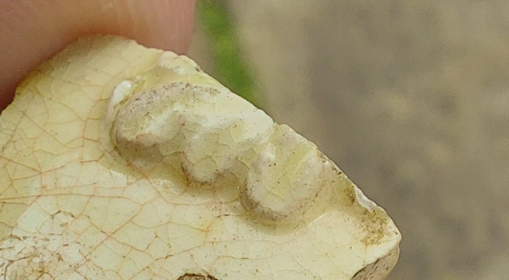
The pipe stem and mouthpiece is to the left, and the bowl should have been to the right – the bit that sticks down is the spur of the pipe. This sort of thing.
Interestingly, the spur – designed to keep the pipe from rolling around and to keep the hot bowl from burning surfaces – has a circular (or annular) maker’s mark or decoration on it. I have no more information to offer, sadly, but I think it is quite a common marking. Love it!
I also love this:
I know, I know… I haven’t washed it!
A lovely sherd of Victorian Hand-Painted pottery. You can see (through the mud – apologies) the individual brush strokes that make up the delicate blue flower that once adorned a probable . I have the next Rough Guide to Pottery planned that, among other pottery types, looks at this Hand-Painted stuff; you lucky people, you! Anyway, enough of the shouting and cursing… this was also found on the Pyegrove path, as indeed was this next one:
I think this was well used and quite worn when it went into the ground.
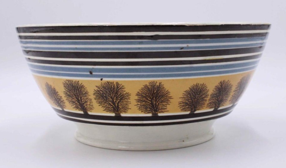
It’s a sherd of Industrial Slipware, in a lovely pale grey colour, and, measuring a diameter of 14cm, it’s probably a rim to a Georgian/early 19th century Mocha Ware open bowl, perhaps like this:
Found on the internet and shamelessly stolen – you could have bought this lovely example from only $225, which is probably well worth it.
The next two were found on the track from Pyegrove to Old Glossop – along the track to Hall Fold:
Another rim sherd.
and…
And a bit of a body sherd – tiny, really, but characteristic.
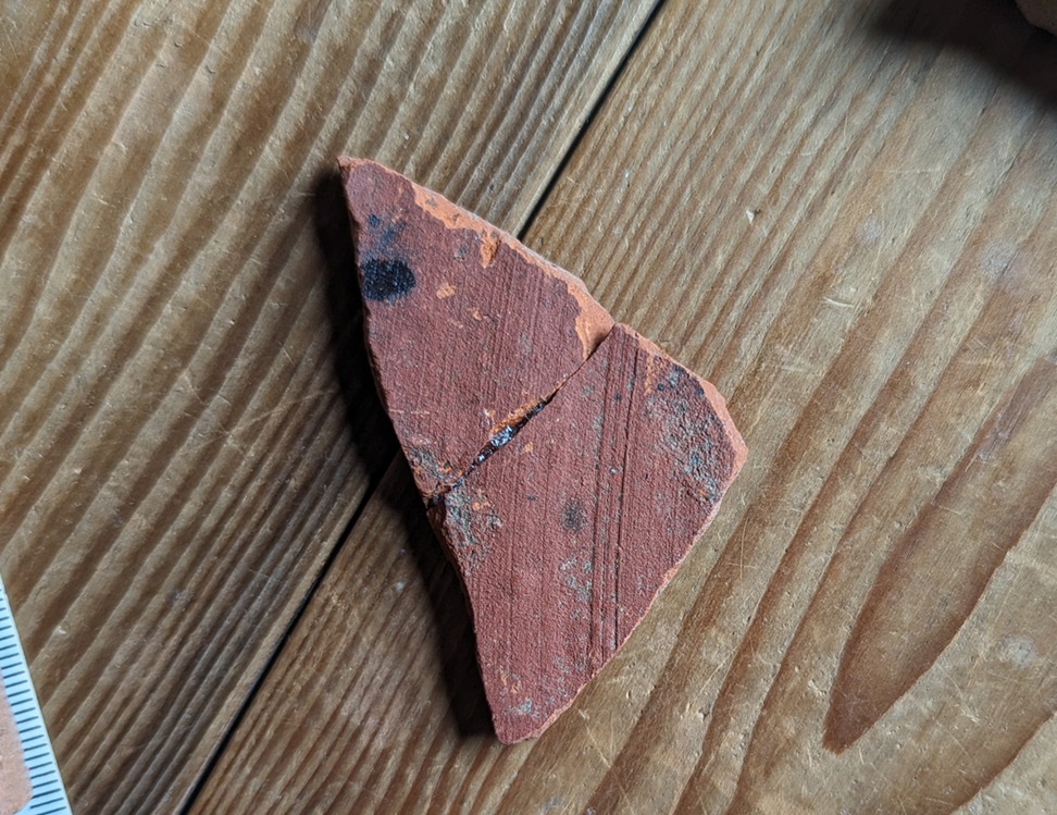
The first sherd is a rim sherd from a large open bowl or plate, and is in a 17th century Midlands Yellow Ware. It’s impossible to get a rim diameter – despite being a rim sherd – because it is such a small fragment (thus we see the limits of the Rim Chart). However, it is chunky and well made, so it is likely to be large, and as it is a relatively fine fabric, so it is likely to be later in date. Probably.
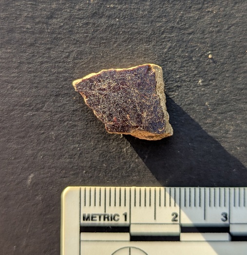
The second sherd is a fragment of a Manganese Glazed vessel. Honestly, I have no idea about the shape – most are open, rather than a closed shape, and this has glaze on the interior and exterior, which also suggests open shape. Date… 17th to very early 18th century.
Both of these are lovely bits, and really bring home the age of these trackways that I keep banging on about! I have a future blog post planned… don’t worry.
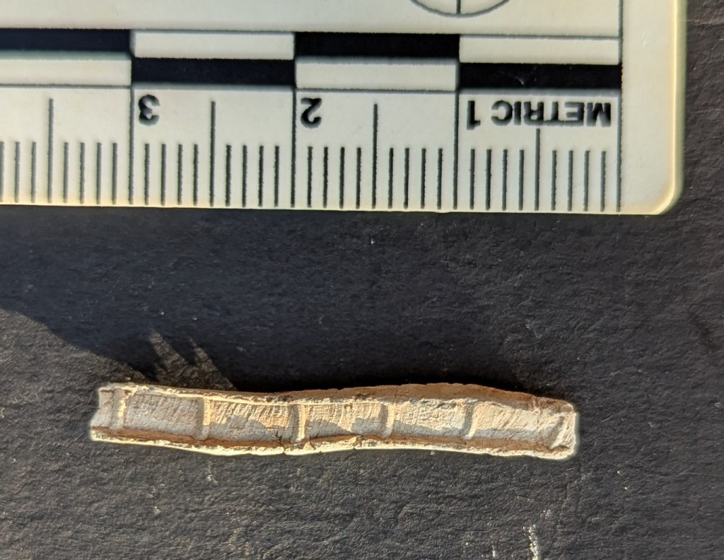
Next is this wonderful thing:
The low evening sunlight really brings out the features.
A single piece of lead came – window lead. This lead came held the small pieces of window glass together to make up a window, and is made by squeezing the lead through a former, whose cogs leave grooves in the lead. It seems that, as a rule of thumb, the smaller the gaps between these ‘reeds’, the newer the came, and vice versa. So it seems that this piece of came is quite early – 17th, or possibly 16th century? It was found on the banks of Erwood Reservoir, near Buxton, along with a whole pile of other 17th century material (the subject of a future article, especially as it very much mimics the same material found on the valley sides around here). This is the fabric of a long lost farm, and I wonder who last looked through the glass it once held.
And to finish this ramshackle wander around my hearthstone, I present the following: a mason’s mark from the railway bridge at the bottom of the Hayfield Road (A624) at Chinley.
In the central larger stone.
Here’s what it looks like:
A rough sketch from my catalogue of mason’s marks in the area.
I realise that it’s not really a fireplace related thing, but I like this sort of thing, and so do most of you, and besides… I don’t know where else to put it! It’s one of several examples of this mark on the bridge, and has maddeningly resisted me taking a photograph for one reason or another. However, the other day we were travelling in our new camper van, and all the planets aligned, and I managed to get this snap! Whilst very similar, it’s not like any of the others in the area that I have documented, and whilst this is disappointing, it makes sense as there were hundreds of stonemasons working on building the rail network in the early to mid-Victorian period (the line here was opened in 1867). This whole area is interesting, and following the construction of the railway, the road system was monkeyed around with, with roads no longer connecting, or moved over and replaced by newer ones. I should explore it a little, who knows what might be uncovered.
In terms of mason’s marks, I’m still toying with the idea of a project that studies all the marks, to catalogue, photograph, and cross reference them. If anyone fancies coming with me on a few walks to make this happen – from Broadbottom to Longdendale, and then the Chinley Line, perhaps – give me a shout.
So, there you go, the Fireplace Finds Frenzy… I hope you enjoyed it.
More soon, honestly. But until then, I know I say this every month, but please do look after yourselves and each other; I have recently learned just how important this is, and in particular, you never know when your time is up.
I know, I know! Another instalment of the seemingly never-ending Rough Guide… it really is the gift that keeps on giving, isn’t it! I can see and hear the hubbub from here. The yelps of excitement, the whoops of joy, the screams of happiness… lots of these. And the exuberant dancing in the street. It even looks like people are running away from me… what fun! And oh look, that man over there has started drinking what looks like cheap vodka from a bottle, and is shaking his fist at me in a cheerful expression of his enthusiasm. Steady on, there’s a good chap…
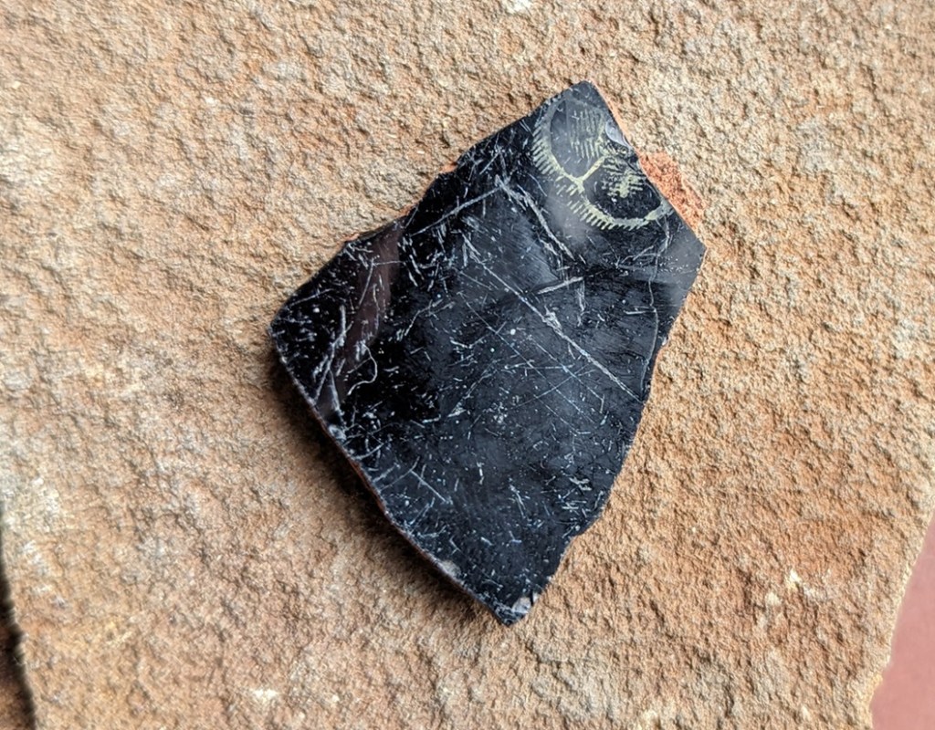
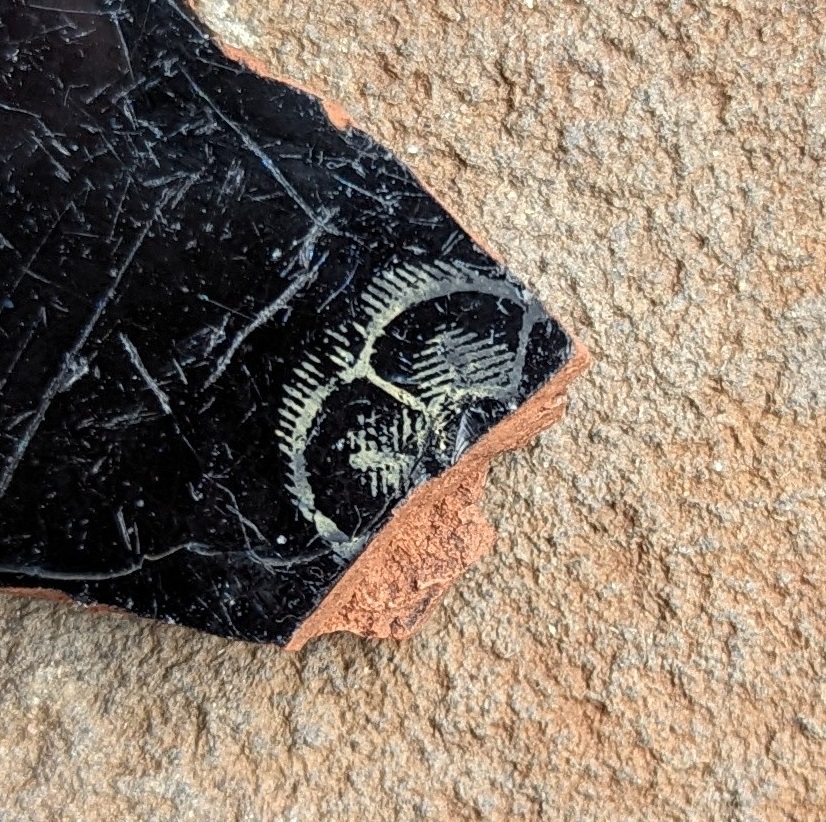
So then, today’s offering is simply black pottery.
At most places you encounter pottery, you will find sherds with a black glaze on them. Of varying quality, and of various sizes and forms, there is always a background noise of them, as a wander through the archives of the site will show. It’s less common than the Blue and White stuff, but you will find it. Most often as a big sherd of a thick walled vessel – a chunky rim if you are lucky – but more often featureless body sherds that feel like they ought to be able to tell you something… but don’t. Mostly these are difficult to date; one black sherd looks very like another, and without having the whole vessel to look at, it can be futile to try – even I just mentally lump most of them together under the banner ‘Victorian’. And largely I’d be correct (as if you ever doubted me!). But… actually there are subtle differences that can give a little more information and provide a rough date.
The problem is that Black glazed pottery is just that. Pottery… with a glazed black surface. So you can see how assigning a date to it might be a tad difficult, and whilst there are some broad observations to be made, the finer points of interest are missed. It has taken me this long to fully wrap my head around it, and I think I have it straight, though even now it’s fuzzy in places. I don’t like ‘fuzzy’. I like things to be simple and logical and straightforward, with neat edges and exact dates. Today’s offering has none of that and is full of fuzzy, which frankly makes me feel a little uncomfortable (does anyone else feel that these little interludes are starting to sound like a therapy session? What do you mean “we know you’re a raving lunatic, get to the pottery”… honestly). No, they are a problem, and quite rightly most people shy away from them; I mean to say, these bally Herberts frighten me… I can only imagine what your normal non-sherd-nerd would make of them. No… by and large it’s safer to just leave them. Unless, of course, some lunatic tries to impose some form of order on it, and takes a trip to the dark side in order to investigate Black Glazed Pottery.
Well… cometh the hour, and cometh the lunatic.
The following is a rough outline of what, where, and when; it isn’t final, it can’t be applied as a law, and certainly not everywhere, and there are always exceptions, and always overlaps. Indeed, we can only speak here of a pottery making ‘tradition’ rather than clean-cut specific ware types, and people have been making pottery in a black-glazed tradition for over 500 years. But it will allow you to look at your black sherd and say “oooh, that’s probably a…”, which is sort of the point of this guide (no, Mr Shouty-Outy, despite what you think, the point of this site is not to attempt to be “the dullest thing on the internet“, thank you very much).
So, we start today somewhere in the 15th century, which is nice!
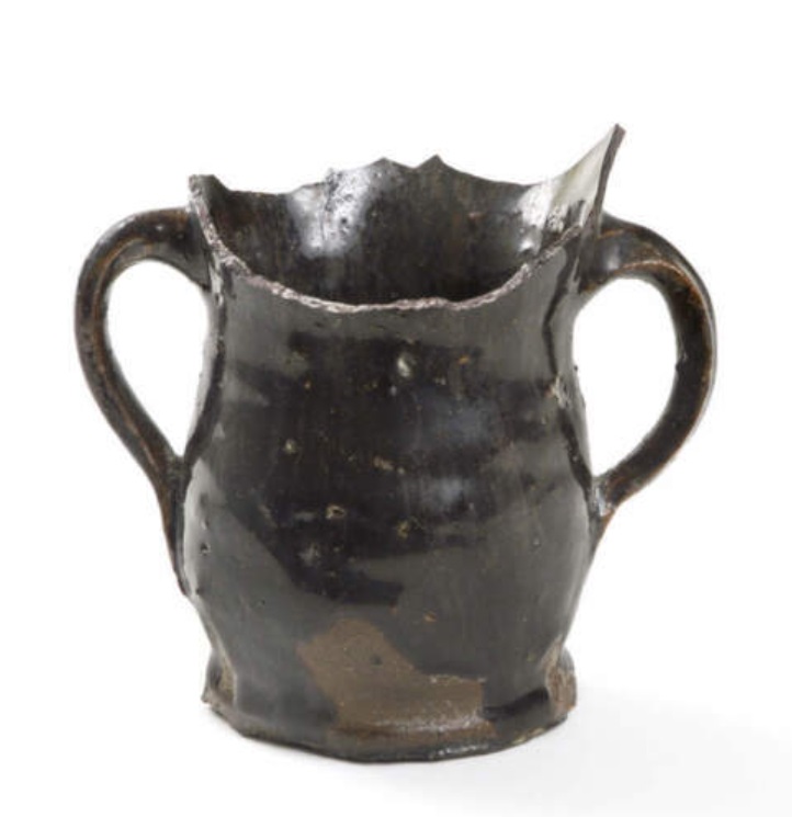
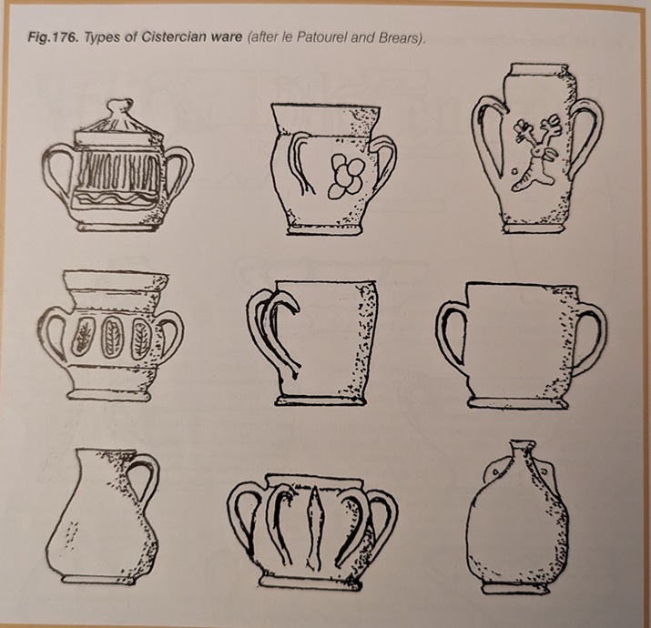
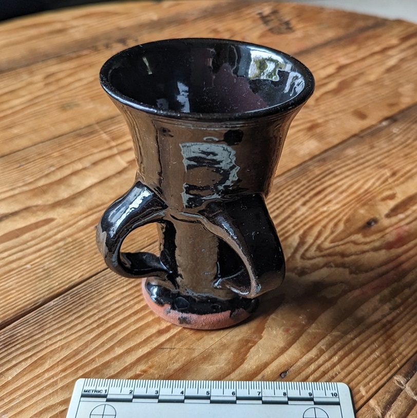
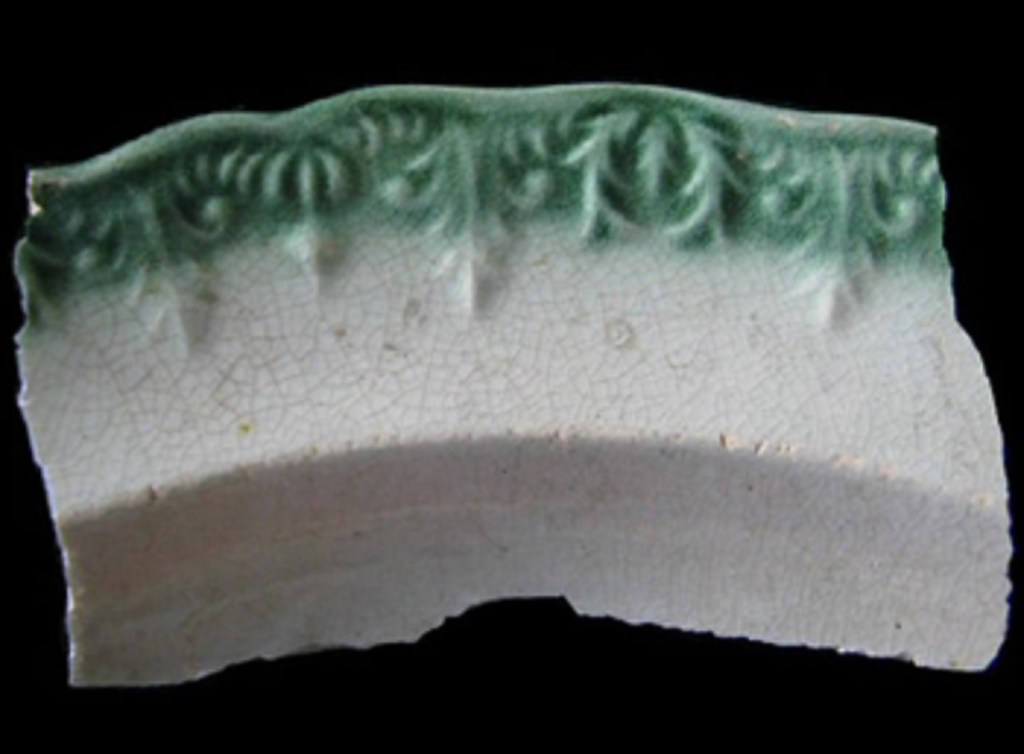
CISTERCIAN WARE DATE: 1475-1600-ish DESCRIPTION: Fine, hard-fired, purple or reddish purple fabric, with a very dark brown to black glazed surface interior and exterior. SHAPES: Mugs, Cups, Tygs, Small Jugs.
This is the first black glazed pottery type, and overtakes Tudor Green Ware as the pottery type found on early Post-Medieval sites up and down the country. It’s origins are unclear – as a tradition it is unlike anything that went before it, and was the technological and design cutting edge. It was originally thought of as being made in Cistercian monasteries in the north – hence the name – it is now known to have been made all over, most famously in Wrenthorpe (West Yorkshire) and Ticknall (Derbyshire).
Sherds of the whole…Image stolen from St Albans Museum (and a damn fine museum and website it is indeed)
Characterised by a very thick all over (interior and exterior) iron rich glaze which produces a very dark brown or black surface when fired.
The glaze is shiny, but has a dullness to it – also very characteristic – and is often fairly poor quality, with pitting and an orange-peel surface, and is often sloppily applied, leading to melted blobs on bases, etc. – it’s still very much in the medieval way of doing things.
The bubbled glaze, melted in the heat of the kiln. Also on the base, you can make out the circular marks made when the Tyg was removed from the still spinning wheel with string. The straight lines might have been where the potter was testing how moist the clay was before putting it in the kiln, and it is something I have seen on other vessels of this period.
Very rarely, there is a pale cream decoration applied in slip, often in blobs or rough images of unicorns or other designs.
The fabric is also very characteristic. Very hard fired (almost vitrified), it is a purple, greyish-purple, or reddish/brownish purple colour. Looking closely at it, you can see voids formed by gases during firing, and very infrequent quartzite ‘sandy’ bits.
You can also see the thick glaze in the section.
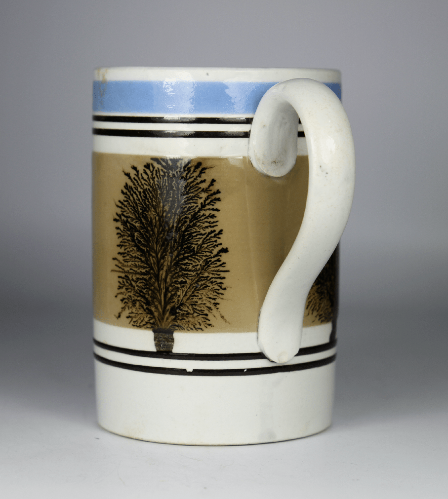
Shapes are mostly drinking vessels – mugs, cups, and tygs (multi handled cups) – with a sprinkling of small jugs and bowls; the emphasis, though, is very much on the stuff that cheers! Handles are often small and delicate, and normally flat.
Taken from Lloyd Laing’s useful book Pottery in Britain 4000BC to AD1900 – very good on early stuff, not great on Post-Medieval… which is why I started the Rough Guide.
I am lucky enough to own a copy of a Tyg by potter John Hudson, an amazing craftsman who used traditional techniques to faithfully recreate medieval and post-medieval vessels:
Lovely stuff – its 3 handles make it a joy to hold. I have, on occasion, carefully sipped a snifter from its curiously shaped body.
The making of this ware type – with this specific fabric type and in these shapes – seems to have died off by the late 1500’s, but the black-glazed tradition continues.
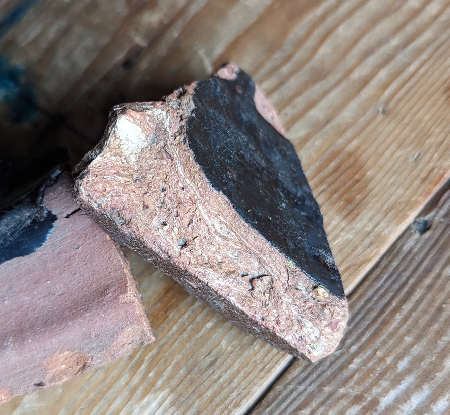
BLACKWARE (aka Midlands Black Ware, Black Glazed, Ticknall Ware, etc. ) DATE: 1550-ish-1800-ish DESCRIPTION: Black shiny glaze over a red or reddish brown fabric. SHAPES: Mugs, Jugs, Tygs, Bowls, Dishes.
This stuff continues the tradition of making pottery with a lustrous black glaze, but without the hard purple fabric. Instead, reddish, reddish-orange, or occasionally buff coloured fabrics are found, and overall it is fired to a lower temperature, making it less hard and more, well, coarseware-y. Often with a small number of quartzite – sandy – inclusions, but normally of a consistent colour throughout.
Fabrics! Multiple colours, and more inclusions than the Cistercian Ware.
The surface is normally much shinier than Cistercian Ware, but can also be found as a metallic looking surface, the result of adding lead in the form of Galena. Often there is an under-glaze slip that provides a red surface which, when covered in the glaze and fired, creates the black surface. This is particularly true in the case of the buff or whitish coloured fabrics such as that in the photo above.
With the light in the right place, you can really see the metallic sheen.
It has been suggested that this was a desired effect; in the poor candlelight of the 17th and 18th centuries it might look like it was made from more expensive pewter. This is a Skeuomorph, an object made from one type of material made to look like it is made from a different material; we’ve encountered it before in the Manganese Mottled Ware pottery. I’ve said it before, but don’t say we don’t learn you nuffink on this website!
Shapes include many of the same type you find with Cistercian Ware – mugs, tygs, jugs, etc. – although slightly more evolved – for example the mugs and tygs are noticeably taller. However, we now see larger bowls and jugs, too. Blackware becomes the utilitarian ware type, and thus it takes on many forms and uses.
To be honest, there is a deal of overlap between Cistercian Ware and Blackware, especially at the beginning, and it is not an exact science. Moreover, it is a good example of problems within post-medieval pottery studies: many different potters are making this stuff, in many different locations all over Britain – the black glaze was very popular, and so there was a ready market. But, 100’s of years later we have archaeologists digging this stuff up everywhere, and mudlarks/tiplarks/fieldlarks finding it all over. But there is no consensus as to what this stuff should be called! And why would there be? It is made everywhere, is found everywhere, and comes in so many different forms. In fact, I only call it Blackware because the last article I read called it that, and I like the name – it is helpfully vague in that it doesn’t rely on a geographical place (Ticknall Ware, for example), or a specific vessel shape (Pancheon Ware), to define it, but it is specific enough to describe what it is. See… fuzzy edges! I’m feeling very uncomfortable… I need a bracer!
The vast majority of the stuff you might find will be in the later part of the date bracket given above – late 17th/early 18th century. Indeed, by about 1720 the Blackware tradition starts to decline, although it probably continues until the end of the 18th century. Whiteware has become the pottery type – white is the new black, and all that – and we see that start of the quest for the perfect white surface that I have talked about before. To be fair, it was dying from the mid 1600’s onwards, with the introduction of the classic post-medieval pottery types – the Manganese Glazed and Slipwares.
Well, I say dying. Actually, and more specifically, the thin-walled vessel Blackware pottery tradition tails off, but it continues to be used on Pancheons.
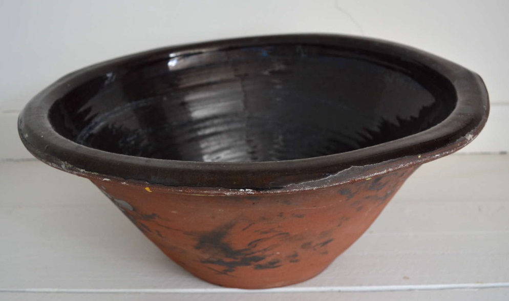
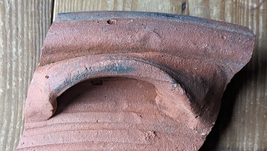
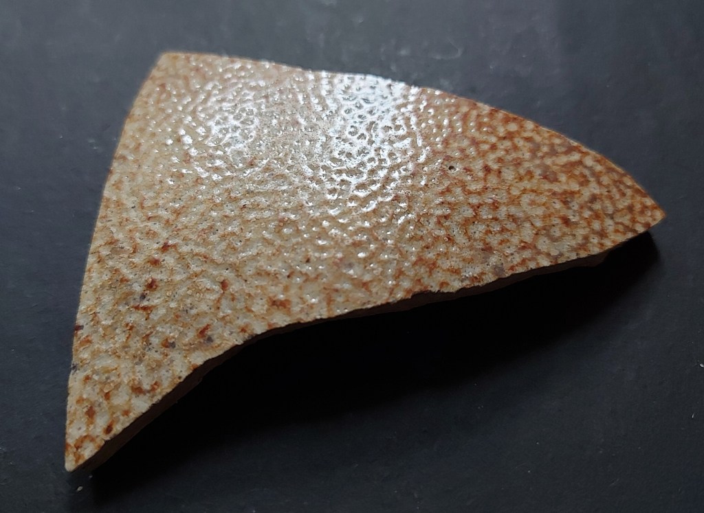
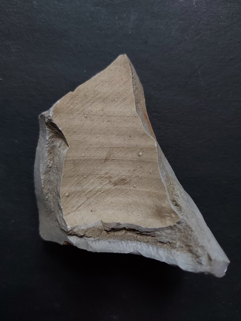
PANCHEON WARE (Coarse Earthernwares) DATE: 1700 ish-1900 ish… emphasis on the ‘ish’! DESCRIPTION: Thick-walled (1-2cm), often reddish/orange coloured fabric, commonly with a black internal glaze, and with a chunky rim. SHAPES: Well, er… Pancheons, but also other large utilitarian vessels: large pots, colanders, chamber pots, etc.
A lovely word, for a great category of pottery – the mighty Pancheon – also described as mixing bowls, cream separators, or dairy bowls. Their purpose is multiple, as their name suggests, but it is their large size that is really impressive, as is the skill, detail, and indeed general lack of care with which they were made and decorated. Into this category we might also add large bowls, large dishes, chamber pots, and colanders. But the commonly encountered type, Pancheons, are generally steep sided open bowl shapes, with a height of up to 30cm, and a rim diameter of up to 60cm, or more. They are big pots, and consequently the sherds, are usually thick walled, ranging in width between 1 and 2cm, and are instantly recognisable.
A complete Pancheon – the word may have been a corruption of Puncheon, meaning a large container of liquid (and possibly the origin of the word punch, meaning a mixed drink).
Fabric is normally reddish or reddish brown.
Commonly, though, the fabric is poorly mixed with another cream or buff coloured clay, giving it a distinctly marbled effect.
Very clear marbling in this sherd.
Why this was done is unclear. If it was just a few examples of this happening, we might suggest that the potter was using up some spare clay he had lying around, but it is too commonly found. It can’t have been a decorative reason as no-one would see the fabric unless the pot was broken. I wonder if it was a practical concern, and that the buff clay had different thermal properties, perhaps allowing the vessel to shrink uniformly when drying or during firing? This might explain why it was poorly mixed into the fabric. But honestly… answers on a sherd to the usual address. My feeling, though I can’t be certain, is that this was more commonly found in earlier vessels, and that these mixed clays stopped being used in the 19th century.
Within the fabric are often found small inclusions – sometimes quartzite (sand), sometimes other small stones, and occasionally grog – crushed fragments of pottery. These too have the effect of improving shrinkage during, and strength after, firing.
Vessel rims are very distinctive – thick and chunky, and often square-ish in section, although other forms of rim – particularly those from shallow dishes – are flatter. Again I suspect, but can’t prove (yet) that these are early vessel types, and that by the 19th century the Pancheon takes on a single uniform shape which is made by potters all over the country.
Some Pancheons have handles, and often these are scooped lug type handles.
I love this – you can see thumb marks where it was pressed onto the body whilst wet. But also, you can see scuff marks above, where it was fixed properly and the potter accidentaly left an impression. Rough, and not over produced pottery like this, is so much more human.
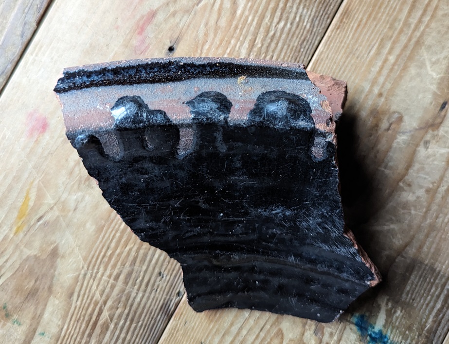
Perhaps most distinctive is the black glazed surface. Because these vessels were normally only glazed on the interior, you will only find it on one side. As with the Blackware above, the dark colour was achieved by roughly painting a red slip on the interior and the rim, over which was applied a thick iron-rich glaze which, when fired, becomes the very dark brown or black we see. Sometimes this red slip was applied to the whole vessel, but even then any glaze or slip on the rim or exterior is the result of spillage.
Here you can clearly see the red slip over the orange fabric, and where the glaze has splashed has become black. Also, lovely lovely wiping marks, and is that a fingerprint? A person made those… 200 years ago! *shudder* This is why I do what I do!
That said, sometimes this spillage was a deliberate decorative feature, with the large exaggerated thick drips over the rim and down the outside giving it a certain devil-may-care look.
Lovely stuff!
This devil-may-care look also extends to the interior and exterior surface treatment of the vessels, where they also make use of ‘manufacturing’ marks as a form of decoration, thus you can see deep grooves and ridges on the interior and exterior where the clay has been pulled up on the wheel, and roughly made smoothing marks on the exterior.
Groovy! What? It made me smile…
Indeed, overall they seem to be very roughly made, with little attention to ‘perfection’ at a time when pottery was fast becoming quite literally an art form. I suspect that this is in part due to speed being the essence in making them, combined with the fact that they are entirely practical with very little attention paid to decoration. Even the fact that they are glazed on the interior only is suggestive of their practical nature – it’s quicker to glaze only one side, and it is cheaper, but it is also not necessary to glaze the exterior as only the interior needs to be waterproof. However, I also think there was a decorative element to the roughness – the exaggerated drips, the course smoothing, the noticeable finger and thumb marks in the wet clay and slip. I like this, it adds character and a human element.
Deliberate grooves on the interior and exterior of these vessels.
Now, whilst most sherds you will encounter are Black glazed, within the broad category of Pancheon Ware are sub-types, with different coloured exteriors – namely Brown, Yellow, and Pale Yellow/Cream.
A massive chunky rim sherd… from my back garden!
Actually, the colours depend on the amount of iron in the glaze and the colour of the surface underneath, but it is all the same process. It works like this: the more iron you add to a glaze, and the darker the surface under the glaze, the darker colour the pot will fire. And conversely, the less iron you add to the glaze, and the lighter the surface under the glaze, the lighter the finished pot will fire. So the Yellow glazed sherds often have a white slip and a glaze with little iron in it, and the Cream, too, but with a glaze that has even less iron added to it.
You can clearly make out the white under-glaze slip covering the naturally red clay where the glaze has peeled away. Ignore the writing, that’s a code I use in my reference collection (which is kept separate from the main ‘Pile o’ Pottery’) to tell me where it came from: BGW = Back Garden Wall. Here we can see where the glaze has run over the white slip and onto the red fabric, producing the brown stripe. Now imagine if the fabric was a darker red, or had a red slip… it would produce a black glazed surface.
Brown has a darker coloured red fabric or a red slip, and an iron rich glaze, but not as iron rich as the Black glazed surfaces.
The truly wonderful Bingham Heritage Trails Association, who have done an amazing amount of work on post-medieval pottery (a very much recommended website full of pottery), have given them different names, and put them in a tentative chronological order, depending on fabric types and surface colour. This might work, but I’m not 100% convinced, and I think the differences maybe have more to do with desired colour, geographical origin of the clay, and our old friend fashion, than the date it was made. Essentially, any colour/surface treatment could have been made at any stage between 1650 – 1900… ish. I am always happy to be wrong, though – its the story of the pottery that matters.
The fact that Pancheon fragments crop up everywhere is both testament to their popularity – at one stage everyone seems to have had one – but also their large size; there’s simply more of it, so when they break up, they produce many more sherds than, for example, a smaller plate would.
Overall, it seems that Pancheons – and indeed all of these large domestic vessels – stop being made, or at least stop being popular, at around 1900 (although I’m sure many would still be in use from then on). Why is unclear, but it may simply be that the large clunky vessels were impractical in most kitchens, particularly in the cramped interior of terraced houses in the cities, and so they fell out of favour.
Our final black glazed pottery type is…
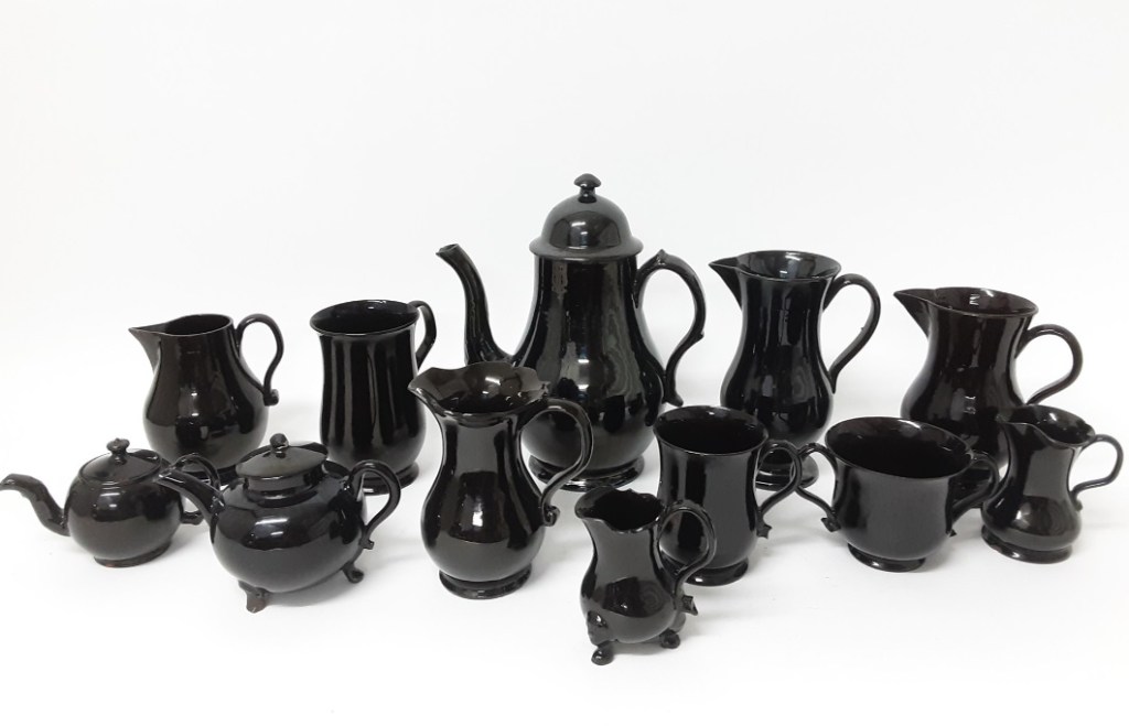
JACKFIELD WARE (aka Shining Black) DATE: 1750 – 1820-ish DESCRIPTION: Very shiny black surface on a red earthernware fabric. Often has handpainted white decoration. SHAPES: Very tea/coffee focused, so teapots, coffee pots, sugar bowl, cups, jugs, mugs, creamers, etc.
Not common at all (I only have one sherd!), Jackfield Ware is a refined earthernware that was popular for a short period in the late 18th century, and was focused on the consumption of tea and coffee, incredibly fashionable at that point in time. It reproduced all the essential elements of the black glazed tradition, but did so to an almost perfect finish. It is named after Jackfield in Shropshire, where it is known to be made, but the majority seems to have been made in Staffordshire. I have to say, this stuff is almost impossible to identify as a single sherd – it looks very like all the others, perhaps just a bit finer. If it wasn’t for the painted decoration on this example, I wouldn’t know I had any at all!
Fabric is red or a reddish brown, hard fired, with almost no inclusions – it is refined, and dense, and the vessels are thin walled.
The surface treatment is a uniform black glazed interior and exterior, with the glaze being particularly shiny – almost metallic – probably due to a high lead content. Honestly, you can see your reflection in this stuff. There is often sprigged decoration (a separately moulded clay three dimensional design stuck on the outside – often, in this case, floral designs – flowers, grapes, etc.), but commonly there are hand painted designs. These images were painted after the vessel was fired – over-glaze decoration – as contemporary under-glaze paint wouldn’t survive the firing process. As a consequence they often rubbed off, and exist as ghost-like images, especially in the kind of sherds that we find.
A flower design – I really like this. You can also see how it would wear away easily.
In terms of manufacturing, you can see the grooves where the potter pulled the clay up, but only on the interior wall where it wouldn’t be seen – this is fine pottery after all – whilst the exterior is super smooth, and is usually turned on a lathe to produce a perfect finish.
Shapes, as I say, are dominated by tea and coffee consumption, so commonly there are teapots, coffee pots, and cups.
The cups are more like those we would recognise today in that they have only one handle, rather than the multiple handles of the tyg – a design development. This is the start of modern pottery… raise a toast with your next cup of tea!
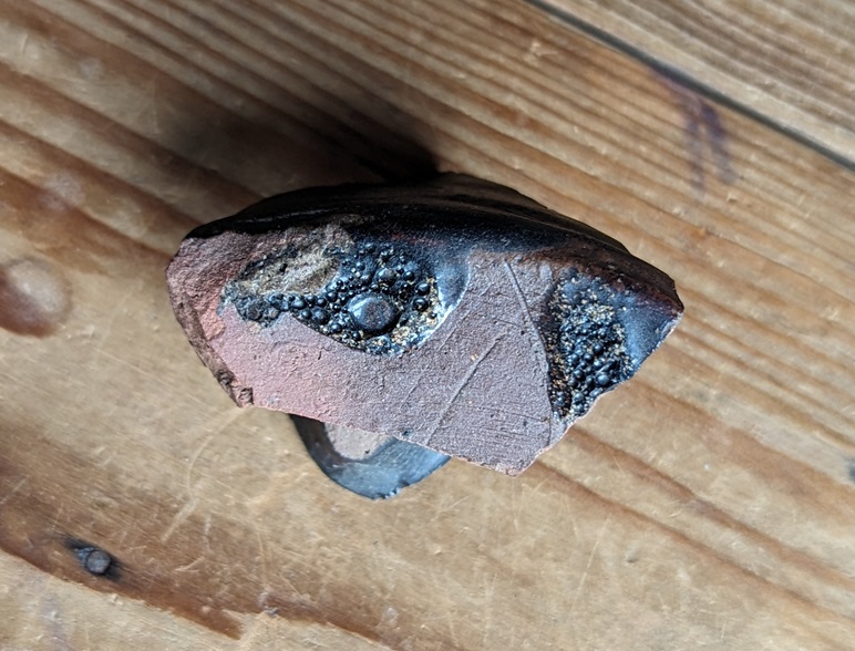
And to end with, a broad description of Midlands Purple Ware, a slightly coarser version of the fabric that Cistercian Ware is made from.
MIDLANDS PURPLE WARE DATE: 1400-1700 ish DESCRIPTION: Hard fired coarsish pottery, purple-brown/grey in colour. Coarse surface, normally slipped with wiping marks. Occasional internal dark glaze. SHAPES: Large open vessels, bowls, urns with spigot hole, salt pans, butter pots, rarer in small vessels, cups, mugs, etc.
Not commonly encountered to be fair (I only have a single, if large, sherd), but it is occasionally found in small quantities on early sites, and is part of a story. Midlands Purple straddles the period between the medieval and periods wonderfully, and takes elements of both.
My only sherd of Midland Purple Ware. Mind you, it’s a biggun!
Made in the same potteries and kilns as Cistercian Ware, and indeed the larger Midland Purple vessels were sometimes used as Saggars (a protective ‘box’ within a kiln) for the smaller and more delicate Cistercian Ware vessels. Thus we can be sure that the two ware types were contemporary, and Cistercian Ware seems to share the fabric type – that is, both ware types are made using the same clay, and fired at the same temperature, to produce a very similar type of fabric.
Purple, reddish purple, or greyish purple in colour, the fabric is hard fired, almost vitrified, with numerous voids, and has numerous quartzite inclusions, often with a black and white “salt and pepper” like colouring.
The surface is purplish, greyish purple or a browny purple, and is usually slipped, or simply smoothed, and smoothing marks are normally visible. The inclusions also poke though this slip, giving the surface a coarse feel. Rarely it is glazed on the interior, and these are normally found on butter pots, used to export butter into the big cities, notably London. A common shape is that of a jar with a reinforced bung hole just above the base, and these are often associated with domestic beer making, with the holes taking a spigot. Shapes include jars, butter pots, storage jars, jugs, pipkins, bowls, mugs… in fact a huge range of vessels, but the large jars and butter pots are the most common.
Midland Purple Ware shapes.
Traditionally, MPW is though of as dying out by the late 17th century, when it’s role as the hard-wearing utilitarian pottery type was probably overtaken by the aesthetically more pleasing Brown Stonewares.
So there we have it, Part 10. I’m pretty sure people who have spent long years studying one type of black glaze from a single pottery workshop are currently forming angry mobs, complete with lit torches and pitchforks, to seek me out, but I hope it helps.
The bad (good?) news is there’s only two more parts to the Rough Guide… Finewares and “Things That Might Be Pottery… But Aren’t”. The good (bad?) news is that I’m going to try and edit this guide into a Where/When Special booklet or zine, so that you can take it with you when you go Wandering. I know, I know… you can’t wait.
More very soon, as I have some big announcements! *Cough Wanders-a-plenty *Cough… and more.
Until then, please look after yourselves, and each other – just a quick check in with the neighbours, or even the person serving you in the shop, can make all the difference.
What ho! Come in, come in. May I take your coat? Perhaps a glass of the stuff that cheers? Red? White? There is some fizz open, too. Now take a seat for Part 9 of the Rough Guide to Pottery. I know, I know, I can feel your excitement from this side of the screen.
So what, then, is today’s offering? Well, quite frankly… Stoneware.
This is a bit of an odd entry, to be honest, and truthfully this is a sort of catch-all grouping, rather than a coherent ware type as is the case with other entries in the series; essentially, it covers all stoneware vessels regardless of glaze type or decoration. We’ve covered stonewares before (Brown Stoneware and white stoneware and associated types), but this one looks at everything else (look, it’s no use screaming “for the love of Zeus, spare us” no one is asking you to read the site, you know).
So then what do we mean. Stoneware is regular earthernware that is fired to a higher temperature (roughly 1200-1250 degrees, as opposed to 600-1000 degrees with regular pottery). This means it vitrifies – or melts – and produces a very hard wearing and watertight pottery which is perfectly suited for all manner of uses, from cooking and storage, to serving and drinking.
Stoneware has a characteristic pale grey/creamy coloured fabric, which is extremely hard and often with tiny visible voids in it, produced by gases during the firing process.
Mmmmm… a crunchy sandwich. The fabric is broadly similar in colour and makeup.
It also produces a sort of metallic ‘tink’ when tapped with another sherd, as opposed to the duller ‘thunk’ of regular pottery (but the ‘tink’ is not as high as that made by porcelain… don’t look at me like that, I know what I mean).
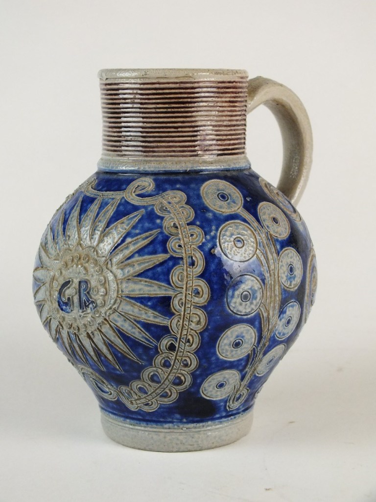
Now, although technically it doesn’t need a glaze, one is usually applied for decorative purposes, and to provide a smooth surface. However, most glazes wouldn’t survive the heat needed to produce stoneware, so early Stonewares used a salt based glaze. In this method salt is added to the kiln, which vaporises into the atmosphere inside coating the vessel. The sodium oxide in the salt reacts with the silica in the clay producing the characteristic ‘orange peel’ surface which is particularly associated with early forms of salt glaze pottery.
Beautiful. The ‘orange peel’ surface is very clear here. This is honestly one of my favourite sherds of all time. Confession time, I found it in New Mills, not Glossop… but close enough.
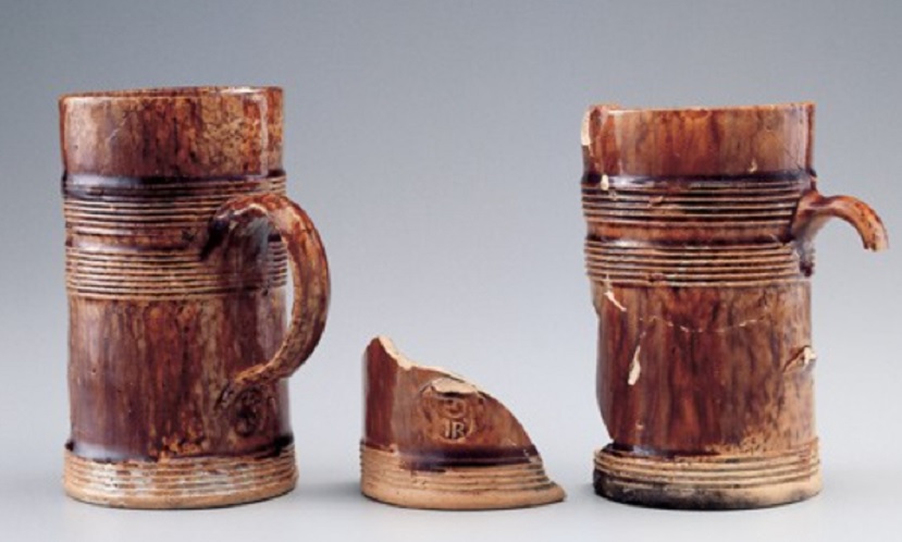
The salt glaze is naturally a creamy light brown colour – honey and mustard are words often used – although when other chemicals are added, this can change (the iron rich salt-glaze in the Nottingham/Derbyshire stonewares, to name an example we have seen before). Vessel forms associated with the earlier salt-glazed stonewares are bottles – some of which could be quite large – mugs, and jugs. Perhaps the most famous type is the Bartmann, or Bellarmine, jug:
A pair of Bartmann jugs – I love these guys. From Wikipedia article – photo by Hadley Paul Garland
the Bartmann (German ‘Bearded Man’) was produced in the Colgne area of what is now Germany in the 16th – 18th centuries, and were exported all over Europe, containing wine and other liquids. They were imported into Britain in huge quantities, and are relatively common in the London/south area, but much rarer up north. Their characteristic bearded face give them a sort of human-like appearance – a man with a large belly – hence their other name of Bellarmine Jars, after the portly Cardinal Bellarmine. I am almost certain that my favourite sherd above comes from a Bartmann… or is that wishful thinking?
It is this human-like appearance that may account for their popularity as ‘witch bottles’ as a form of sympathetic counter-magical protection very popular in the 17th century (although examples exist of ‘witch bottles being made in the early 20th century). If you suspected that you were being cursed by a witch, you took one of these bottles – symbolically representing the witch, and in particular their bladder – and fill it with urine, nails, metal pieces, broken glass, hair, and other assorted unpleasant objects; stopper it, and then gently heat it in front of a fire. The idea being that this would cause the witch intense pain in the bladder, causing them stop cursing you. Depending on the need, the bottle could also be buried, particularly beneath the hearth, so that the pain continues. Unpleasantly, there is at least one instance on record of a death caused by the bottle exploding – a sort of stoneware hand grenade. As an aside, Magical household protection and counter magic in the Glossop area really needs its own article, as I have a whole pile of evidence for such practices. Hmmm… let me see what I can do.
By mid to late 18th century, and probably connected with the increased use of coal-fired kilns, the surface of salt-glazed stonewares begins to smooth out – a useful rough dating tool for sherds – the rougher the orange-peel, the earlier the bottle… or something like that.
Around 1835 a new, no salt-based glaze was developed – the Bristol Glaze. My notes inform me that this is technically a “feldspathic glaze slip using zinc oxide“, and I for one am not going to argue with that. This produced a much smoother and more consistent surface, and was widely adopted. This is most characteristically found in a two-tone version, with the upper part of a bottle being a mustard colour, with the lower a pale grey or cream.
I found this bottle in four pieces and managed to glue it back together again.
There is something aesthetically pleasing about these bottles, and they have a sort of gentle nostalgic feel about them, which is odd because they stopped being manufactured at the turn of the 20th century when glass bottles became the norm. Again, a useful dating method – not a hard rule, more of a gentle indication.
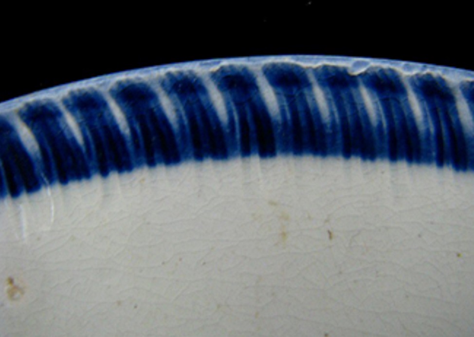
The Victorian period saw a huge explosion in the production of stoneware, and in particular bottles which were, remarkably, all hand made on a wheel. If you find a broken bottle, look carefully at the interior; you can normally find pulling marks, where the potter has formed it using their hands, and the base frequently has circular marks from when the finished bottle was cut from the wheel using a string whilst it was still turning.
This is a really nice example of the manufacturing process from a bottle interior.
This photo of the bottle interior really illustrates how the bottle was made. Not only can you see the large horizontal ribs made by the potter’s fingers as he draws up the clay to form the shape, but you can see wiping marks running diagonally, formed as the potter used a cloth to smooth the interior. Once the bottle is finished, it was cut from the wheel using a string or wire, which usually leaves characteristic marks:
The marks made by a wire as bottle is separated from potters wheel.
The wire is drawn toward the potter who would have been sat to the upper right in this photo – the ‘U’ shaped marks pointing toward them. But note also the slight wobble in the ‘U’ shape, produced because the wheel was still moving slightly; speed is of the essence here, as the potters would have been paid for the number of bottles made.
I love this, not only does it provide us a view of how the bottle was made, but it really gives a connection to a long dead human, a real person amidst the industrialised chaos. I read somewhere of celebratory bottles marking the occasion of a potter’s millionth bottle being made, which gives you an indication of the scale of the bottle making industry.
On bottles, the name of the bottle manufacturer is often found impressed into the clay, usually near the base.
Price of Bristol in this instance, which has a fascinating history in itself – this website tells all, but it also gives a real insight into stoneware manufacturing in the Victorian period – it is well worth a read.
The name and logo of the company, as well as the contents, are much larger, and were originally impressed into the body.
Andrew & Atkinson of Hyde – a well known maker of ginger beer, etc. I posted about them before, here, including a vulcanite bottle top of theirs.
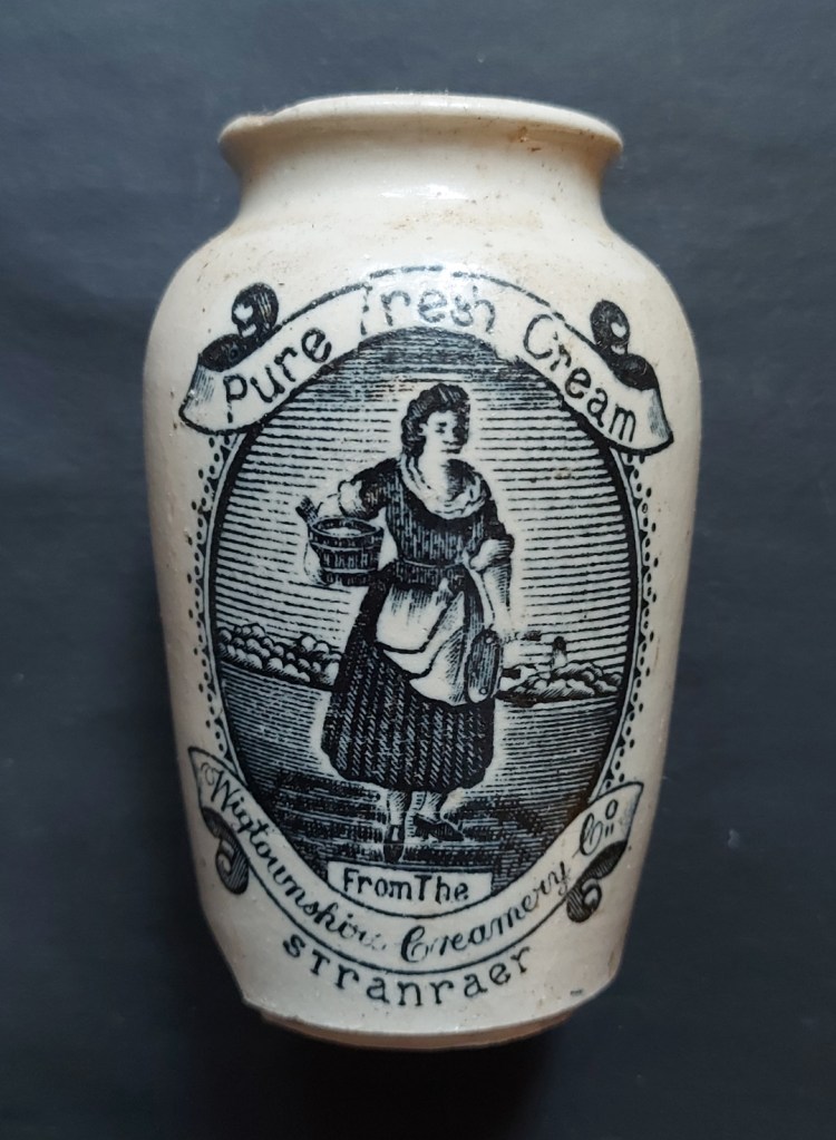
After about 1880 (ish), the development of high temperature resistant transfer printing meant that information and designs could be clearly printed on the side.
The classic Stranraer cream pot
Common are ginger beer bottles (though truthfully, they contained all manner of drinks), blacking bottles, containing blacking for ovens, and which are, oddly enough, normally white in colour. Also cream pots, milk bottles, and large flagons of cider or chemicals.
Cider flagon made by Bourne Denby – for sale here (not me, by the way!).
Ink bottles, too, and in particular the ‘penny ink’ bottles are common. Also known as pork pie inks, as they are the same shape and size of said savoury delicacy, and cost how much… that’s right, a penny.
The ‘penny ink’ pot.
Always check the exterior of any sherds you find, as often they have finger marks on the exterior, from where the wet glazed and pre-fired pot was put on a rack to dry. Often, soberingly, the finger marks are very small, an illustration of the child labour that underpinned the industrial boom of the Victorian period.
The human touch. This one is quite deep, and actually marked the clay. Normally, they are just about visible in the wet and sticky surface of the glaze.
Right then, I think that’s all I have for Victorian Stonewares, and honestly that is about all we need – it’s very recognisable, but it’s good to have a little context. I know I’ve said it before, but I’d really like to try my hand at potting, perhaps reviving some of the older 17th and early 18th century shapes of cups, mugs, plates; I’ll add that to the list of retirement plans!
So then, other news.
I’m planning a new Wander, this one involving lots of medieval bits and pieces, and a merry jaunt from Whitfield to Old Glossop, and back. It will form the basis of two future issues of Where/When… when I get round to writing them up. But before that can happen, it needs a test-drive, so to speak. Keep an eye open here, on twitter, or simply “what ho!” me in the street. I’ll put it on Eventbrite, too, so I can keep an eye on the numbers. I’m excited about this one, so watch this space, and let me know if you fancy it.
The first issue of the Where/When ‘zine is still available, only £5 and available at Dark Peak Books, or seek me out. A free PDF is available, too – click on the tab at the top of the site.
I’ve got a lot of big ideas and collaborations that might come to fruition. Might. But again, watch this space. And do stay in touch… It’s nice to know that all 6 of you are ok! Expect another post soon, too… I’m aiming for two in February. Aiming…
So then, until next time, look after yourselves and each other, and I remain.
What Ho! What Ho! And if I may be so bold… What Ho!
How are we all? Bearing up under the circumstances? Summer, such as it was, has gone, and Autumn is upon us. A time of harvesting, of blackberrying, of apples… and pottery, obviously. And just like that, without further ado (and ignoring the groaning and wailing and gnashing of teeth), we tiptoe into Part 8 of the fabled (and seemingly never-ending) Rough Guide to Pottery; let’s have a look at some rather splendid sherds.
So then, today we are looking at some rarer types of pottery – well, perhaps not rare as such, just not as commonly encountered as some of the other stuff I’ve previously talked about.
TIN-GLAZED EARTHENWARE (aka Delft) DATE: 1650-1770 DESCRIPTION: Hand painted glazed blued decoration on a whitish/blueish background SHAPES: Cups, saucers, bowls, plates, small jugs, tankards, chargers with prominent ring foot. fine and delicate, with thin walls. Decorative tiles were also common in wealthy houses.
Originally tin-glazed pottery was imported from Italy, Spain and the Low Countries, but UK production began in Norwich in late 16th Century. Its heyday was roughly 1700 to say 1800… roughly. It remained popular until it was gradually replaced by White Salt-Glazed Stoneware by the mid 18th Century, which was more robust and much lighter, and cheaper to make. Tin-glazed pottery was another attempt at reproducing porcelain type pottery, and part of the quest to find a pure white background that seems to have dominated pottery making in the 17th and 18th centuries.
The process of manufacture was as follows. The vessel was turned by hand and using a former, and then biscuit fired (that is, it was fired undecorated and without a glaze). The pot is then dipped in the glaze and allowed to air dry. Once dry, the pot is then decorated by hand – quickly as the glaze is very absorbent. It is then once again fired, which fuses the glaze and fixes the decoration.
In terms of fabric, it’s an earthenware, a pale colour – white-ish or cream colour, with later examples being almost pure white. It has occasional tiny pink, reddish or darker inclusions, and is a soft to medium hardness.
Fabric. It is stained slightly to a creamy colour, but you can see the paler white where there is a new break. You can also make out some reddish inclusions in the fresh break… if you squint hard enough.
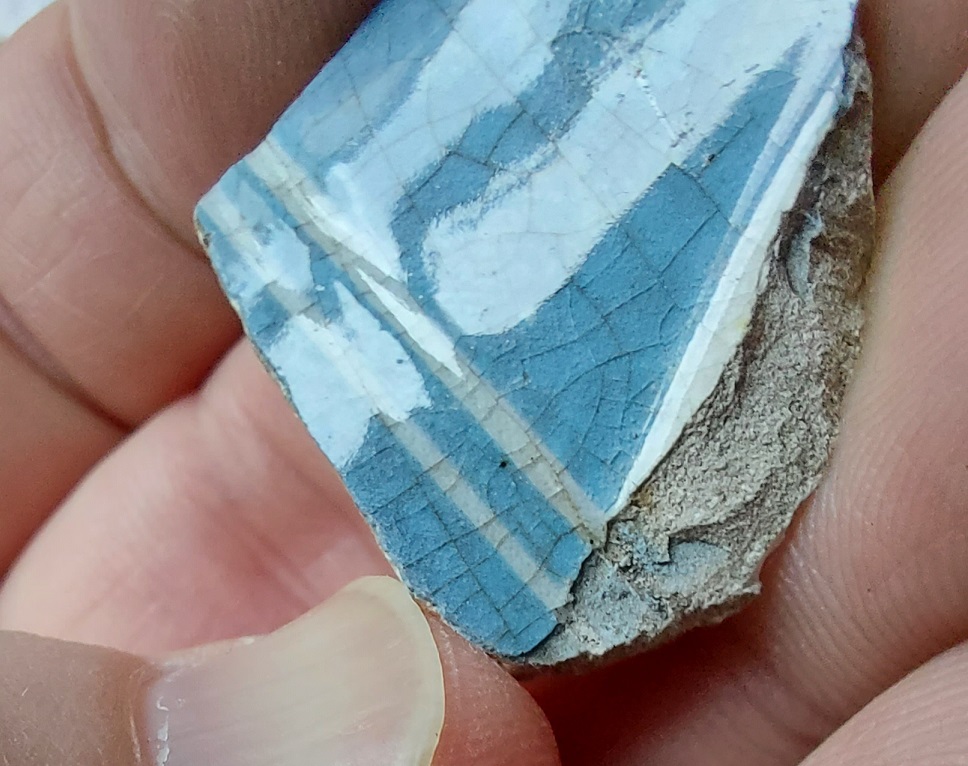
It uses a lead oxide glaze mixed with tin, which gives it a blueish white or pale cream colour, but is more blue where it pools – in particular around the ring base, where the pot was dried upside down.
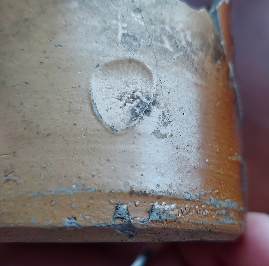
The pooled glaze is very blue here. There is also a maker’s mark on the bottom – alas, that’s all I have of this pot, otherewise we might have been able to identify the potter.
The glaze has an almost luminescent quality and has a consistent smooth, dense feel to it – the product of the lead – but can occasionally have tiny imperfections or dimples in it. The glaze can also be thickish in places, but it is fragile and can flake off in patches, exposing the fabric below – most obviously at the edges of sherds. The surface occasionally shows the marks of the trivets that separated the vessels in the kiln.
Flaky! This was what was in my bag after I emptied it… bits. You can also clearly see the glaze has crazed and flaked off in patches.
It’s the decoration that really makes this stuff special, though. It’s all hand-painted, and because the dried but unfired glaze is super absorbent, it has to be done with speed: the brush strokes are wide or thin, and it’s done in a fluid and moving motion, quick and rough, impressionistic, and almost living, and certainly not fixed like transfer-printed wares.
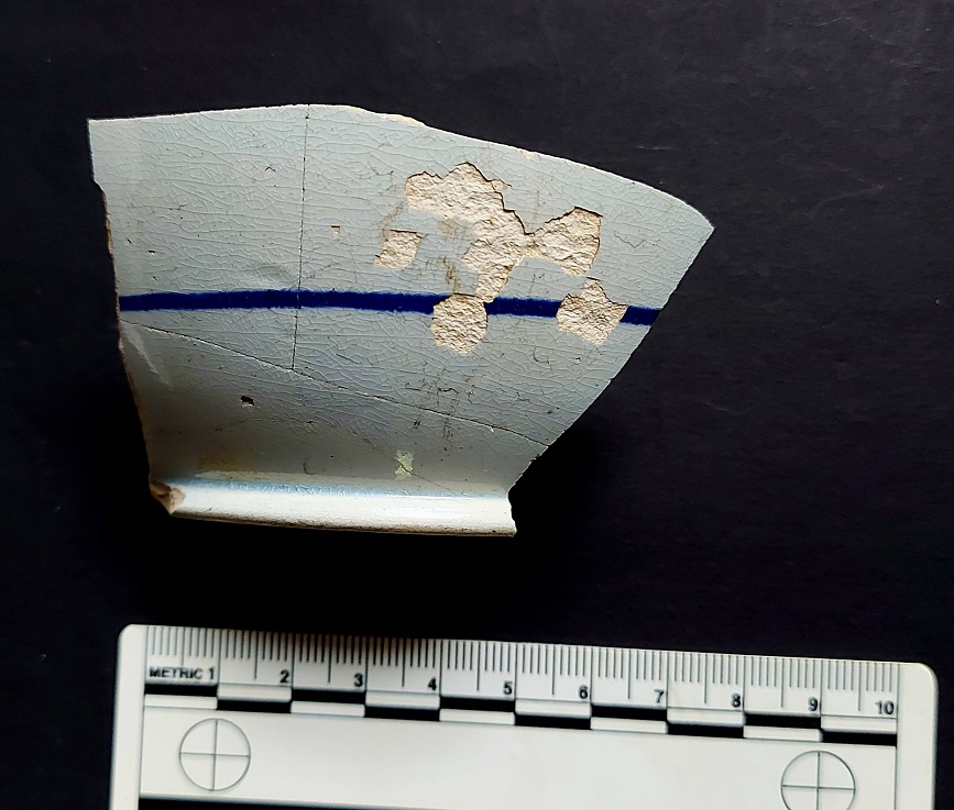
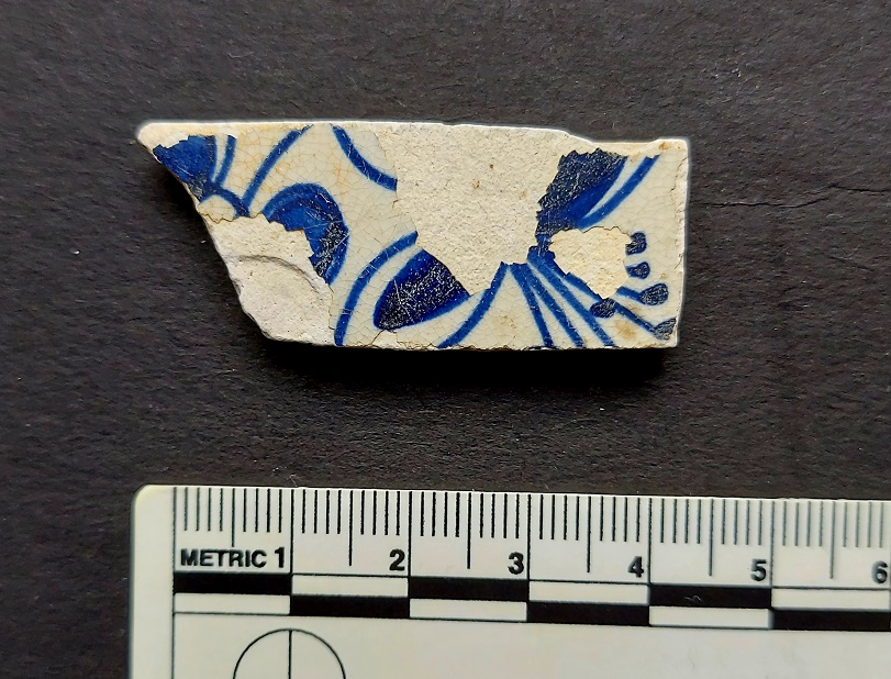
There’s no mistaking this is hand drawn – each line is human made. A beautiful if naive image of a house, surrounded by trees that seem to have been made with sponges.Simple but wonderfully effective decoration – a single line hand drawn around the vessel – probably a tea bowl or similar shape. You can also see the flaked glaze surface.
Delicate handle for a jug or similar.
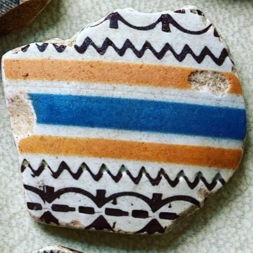
There is no way to erase the decoration once applied, which accounts for occasional errors, and which I think only adds to the attraction. The colour is almost universally a wonderful cobalt blue, but occasionally purple or orange is found. The subjects are largely naturalistic – foliage in particular – but there are also scenes with animals, people, and buildings. As well as actual pots, tin-glazed pottery was very much favoured for tiles among the wealthy, and some stunning examples exist.
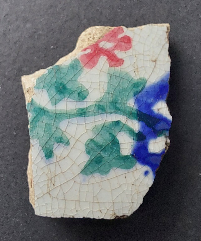
Stunning dragonfly tile dating to 1670ish – from this website, and only £216!Tile fragment found by me – the colour on this tile are simply stunning. Showing a stylised flower (thanks Julian)… I wish I could find the rest of it.
I honestly love this stuff, there is something wonderful about it – the colours in particular – and although I don’t have a lot of it, it’s always a joy to find.
The next lot of pottery type occupies a similar space in time – broadly the 18th century – and indeed, overtook Tin-Glazed pottery in terms of popularity…
WHITE SALT-GLAZED STONEWARE (aka Fine White Stoneware) DATE: c.1720-1770 DESCRIPTION: Thin walled, white glazed, impressed decoration, hard stoneware. SHAPES: All sorts of tablewares (i.e. not cooking or storage), common are cups and bowls, but plates, platters, jugs, salt shakers, sugar bowls, etc.
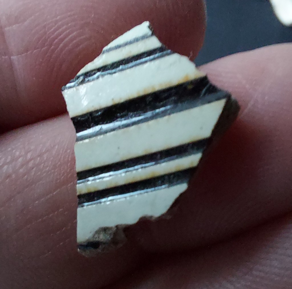
A selection of sherds, all mid 1700’s in date.
A later development than Tin-Glazed, it was first made in the later 17th century, but only began to be produced commercially from the 1720’s onwards.
The fabric is a typical stoneware, in this instance with added calcined (burnt) flint to produce a pale cream, almost white colour. It is then fired at a very high temperature and salt glazed, to produce a fine, strong, pottery that I find really quite beautiful.
Close up of the fabric. Very pale grey-ish to white, with visible voids created by gases formed by the high temperature it is fired at. There are also occasional brown and dark grey inclusions visible both in the break and the surface.
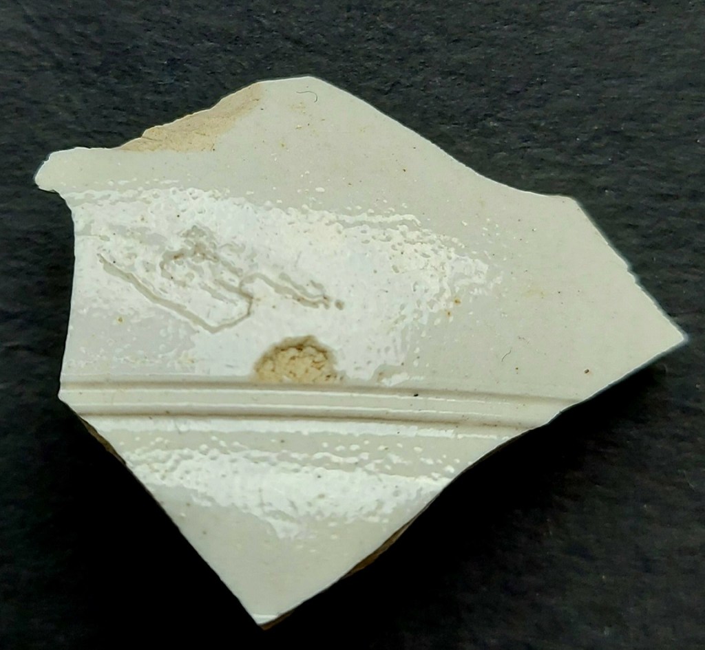
Vessels are formed one of two ways: either by being turned on a lathe when leather dry but before firing, which produces very sharp edges and fine horizontal banding; or by pressing thin sheets of clay into a mould, which allows the fine relief decoration to be made.
In this latter case, often the inside of the clay is wiped with a cloth to ensure the clay presses into every corner of the mould, which leaves very clear wiping marks, especially on closed vessels (jugs, for example) where the inside wouldn’t be seen.
Wiping marks on the interior of a jug. The black writing is an excavation code – BGW (upside down in this photo) – which stands for Back Garden Wall… I found these sherds underneath my garden wall!
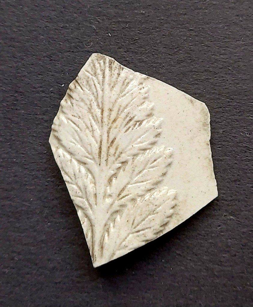
External decoration, beginning c.1730, includes basket work patterns, leaves and other foliate designs, although simple incised horizontal lines are commonly encountered on earlier pieces.
Close up of that beautiful foliate decoration – the result of being formed in a mould.
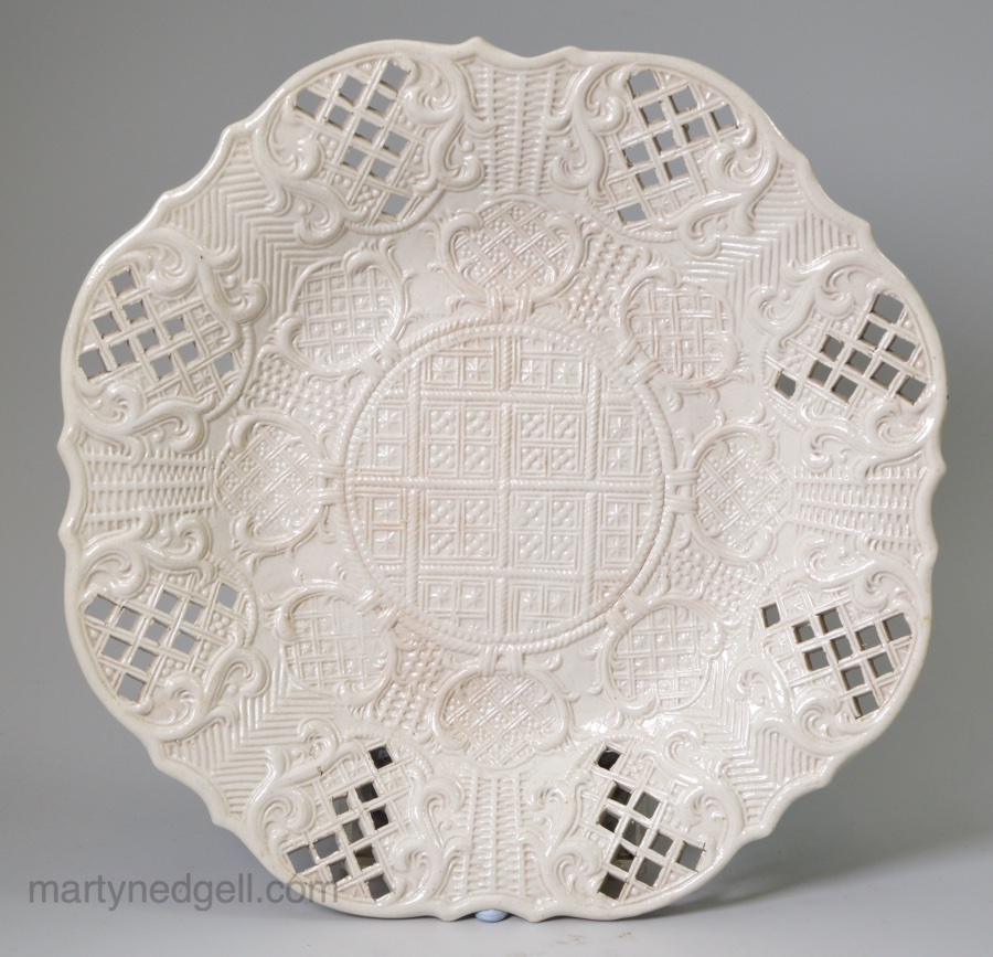
Occasionally, the walls are pierced, though this seems largely confined to high-end expensive dinner services.
Alas, not found beneath my garden wall! Lovely plate with pierced decoration and impressed motifs. Image is stolen without shame from this website here. A snip at £450! Do check out the website, though, as there are more examples of White Stoneware.
There are also rare examples of transfer-printing on stoneware:
A truly terrible photograph, but you get the idea! This is dated from the period where potters are experimenting with transfer-printing – later 1700’s.
The exterior is salt-glazed, meaning that at a point during the firing process salt is added to the kiln, which vaporises and coats the vessels in a clear glaze. Although solid and even, it often leaves an orange-peel, slightly melted roughened type effect on the surface, as it does on the Brown Salt-Glazed Stonewares discussed here.
The ‘orange peel’ salt-glaze is very obvious on this sherd. The horizontal band is very neat and tight, carved using a tool on a lathe. You can also see some sort of damage underneath the glaze (above the chip).Wonderful coffee pot of c.1760-ish, and a snip at £1250! It is lovely, though. Same website.
White Stoneware gradually overtook Tin-Glazed pottery in popularity, and began to dominate the fineware market from the 1740’s onwards – it is a lot lighter than the earthenware, and crucially it is much more hardwearing, with the surface unlikely to flake off or crack. It also appealed to the middle classes; its fine white background mimicking the desirable but very expensive imported Chinese porcelain, a crucial part of the tea and coffee drinking craze that had gripped Britain at this point. It remained popular until eventually overtaken by the development of Creamware and other earthenware types in the late 18th century.
SCRATCH BLUE DATE: c.1740-1780 DESCRIPTION: Pale stoneware, incised decoration highlighted in messy cobalt blue SHAPES: Mugs, Tankards, Jugs, Chamber Pots.
Broadly speaking, Scratch Blue is decorated Pale/Grey/White Salt-Glazed Stoneware – it has the same fabric and glaze. Essentially, this was a UK answer to the lovely looking Westerwald stoneware pottery being made in Germany (see below) and imported in large quantities – the English potters wanted a piece of the action, and produced a cut price version. It reproduces the essentials of Westerwald – incised decoration and stunning cobalt blue highlights on a pale stoneware (white-ish or pale creamy grey) background, but overall it tends to be more sloppy. The incised decoration is less careful, often looking as though it was done quickly, and the cobalt slip often overruns and splashes.
Wonderful chamber pot, with a King George medallion (probably George II)
Actually, I think this ‘messiness’ was deliberate, a way of ‘jazzing up’ the decoration, and it’s certainly effective. That’s not to say that there aren’t some very careful and precise examples, though, and in fact American archaeology seems to divide Scratch Blue into two types – Scratch Blue, which is very finely decorated, and ‘Debased’ Scratch Blue, which is the messier variety. I’m not sure that the distinction is particularly useful, or indeed ‘real’ as such, but there you go – my twopenn’orth.
A jug.
In terms of decoration, there are incised flowers and leaves and multiple horizontal turned bands at the top and bottom, all highlighted in cobalt blue and occasionally manganese brown. Also, there are applied medallions, sometimes containing the royal arms and cipher of King George II/III.
A tea bowl with a lovely flower incised on it. All these images are stolen from the hugely invaluable Colonial Ceramics website of Maryland – well worth checking out their huge database of pottery.
I have a single, very small, sherd of Scratch Blue pottery, and this stuff is by no means common, especially up North.
That’s it, a single 2cm sherd of Scratch Blue is all I have. There must be more out there…
It seems to be from the base or top of a tankard, something like this:
Possibly something like this, from roughly 1780. From Colonial Williamsburg’s website.
This seems appropriate as it was found on the footpath outside an 18th century one-time pub, the Seven Stars off Hague Street, Whitfield.
WESTERWALD (aka Rhenish Ware) DATE: c.1650-1780 DESCRIPTION: Pale or grey Stoneware, incised decoration highlighted in cobalt blue SHAPES: Mugs, Tankards, Jugs.
Unusually, I don’t actually have a sherd of this to show you! It wasn’t particularly common up in the North – London being the big importer and consumer of this ware type. As I said above, Scratch Blue is the indigenous British potter’s response to this German imported pottery, and as you can see it is very similar:
Lovely jug of Westerwald from this website – it sold at auction for a surprisingly cheap £150
Incised decoration, cobalt blue highlights, applied medallions and other decoration, it is often difficult to tell apart. However, Westerwald seems to be bigger somehow, less delicate… and at the risk of offending our German cousins, more Teutonic. There also seems to be a greater use of cobalt decoration, and the background stoneware is darker in many circumstances.
And there the matter shall have to rest until I can find some Westerwald sherds to discuss at greater length (I might have to get a mudlarks license and head down to London and poke about on the Thames foreshore).
Right, I think that’s enough pottery for now – next time we’ll look at some fine earthernwares… you lucky folk.
Now, someone recently asked me if I could put links to all the previous Pottery Guides at the bottom of the post, so they can use it quickly to find out what they have… well here you are:
Part 1 – Marmalade Jars and Brown Stoneware (Nottingham and Derbyshire)
Part 7 – 17th Century Slipwares, Manganese Glazed, and Yellow Ware
Enjoy, or not, as you wish.
Right, that’s all for now.
In other news, the Glossop Big Dig results are forthcoming… slowly. If any of you have any bags that need handing in, please do so, and I’ll get the results up asap.
Other other news is the ‘zine – Where/When – The Journal of Archaeological Wanderings – which is just about ready to go off to the printers. You will soon be able to buy a physical copy of a guided walk I did a while back, filled with historical musings and observations (and a sprinkling of pottery, obviously). It’s an experiment of sorts – we’ll see how it sells and whether I can make my costs back, but I’ve got about 6 more walks ready to go, and I’d like each one to be in the ‘zine. It will be full colour, 40 pages, fully illustrated, and should be retailing for £6, but watch this space.
The front cover of the first edition – hopefully ready within a week or two, and available to order via the Where / When button at the top.
If any of you out there have either suggestions for walks, or would like to publish one yourself, do get in contact. More news on this soon.
Until then, look after yourselves and each other, and I remain.
The pottery guide is back… I know, I know, I can feel your excitement from here!
Well, let’s get straight down to it… no point in beating about the old ‘b’, is there.
Influenced by the first finds from Glossop’s Big Dig (courtesy of my wonderful neighbours, Helen and Sarah), I have devoted this post to the 17th and early 18th century pottery types, and in particular Slipwares.
Two pieces of lovely late 17th or early 18th century pottery – left is a sherd of a Staffordshire Slipware plate or platter, right is a cup in Slip Trailed Ware. And a Victorian marble. Not bad for the first finds of Glossop’s Big Dig!
Ah, slipware… wonderful slipware! I love this stuff. This is the stuff that keeps me feeling warm and fuzzy at night (nobody tell Mrs C-G). And wine, if I’m honest. If only there was some way of combining both… Anyway, I digress. Slipware! We met it’s younger cousin, Industrial Slipware, in a previous episode of the guide (Pt.3, here). However, regular Slipware dates from much earlier (roughly 1630- 1750 say), and whilst there is a similar process involved (essentially slip and pottery), this is very different; simple and less precise, it’s rough and oddly much more human. In a philosophical way, this is what the Arts & Crafts movement, in it’s deliberate rejection of industrialisation and mass production, was trying to get back to. And I think it’s why I like it so much. Bold colours, somewhat messy, and very tactile, it is a celebration of creativity, and is tremendous fun. What I like about this, too, is that whilst it’s of its time, you can see the medieval influence in the pottery, and in a way it looks back to its roots. But it also looks forward, to the Industrial Revolution that would completely and permanantly change Glossop. It straddles both these periods, linking them, Whilst it’s not common, you can find this stuff fairly regularly in the Glossop area – testament to the growing size and importance of the town in the early 18th century.
Slipware is all made using broadly the same techniques, and truthfully, the first two categories Slip Trailed Ware and Staffordshire Slipware are in essence the same type of pottery, made and decorated using the same methods, but with different decorative motifs… you’ll see what I mean.
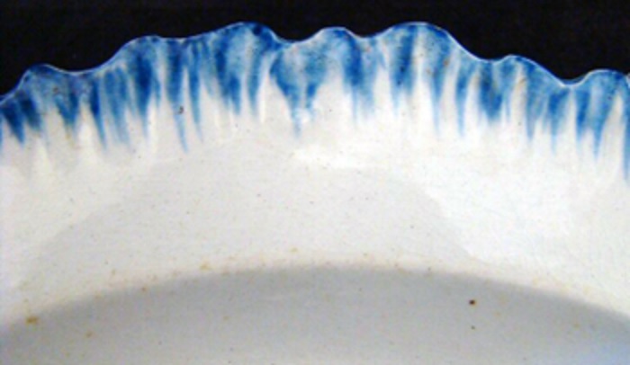
SLIP TRAILED WARE DATE: 1650-1740 DESCRIPTION: Yellow or cream decoration on a dark (often reddish, brown, black, sometimes yellow) background. SHAPES: Table wares only, no cooking or storage – plates, platters, bowls, jugs, cups, tankards.
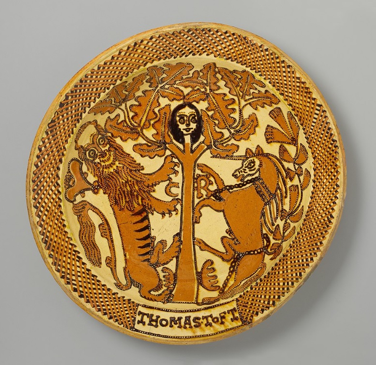
The process of manufacture is relatively simple. The vessel is shaped on the wheel (although flat shapes – platters and plates, for example – were shaped in a mould), and left to dry. When leather hard (that is not fully dry, but hard enough to maintain the shape), the vessels were covered in a reddish brown slip (that is, a solution of clay and water) and decorated using more slip of a different colour. A glaze is applied over the top, which, when fired, changes the colour to a much darker tone. The slip was poured from a bottle or jug, using a hollow quill as a nib enabling designs to be drawn. The background colours are earthy tones, and are often dark – browns, blacks, and reds are common – although it can be yellow. The decoration is in a contrasting colour (rarely more than one) and is piped on. Often abstract patterns – spirals, lines, circles, wavy lines, and feathers – but also words, names, and dates, as well as sometimes bizarre looking animals or people, the result of the difficulty in getting finer details whilst piping the slip out of what is essentially an icing bag.
The finest of this type were made by a potter called Thomas Toft (d.1698), who made very complex, if by our standards naïve, images.
The work of Thomas Toft. King Charles I hiding in an oak tree.
It’s unlikely we’ll find something like that (and good luck if you do – they are worth an absolute fortune!), and the more commonly encountered examples of this pottery are much simpler, comprising geometric designs, such as wavy lines on the flat rim of bowls, and lines and pellets on cups.
Not all vessels were decorated though, and one often encounters vessels simply slipped and glazed – these are often referred to as ‘Slip-Coated’ in the archaeological literature. The pottery is not particularly hard-wearing, and the slip and glaze is often found to have flaked off.
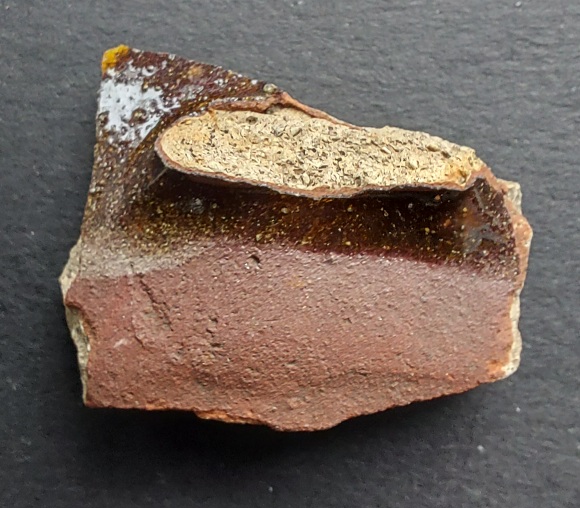
Where the glaze/slip has flaked off (bottom right), you can see how it was made. The natural clay colour – a sandy buff – is overlaid by the red slip, which turns black when the lead glaze is applied over it.
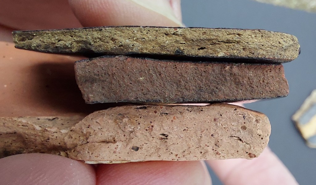
The fabric is not particularly hard-fired, and is normally pinkish buff, creamy, or pale yellow, with reddish-brown and white inclusions (archaeology talk for ‘bits added to the clay’ in this case, stone and bits of crushed pottery known as grog).
Fabric goodness! The grog is the larger lumps, made from crushed pottery.
Darker buff, grey, and reddish fabrics also exist reflecting the fact that there are several places of manufacture for this type of pottery besides Staffordshire (the potters would use their own local clay sources, so the fabric will be slightly different in each case). Ticknall, Derbyshire; Buckley, North Wales; and Wakefield, West Yorkshire all had large active potteries, and given the location of Glossop in relation to these places, it is likely that any could be a source. We also can’t discount very local pottery manufacture.
Three very different fabrics for the same type of pottery, probably representing three different manufacturing centres.
Shapes are commonly plates and bowls, jugs, salt pigs, and mugs/cups. The plates and bowls are often quite thick by today’s standards – up to 1/2 inch. These normally have a ‘pie crust’ rim, and sometimes clearly visible knife marks where the edges were shaped. Flat shaped vessels (plates, platters, etc.) were only slipped and glazed on the interior, with the base/exterior left clear, or with only a slipped surface.
Wonderful stuff.
Conversely the cups are thin walled, with rounded or angular foot rims. The underside and foot of the cups/jugs are not normally slipped or glazed, creating a sort of messy, slap-dash, finish to the whole. The interior can be slipped in the same colour as the background, or sometimes in a yellow.
This is Helen & Sarah’s cup fragment. The scar of the strap handle is centre of the sherd, and top right there is just a tiny bit of yellow decoration visible. You can also see the red slip, and the difference in colour that the glaze makes when laid over it. This is a cup just like that above, and dates to about 1700.
Next up, we have the remarkably similar…
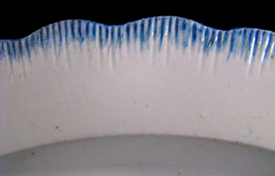
STAFFORDSHIRE SLIP WARE DATE: 1650-1740 DESCRIPTION: Black or dark brown decoration on a yellow background, often feathered. SHAPES: Table wares only, no cooking or storage – plates, platters, bowls, jugs, cups, tankards.
By and large, the same as Slip Trailed Ware above. Certainly, the manufacturing methods, fabric types, and shapes, are all the same. However, a distinction (perhaps a false one) is made in terms of decoration. The vessel is slipped in a pale cream, with a red slipped decoration applied (the opposite of Slip Trailed Ware), and the whole is glazed and fired. The glaze contains lead, which darkens the colours when fired, creating the bright yellow and dark brown/black decorative motifs that characterise this ware group.
This is actually wonderful!
In terms of decoration, we find broad stripes splashed across plates and bowls, and again lines and pellets, especially on cups.
The most common, though, is the ‘feathered’ decoration that really is quite eye-catching / eye-watering / migraine inducing (delete as appropriate). This characteristic decoration was achieved by dragging a comb or some other implement through the still wet slip, pulling the dark colour through the light, and producing a ‘feathered’ effect.
I love the shape, but not sure about the colour!
The interior of a pair of Staffordshire Slipware cups.
Occasionally, the slips are ‘joggled’, that is swirled together to produce a psychedelic pattern. Sometimes there is an impressed decoration or even words or dates below the slip. A less commonly encountered decoration is the ‘sgraffito’ style, in which the slip is scratched away to reveal the clay underneath, allowing quite detailed drawings to be made.
Impressed decoration under the glaze.
The shapes are the same as those in Slip Trailed Ware – plates and bowls, jugs, salt pigs, and mugs/cups.
The ‘pie crust’ rim on the sherd on the left is quite a common finish to large flat plates.
The other side of the above sherds, showing the lack of slip and glaze.
From an artistic point of view, I genuinely still don’t know whether I love or hate this stuff, but archaeologically it’s wonderful – instantly recognisable, and drops out of use in the early decades of the 18th century, giving us a great date.
Next up we have…
MANGANESE GLAZED (aka Manganese Mottled or simply Mottled Ware) DATE: 1690-1750 DESCRIPTION: A brown mottled and/or streaked glazed surface. SHAPES: Largely table wares – commonly mugs and tankards, plates, bowls, jugs.
Another relatively commonly encountered ware type. Here, the vessel is shaped – usually on a wheel – and then, instead of an underglaze slip being applied, it has a manganese glaze applied directly to the vessel interior and most of the exterior (with the exception of the underside of bases, and the lower part of the exterior of mugs/cups/tankards). When fired this creates the distinctive brown mottled and/or streaked effect.
A selection of Manganese Mottled sherds
Close up of the mottled surface
Another close up.
Broadly speaking, a darker glaze colour is usually seen as an earlier trait, with later examples tending to be lighter. Although, as is usual with such things, this is an overall tendency rather than an absolute rule, and there is often variation within the surface of a single vessel.
In terms of fabric, it is often the same as the Slip Wares described above – commonly pale buff or pink, with few red or dark brown inclusions – and it seems to have been made in the same potteries. And of course there are variations here, too, reflecting these different manufacturing centres.
Fabric types.
In terms of shapes, there is very much a focus on cups, mugs, and tankards, with them being used extensively in taverns of the time. Plates and bowls are less common. Decoration is limited (the glaze itself seems to be the main decorative motif), but includes multiple horizontal rings around the drinking vessels.
This leads us neatly to today’s barely pronounceable word of archaeological jargon – skeuomorph. A skeuomorph is something, made from one substance, but which is made to look like it’s made out of a different substance. In this case a tankard made from clay designed to look like it’s a more traditional one made from wood. Don’t say you don’t learn anything from this website!
A wooden staved tankard recovered from a shipwreck dated 1758. Earlier examples are also known. From this website, here.
This can’t be a coincidence – even the manganese glaze streaks look like wood – and I wonder if it is simply a case of “that’s how tankards are meant to look”.
Wonderful cup, squared foot with bad glazing.
This last photo (and the one above the wooden tankard) are taken from a truly remarkable website – the Chipstone Foundation – who have published, amongst other wonders, the contents of a pit excavated behind the Talbot Hotel in Tetbury, Wiltshire. All the material dates from between 1680 and 1720, giving a 40 year window into pottery use in a public house, and wow… if you like the stuff you see here, you’ll love the rest of the material. Honestly, it really is a hugely important site as it allows us to see what was used when, and how. I keep going back to the website just to gawp at the pottery! Check it out.
It is worth noting that there is a revival of manganese glaze in Victorian period, when it was used extensively on ‘Brown Betty’ teapots, in what was known as a ‘Rockingham glaze’. There shouldn’t be a problem in identifying these, though, as the glaze is not particularly mottled and is much better quality, and the all important fabric is very different, being a refined red in the proper versions, and a white or pale cream in knock-offs.
Finally then, we have this stuff.
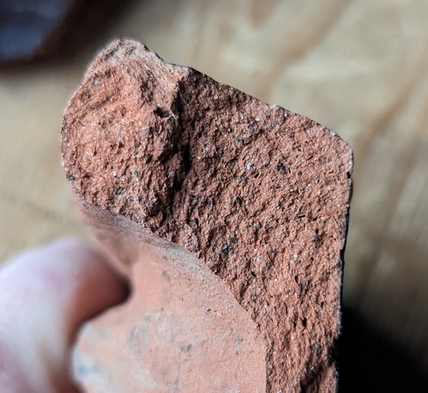
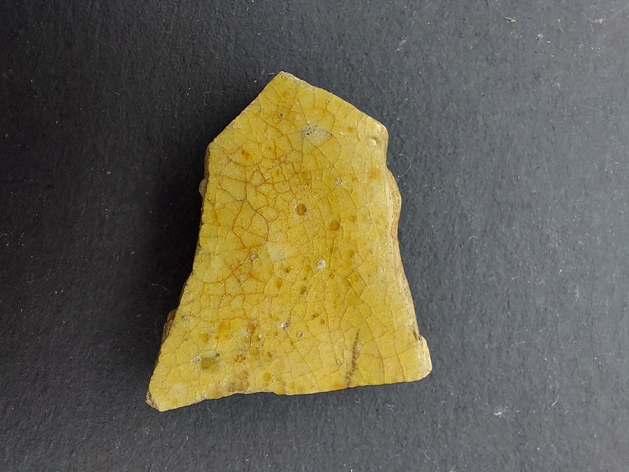
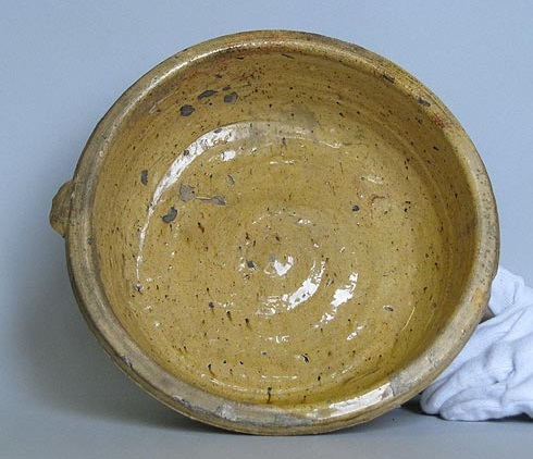
MIDLANDS YELLOW WARE (aka Yellow Ware) DATE: 1630-1720 DESCRIPTION: As the name suggests, a pale to bright yellow surface. SHAPES: Table wares only, no cooking or storage – plates, platters, bowls, jugs, cups, tankards.
A small and uncommonly encountered ware type, Midland Yellow Ware does crop up from time to time in the Glossop area so I thought I’d include it.
Lovely stuff. Not common, but it’s out there.
Characterised by a dullish pale yellow colour, it is not normally slipped, but instead the lead glaze is applied directly to the vessel, enhancing the pale fabric. The glaze is not particularly good quality – there are usually brown spots (iron oxide reacting with the glaze) visible on the surface, it is roughly applied, and is often crazed with bits flaked off. Decoration is limited to incised lines and sharpish carination on more elegant cups.
Weird light makes it seem more yellow than it it… it’s a lot paler in real life.
The fabric is a pale pinkish buff, not particularly hard-fired, with red and dark brown/black inclusions and lots of voids. But it’s very similar to the Slip Wares described above which may point to a common origin for the pottery.
You can see the lead glaze where it has pooled.
Shape wise, it’s all tableware – serving and consumption – so bowls, plates, jugs, but commonly cups and mugs in the same styles as the Slip Wares described above. Often roughly made, with thin walls and finger marks showing, they have an almost organic feel.
Yellow Ware bowl
Yellow Ware cup
These last two images are taken from the another remarkable website/resource – the Bingham Heritage Trails Association website. They undertook a series of fieldwalking projects in the fields around the village in Nottinghamshire, and published the huge amounts of pottery they found online (follow the above link to explore – the different periods and types of finds are in the menu at the left). It is truly a remarkable resource, filled with photographs, descriptions, and drawings – just the sort of things sherd nerds and associated odd folk love – hugely recommended. Indeed, the whole project is one that I’m like to try and reproduce in Glossop. Ahhh, plans…
Right, that’s all for this time folks. I hope you are all beavering away, eyes down, in the Glossop Big Dig. Early results are looking great, and straight away we have material much earlier than the Victorian that is quite common. Keep looking, and who knows where we might end up – after all, we’re surrounded by 9000 years of history!
Until next time, look after yourselves and each other.
We have today yet another instalment of that momentous work The Rough Guide to Pottery – it truly is the gift that keeps on giving. Try to contain your excitement, but I know it is difficult. Mrs Hamnett herself commented only the other day, as I was explaining the process of making a 17th century slip ware bowl, how lucky she was to have married me. And Master Hamnett runs and hides from me screaming “go away!” whenever I show him a lovely piece of stoneware… the playful scamp.
So then… Porcelain.
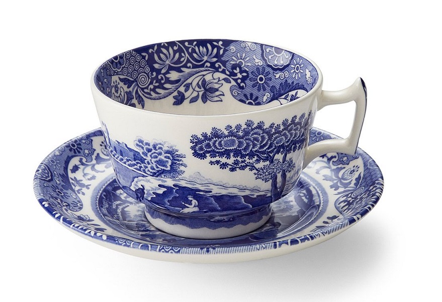
A modern Spode porcelain teacup and saucer – stolen shamelessly from their website here.
Here we stray into the realm of real ‘collectors’ and people who spend hundreds of thousands of pounds on a cup. Fair play to them I say, but to be honest, to me and you the minute details of rare and collectible porcelain don’t matter that much.
A Victorian pair of tea/coffee cups – £13 on ebay here (and no, they are not mine!)
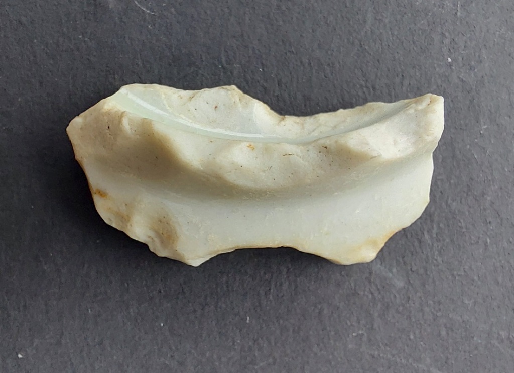
True Porcelain was developed in China in the 9th century, and is essentially a very refined stoneware. It is often delicate with very thin walls – so thin that you can see light through them – yet is very hard wearing and tough. Its development was due to an aesthetic search to find a substance that was as hard and cold as jade, and yet gave a ringing tone when struck, like bronze. True Porcelain is made from a mixture of the mineral feldspar and kaolin, a type of clay, and fired to a very high temperature (1400°) which vitrifies (melts) it into an almost glass-like state. It was exported to Europe from 1500s onwards, and was hugely different to the coarse earthernwares that made up European pottery then; this stuff was incomparable (that thing your 3-year-old made using Playdoh versus the finest China).
The genuine thing; late 17th/early 18th century Chinese porcelain. A mere snip at £38,000!
Porcelain became very popular in the 17th and 18th centuries, particularly due to tea and coffee consumption among the wealthy being fashionable – essentially they wanted something similarly exclusive to drink out of. It honestly amazes me how much of history is driven by fashion and the need to be different and ahead of the crowd – something that isn’t going to change any time soon.
Now, being imported from China meant it was hugely expensive, and many factories began to try and make it. However, no one really knew how it was done. Meisson in Germany began producing very similar pottery in the 1710’s, and others in Europe and the UK had early successes, often involving adding glass dust to fine clays. A significant breakthrough came in the mid 1790’s when Josiah Spode perfected what became known as Bone China. Here, a very fine clay is mixed with about 25% crushed burnt bone, and fired. This produced an almost identical porcelain, and it allowed the mass production of the pottery which is still going today. Also, as it became affordable, it was no longer an exclusive product despite still having a ‘classy’, even snobbish, image. Personally, I prefer an earthernware mug, but my grandparents generation would have scowled at my choice of cup. Now, at the risk of incurring the wrath of Porcelain experts, I’m lumping true imported Porcelain with Bone China here.
Does exactly what it says on the bottom on the early 20th century teacup
There are no perceptible differences at the level at which we are working, nor is it vital that we pinpoint a date of something – we are simply having fun (admittedly some of us take our fun more seriously than others who, for example, don’t clean their pottery. Or who use an egg as a photographic scale. I’m not naming names, you know who you are.). If you do want to go down that rabbit hole, there are dozens of books on the subject that allow you to explore dates, patterns, shapes, types, names, etc. However, for our purposes, it all goes under the heading PORCELAIN. I expect a visit from the heavy thugs of the porcelain collecting world within moments of publishing this.
PORCELAIN (aka Bone China, China) DATE: Realistically c.1800 – Now. Theoretically, but unlikely, 1500 onwards. DESCRIPTION: Thin walled vessels, delicate, with many different decorative motifs and colours, occasionally with gilding. SHAPES: Most shapes, but very commonly tea/coffee cups, saucers, small plates.
Very thin walls, but is very hard, especially when compared with ‘normal’ pottery. The fabric is white or very pale grey, with perhaps a hint of blue, and with no inclusions – it is pure. The texture is very glassy, and is grainy with tiny voids – it reminds me of cauliflower heads, or snow. See this comparison with earthernware, for example:
Porcelain left, earthernware right (my bare foot, bottom right… it’s probably for the best we move on, really). The difference in the fabrics is very noticeable, it’s almost wet(porcelain) versus dry (earthernware).
It also breaks like glass or flint, rather than pottery, with tiny flattish flakes and sharp edges.
It’s odd stuff! You can see how it breaks into flakes, and I remember reading about Australian Aboriginal tribes using telegraph wire insulators to make stone tools. Makes sense.
Banging sherds together, they make a high ringing sound – a ‘tink’, rather than a ‘thunk’ if you see what I mean (don’t look at me like that…). Also, if you hold a sherd up to a light, you should be able to see through it – try moving a finger between the sherd and the light source. The surface is very shiny with the glaze visible in the section as a clear white line, often with the paint of the decoration bleeding into it. Decoration is fine hand-painted images, normally in blue, though other colours are found, and normally of naturalistic scenes – flowers, landscapes, trees, etc. The start of the obsession with ‘Chinese’ decorations (including ‘Willow Pattern’) can be traced to the original porcelain vessels. Shapes are largely bowls, delicate teacups, plates and saucers, though teapots, milk jugs, and other shapes do occur. Other decoration can be painted over the top of the glaze. Later examples of Porcelain/Bone China can be very colourful, and very fine, too, often with a gold leaf gilding.
A random selection of Glossop found sherds of porcelain showing a range of decoration. I have to say, it’s all a little gaudy for my tastes.
This is more like it – a flowing, living, painted decoration – fluid lines, almost jazz-like in improvisation. Lovely stuff. I found this tiny sherd in the River Thames a few years ago, and it is one of my favourite sherds. Blimey, now there’s a phrase I never expected to type!
Now, because I love you so much, and I know how much you enjoy my ramblings about pottery (I’m ignoring you – you don’t have to be here, you know), I thought I’d add another related ware type.
Whilst searching for an easy Porcelain recipe, Wedgewood made numerous innovations in pottery (including the famous Jasper Ware), one of which was Basalt Ware. Although it is rare, I love this stuff.
Some Black Basalt Ware. As I say, I really like this stuff.
BLACK BASALT WARE (aka Basalt Ware or Basaltes) DATE: 1770-1820 DESCRIPTION: It is characterised by a black surface, thin walls, and impressed – not painted – decoration. Very classical Greek and Roman influenced motifs and designs. SHAPES: Cups, Bowls, Tea & Coffee Sets, Vases, Busts, Plaques, Figurines, and Relief Medallions.
A red clay is mixed with manganese oxide, which gives it its black colour, and it is fired to a very high temperature to make a refined stoneware. It is hard-wearing, and, like porcelain, doesn’t break like ‘normal’ pottery, but more like glass, with straightish sharp edges. The fabric is very hard and very dense, as you would expect, and is totally uniform – there are no inclusions – but it is quite grainy, again, like porcelain. The gloss surface can be dull or shiny, though never a brilliant shine, and there is no glaze or surface; the fabric is the pot, which seems odd.
Here is the fabric – hard and grainy, but there is no surface. You can also see the voids that are formed by gasses produced during firing.
Impressed decoration, very Classical in inspiration.
More impressed decoration – this time the base of a tree or shrub.
Thin walled, it has impressed and embossed decoration – rouletting, geometric shapes, naturalistic scenes with classical motifs and flora. It looks vaguely Roman, and is very heavily influenced by the Greek, Roman, and Egyptian antiquities that were being unearthed at that time, and which were fuelling the Georgian neo-classical obsession in all aspects of life. As a pottery type it’s not common, but you can occasionally find it here and there.
Well then, excitement over. That’s all for this time.
There is lots in the pipeline – both Glossop related, and further afield – so watch this space, and as always I have several large posts ready written – so perhaps two this month? You lucky people, you!
I also have a thing coming up – one of this public speaking things that I can’t seem to stop doing! This one is in Chester, and is a folklore/archaeology ‘discussion’ with the wonderful Elizabeth Garner, and called ‘The Gold In Your Back Yard‘. It’s free, but do book through Eventbrite here. It will, of course, be amazing… I think. But if not, you can just sit at the back and ask awkward questions! I’ll also shamelessly plug Liz’s book, Lost and Found (buy it here). It is a wonderful collection of folktales, beautifully told. She also mentions this archaeologist bloke, Tim Campbell-something-or-other. Honestly though, it is well worth buying.
More soon, I promise. But until then, look after yourselves and each other. And I remain,
Look, it’s no use yelling “for the love of Jove, not more bloody pottery!” No one is forcing you to be here. Honestly, I haven’t even started yet, and here you are, giving your two penn’orth.
What ho! Wonderful readers. Welcome, welcome, welcome.
A quick one today – Part 5 of my best-selling, most talked about book of the year, Booker Prize shortlisted Guide to Bits of Old Pot. I have a brace of posts almost ready to go, but to keep you going I thought I’d publish this. Enjoy.
TRANSFER PRINTED WARE (aka Willow Pattern, Blue & White) DATE: 1800 – Now DESCRIPTION: A cobalt blue pattern or image on a white background. Also, red, brown, black, or green. SHAPES: Any and all vessel shapes – from delicate tea cups to whacking great soup tureens – literally everything.
Ah yes… Transfer Printed Ware. If you are going to find pottery, this is the stuff you’ll find, and in particular the ‘Willow Pattern’ pottery. It dominated the 19th century, and arguably a large portion of the 20th – it is everywhere. I have actually dreaded writing this part of the guide, probably because of the quantity of material, but also I’m worried that it might not appeal to all of you (*sigh, yes I know it doesn’t appeal to you. And look here, there’s no need to use language like that… there are ladies present, and calling me a “honking tallywacker” is hardly becoming of a gentleman.”). But it turns out that it’s exactly the sort of thing appeals to (most of) my readers.
As we have covered previously, 18th & 19th century potters were trying to find the perfect blue and white decoration on a perfect white background to match the desirable Porcelain being imported from China. Tin Glazed Pottery (or Delft) certainly filled that gap, but it really wasn’t perfect. An easier form of decoration was wanted, and the idea of transfer printing began to take shape in roughly 1750, being applied to Porcelain only at this point. It was in about 1785 that the process successfully began to be applied to earthernware, being perfected by that wizard of English pottery, Josiah Spode.
A random selection of Blue & White Transfer Printed pottery.
The process is relatively simple if a little convoluted. Firstly, an image was engraved in a copper plate, as was done for book illustrations at the time, and applied to an oiled tissue paper using a cobalt ink – this being the only colour at the time that would survive the firing process. This is the ‘transfer’. Next, a vessel is ‘biscuit’ fired – that is fired without glaze, and at a lower temperature, to make it hard and able to take the transfer print. The transfer paper is then pressed onto the surface of the vessel, with the ink absorbed in the fabric. The pot is then fired a second time to remove oils and fix the ink into the clay body. Next, a glaze is applied, and then it is fired a third and final time. Originally applied to Creamware, then Pearlware, it became a standard decoration for White Ware, and by 1820 TPW was everywhere, and being used for all sorts of images. A brown ink was developed in roughly 1835, a green chrome ink in 1850, and a red ink at about this time, too.
Various coloured Transfer Printed plates. And of varying quality.
Eventually a technique for multi colour printing was developed by the pottery factory F.R. Pratt, allowing full images to be put onto vessels from late 19th century on.
Pratt’s development meant that anything could be printed in any colour. These date to very late Victorian and early 20th Century.
A technique called ‘Flow Blue’ was perfected around 1800, in which the cobalt blue transfer print was deliberately smudged or blurred. The pot is prepared as normal, but during the firing a ‘flow powder’ (a mixture of 22% salt, 40% white lead, 30% calcium carbonate, and 8% borax) was added into the kiln, giving off a chlorine gas which caused the cobalt to diffuse or blur into the glaze.
Flow Blue. For some reason, I just couldn’t take a good photograph of this. I must have spent 20 minutes getting more and more frustrated, taking endless shots of just this scene. To be honest, even looking at it now makes me angry.
Sometimes this changed into a more purple colour, termed ‘Mulberry’, occasionally it was highlighted with gold.
My only piece of Mulberry Flow Blue.
Flow Blue’s popularity peaked around mid-century, and as a style lasted until perhaps 1900. The more extreme blurred examples may have been sold as cheaply as ‘seconds’, and were thus popular with the poorer market. Indeed, for many years I just thought that Flow Blue style was just really badly made TPW, and only fairly recently did I discover that it was deliberate.
In terms of decoration, I don’t know where to begin; from classical scenes to commemorative plates, souvenirs from castles, to children’s rhymes – literally anything and everything was inked onto the vessels. You may get lucky and find a name or a date, or a maker’s mark from the underside of a plate. Or it may just be a pattern from the edge. The classic is of course the ‘Willow Pattern’, with its spurious story of lovers turned into birds. This was, and still is, reproduced in huge numbers: it is everywhere. In fact, so common was this pattern that it is used – incorrectly – as a short hand for all Blue & White pottery.
The actual Willow Pattern – image from Wikipedia.
Theoretically, though, given infinite time and patience, one could identify and date any sherd using the wealth of pattern books that were kept by the factories that made them, but even for a certified sherd nerd such as myself, that way madness lies!
Transfer Printed Ware began life as a prestigious and very exclusive pottery type, with the early stuff being of incredibly high quality. Once it began to be mass produced, as always happens, the quality began slipping, until the lower end of the market was cheaply produced and sold for next to nothing. This produced some shoddy designs and duff workmanship; sometimes you can see where the transfer has slipped, where bits overlie each other or don’t join in the pattern as they should. I do like these mistakes – I think it adds a human touch.
At first glance, quite attractive – bees and flowers, what’s not to love. But look closely – it’s blurred, there are smudges, blobs, lines stop and start, patterns don’t meet. This is budget pottery of the lowest order. I love it!
Allied to Transfer Printed Ware, although not actually transfer printed, is this stuff:
SHELL EDGED WARE (aka Feather Edged/Edge) DATE: 1780 – 1890 DESCRIPTION: Plain white bowl or plate rim decorated with crinkly ‘feathering’ and painted blue (occasionally green). SHAPES: Plates, wide rimmed soup bowls, tureens.
This type of decoration is very distinct, and was fairly common in the late 18th and early-mid 19th centuries making it a frequent find. Once seen, it never forgotten.
A varied selection of Shell Edged Ware. You can see the blue-tinged Pearlware of some of these sherds, dating them to roughly pre-1830. I also realised I don’t have any green edged sherds.
Essentially a plain white bowl or plate – Creamware, Pearlware, or Whiteware – is decorated on the rim edge with a feathered type decoration in cobalt blue or, less commonly, chrome green. The rim may or may not be undulating, and the feathering may or may not be impressed into the clay, but it is always painted to look feathered or shell-like. I seem to be a magnet for this stuff, but it’s always a welcome find.
Lovely shot. You can see the cobalt blue edge, and impressed decorative ‘feathering’ that here has been filled with the blue tinged glaze that makes up Pearlware. I improved the shot by cropping out my gnarled bare feet that were visible at the bottom of the photo.
Interestingly, there seems to have been a development in the style, allowing a broad date to be given to some sherds. This is based on American data – much of this ware type was exported, and there was some serious work done on dating it – and I’m not sure how applicable it is in England. Chronologically then:
Type 1. I must add that I don’t own the rights to this, or any of the following images, and cannot now recall from where I stole them, shamelessly as always. Apologies if it is your image.
Type 2 (1800-1830’s)
Symmetrical scalloped rim, impressed curved or straight lines, blue/green edging.
Type 2
3) 1820’s-1830’s
Symmetrical scalloped rim, impressed curved or straight lines, embossed decoration below – garlands, flowers, wheat, feathers, etc. blue/green edging
Type 3
Type 4 (1840’s – 1860’s)
Unscalloped rim, impressed curved or straight lines, normally blue edging, not green.
Type 4
5) 1860’s – 1890’s
Scalloped rim, no impressed lines – the paint is applied to make it look like impressing. Blue edging.
Type 5
As I say, the academic rigour is there, but whether this is a ‘true’ chronology rather than reflecting deposition dates (that is the date which the pottery was manufactured, as opposed to the date ended up in the ground – which, given I still use my grandmother’s stoneware pie dish to cook with, could be as much as 100 years or more), I couldn’t possibly comment. And here we stray into the strange realm of archaeological pottery studies; I could talk it all day, but I fear some of you may become violent, and nothing takes the shine off a chap’s day like an angry mob.
Right, I think that’s all for today. I do have more pottery to publish, but I might save that for another time – I don’t want to over-egg the pudding, so to speak.
More soon, but until then look after yourselves and each other, and I remain.
How are we all? I hope everyone is well. Or, at the very least, not actively unwell. Well, all except you, that is. Yes you… you know who you are. The “all pottery is dull as dish soap” chap… Mr Shouty-Outy. I hope you stub your toe really hard.
Anyway, with such unpleasantness out of the way, we can move on to the subject of today’s article. Ladies and gentlefolk, may I introduce to you… Creamware, Pearlware, and Whiteware.
Now, even for a certifiable pottery nerd such as myself, this is far from a riveting subject. I mean, it’s less ‘edge of your seat’, and more slump down the back of the sofa in a fashion that causes people to enquire as to whether one is alright, and mutter concernedly about ‘strokes’ and ‘comas’. But before you agree with Mr Shouty-Outy, and start tying a noose, pause, crack open a bottle of the stuff that cheers, and have a read, as the above three pottery types will form a large part of any pottery you find, and is an important part of the development of British pottery.
The history of British pottery since roughly the mid 17th century can perhaps be characterised as the pursuit of white. Once imports of Chinese porcelain began, with their pure white fabrics and background, and blue painted patterns, we Brits fell in love with the design. But the problem was that it was very, very, expensive, and far out of the price-range of the developing aspirational middle classes, who were seeking to copy the upper classes. We copied the designs and colouring in beautiful Tin Glazed or Delft wares, and made some incredibly fine pottery in what is called Fine White Stoneware (you’ll be pleased to note that both of these will feature in future pottery guides; oh look, that woman over there is so excited about that, she is literally screaming with joy). But with the mid 18th century explosion in tea and coffee consumption, there was increasing demand for a cheaply produced white background upon which decoration might be painted or printed.
The following three types – Creamware, Pearlware, and Whiteware – were developed as these backgrounds. It is unlikely that you will come across them on their own (though not impossible), it is more likely you will say “What ho! I say, that looks like blue and white transfer printed decoration on a Pearlwarebackground” which should, if you use the guide the right way, give a date for your sherd, and make you feel warm, fuzzy, and happy. And a little smug that you know things. Unfortunately, though, it will make other people angry and beg/threaten you to stop talking. No? Just me? Ahem… anyway.
CREAMWARE (aka Queen’s Ware) DATE: 1760’s – 1820’s DESCRIPTION: A pale cream colour ‘white’. SHAPES: A huge number of shapes – from the plain bowl and plate, to wonderful pierced vases, decorative vessels, and truly strange designs.
Developed by, among others, Josiah Wedgewood – the great 18th century potter – in the 1760’s, and by the 1780’s was so popular that it essentially killed off both White Stoneware and Tin-Glazed pottery production. Wedgewood attained royal patronage by supplying a tea set to Queen Charlotte, wife of George III, who later commissioned a 925 piece dinner service; he renamed his Creamware ‘Queen’s Ware’ in her honour. Shape wise, it occurs in every conceivable pottery type – from regular plates and bowls, to rare and fancy shapes – pierced vases, delicate jugs, salt and sugar shakers, ice buckets, etc. Some of the vessels were also moulded with ornate naturalistic shapes – leaves, plants, etc.
Fancy pierced shapes. Courtesy of Salisbury Museum.
It is also very decorative. Commonly with a blue and white transfer print, but also hand painted with pictures, words, and designs.
A two-handed loving cup, hand painted. Courtesy of Wikipedia.
Two sherds of Creamware. The one on the right is particularly nice – a lid to a jug or similar with a moulded leaf design on the top.
Because the shape of the vessel is moulded, it means that it has very thin walls (the nice stuff does at least), but it also means that it can be very decorative, with all sorts of complex applied designs.
The fabric is a pale creamy white, achieved by mixing Kaolin, a very fine white clay, into the regular earthernware clay. This already pale clay base is then coated in a lead glaze mixed with copper, and fired producing the pale butter colour. Where the glaze has pooled whilst drying before being fired – usually on the base – you can sometimes see a greenish tint (the copper), which is a tell-tale sign of Creamware.
The greenish hue of the glaze can be seen where it has pooled in between the leaves.
It is also noticeably cream-coloured when compared with other white sherds. Creamware’s popularity waned after 1800, when it was overtaken by Pearlware, a cheaper, more pure white version of it.
PEARLWARE (aka Pearl White, or China Glaze) DATE: 1780’s – 1820’s DESCRIPTION: A blusish ‘white’. SHAPES: Seemingly more utilitarian than the Creamware, but still a large range; so plates, bowls, dishes, jugs, cups, tankards, & goblets.
Pearlware is a refinement of Creamware, developed again by Wedgewood, in the 1780’s. It is almost like a less fussy, less fine, and more robust version, and there seems to be far fewer of the pierced vessels, ornateness, and incredibly detailed moulding. It does occur moulded, especially in tankards and Feather-Edged dishes, but it is less common than in Creamware. This may reflect the fashion of the time – a move toward simplicity – but equally it could be that Pearlware was conceived as more utilitarian.
The blueish tint of the glaze is obvious against the black background, and especially compared with the white clay.
The whiteness in Pearlware was achieved by adding cobalt – a blue mineral – to the lead glaze, giving an almost blue glow to the pottery – a sort of trick of the eye. Again, the blueness is particularly noticeable where the glaze has pooled, often on the underside.
Here you can see the cobalt blue colouring to the glaze where it has pooled on the underside of this mug. This is a badly made mug, and the glaze has over-fired in places.
In terms of decoration, it could be hand painted – either as a pattern, or just the edges in Feather-Edged Ware (see the example in the photo above). However, it is more commonly encountered as a base for transfer printed decorative motifs – willow pattern and the like. It was also commonly used as a base for Industrial Slipwares (discussed here in Part 3 of the guide). Pearlware began to fall out of favour in the 1820’s, and was superseded by the development of Whiteware.
WHITEWARE DATE: 1820’s – Now DESCRIPTION: White fabric, with a white glaze. SHAPES: Quite literally every shape.
Characterised by a very white fabric, with a white glaze, upon which all sorts of patterns and motifs were put; this is essentially the stuff that we eat from now. If you are uncertain, go into your kitchen, get a plate from Ikea, break it, and have a look at the break. That’s Whiteware.
Cobalt use declined in the early 1800’s, perhaps due to difficulty and expense of obtaining it, but this coincided with the process of chemically refining the clay to produce a purer white becoming easier. And this, combined with better glazes, meant that a perfect white background colour could now be achieved. And not much has changed 200 years later. Well, apart from the fact the glaze now has less lead in it… which is nice. Decoration is, well, everything we can think of – painted, sponged, transfer printed – and is pictures, patterns, or words. This stuff is very, very, common, and largely boring even by my standards, but sometimes, precisely because it was used for all sorts of things, it throws up a gem or two.
A selection of 19th and early 20th century printed sherds on Whiteware. This stuff is always a joy to find.
HOW TO TELL THEM APART.
Should you want to know which sherd is of what type, for whatever reason (and we don’t judge on this website), then it would be very helpful to put them on a plain white piece of paper under a bright light. In this environment, Creamware will appear pale cream coloured, Pearlware will appear blue-ish tinged, and Whiteware will simply blend in – like so:
The three types together: from left, Creamware, Pearlware, Whiteware.
So now you know.
Now, I admit that this wasn’t the most fascinating article (look it’s no use sobbing… I don’t force you to read the blog), but it is an important one in that it builds a more complete picture of post-medieval pottery, and means that you now know what I mean when I say Pearlware. I’ll leave it to you to decide whether that is a good thing or not.
That’s all for now. I have about another six half-finished articles which I will get around to completing very soon, including ‘magical protection‘, ‘quarries‘, ‘holedstones‘, ‘tracks‘, ‘updates‘, and your favourite and mine… some more pottery, but I’ll spare you that until later.
Right, until the next time, look after yourselves and each other, and I remain.
What ho! What ho! And, if I may be so bold… What ho!
Well, as promised, here is the second post in the month of May. At this rate, I might make three posts… but let’s not tempt fate.
And also as promised, it’s a pottery one! Now, I know, I know… pottery is not to everyone’s taste (I say! Look here… calling me a “pottery obsessed hobbledehoy” says more about you than it does me), but it is important. And besides, it’s my blog!
Part 3 of the guide looks at ‘Industrial Slipwares’ – a broad group of commonly encountered Late Georgian and Victorian pottery (roughly 1780 to perhaps the 1850’s, and later). The term Industrial here refers both to the method used to make them – in factories, and often employing machines – but also in order to distinguish them from the earlier handmade 17th and early 18th century ‘Staffordshire’ type slipwares (which I’ll cover in a later post… you lucky folk, you). Originally called ‘Dipped’ wares, the process employed in making them involves dipping the formed clay vessel into a coloured slip – essentially a thin solution of clay suspended in water – and firing it. It is then glazed and fired for a second time to produce a hard-wearing pot. In terms of fabric, it is a fine earthernware with thin walls, in a clean white fabric – originally a Creamware or Pearlware, but later (1830’s onwards) a standard Whiteware.
Fabric. Ahhhhh… fabric. Creamware, Pearlware, and a plain Whiteware.
Originally very fashionable amongst the elite, by the early 19th Century Slipware begins to lose its social status, until eventually it becomes a utilitarian ware of the commoner, very much associated with pubs and taverns.
I have to say, some of this stuff looks decidedly modern – particularly the stripey stuff – and their bright colours and bold slick designs must have been a welcome antidote to the often drab creams and endless blue and white transfer printed stuff that dominated the period. The emphasis is on natural, earthy, almost pastel-coloured slips – brown, blue, green, orange, yellow, grey, and violet are favoured. I have to say, though, that some of this stuff is a tad on the garish side, and wouldn’t look out of place in a Wild West Bordello. Not that I would know what that would look like. Or indeed have any knowledge of such places. At all. In fact, I don’t know why I said that. Anyway… moving swiftly on.
Ahem… the pottery, then. Broadly speaking, there are 5 types that can be readily identified, although there is some crossover between them, as you’ll see.
Multi-Coloured (aka Variegated) (1780 – 1820)
Patterns of slip are made from multiple colours and smudged (the correct term is Joggled), giving a psychedelic effect that you either love or hate. Common patterns are the Cat’s Eye, Earthworm, Fan, and a nightmare-fuelled, migraine inducing, all-over slip. The crucial identifier is the joggled coloured slip.
An ‘earthworm’ design on a Variegated bowl. You can see how the slip decoration was applied in three colours, and then ‘joggled’ to make the wormlike decoration. These sherds are courtesy of The Blackden Trust, where I work. An amazing place where history and creativity collide… well worth checking out.
The nightmarish ‘all over’ decoration.
2. Mocha (aka Dendritic) (1780 – 1890)
Here, the slip is applied, and a substance – boiled tobacco juice, or urine, for example – was applied whilst still wet. This diffused producing the characteristic treelike (dendritic) decoration in a dark blue or black colour. Commonly associated with banded decoration (Annular, below) and in a brown or cream slip. Popular, but largely of early to mid-19th century, and less common later in the century.
Two sherds of Mocha or Dendritic pottery. It’s difficult to get an understanding of what the whole looks like, so here is a shamelessly stolen photo from ebay…
You can buy this tankard for a mere snip of £125 here. You can get an idea of how it looks, though.
3. Engine Turned (1790 – 1880)
This looks particularly 20th century. Here the slip is applied one over another, and the vessel is turned on a lathe, with the upper slip removed by machine, revealing the contrasting colour below. Vertical stripes, horizontal bands, and patterned geometric designs are all common. Painted designs were also applied using a machine, creating complex linear bands. Mainly early 19th century in date, and particularly associated with Pearlware, so is much less common later.
Sherds of Engine Turned, showing the patterns created by machine – putting the ‘Industrial’ into industrial Slipware.
An excellent example of the complex painted and turned designs found on Engine Turned pottery. Sherd is not mine, alas. It belongs to a friend, Helen D.
Good close-up of a sherd showing where the slip removed to create the pattern.
Another close-up showing the grooves… groovy! Sorry, that was terrible – although I think I got away with it as no one seems to read these captions.
4. Banded (aka Annular) (1780 – 1890’s)
Simple horizontal bands of slip are painted on using a lathe in the manner of Engine Turned above, producing precise clean lines. Commonly contrasting blue and white, but also in browns, yellows, and creams. The banded decoration is also a large part of the decoration of the above three types, particularly Mocha, so there is considerable overlap. Also, the simple basic theme of bands continues into the 21st century, particularly in Cornishware pottery.
A selection of Annular pottery. The stripes were applied using a lathe, rather than by hand, hence their precision and uniform nature. This photo also gives us a sample of the kinds of colours that Industrial Slipware used. The distinctly modern looking blue striped pottery, a predecessor to the Cornishware type you can still buy.
Date wise, it’s difficult to distinguish. My feeling, based on some evidence, is that prior to about 1840 Banded Ware used the browns, yellows, blues, and greys seen above. After that date however, banded decoration was confined largely to blue banding. Now, this is not absolute; the date is flexible; date of deposition is different to date of manufacture; ‘absence of evidence’ is not a strong argument; and it may even depend on such variables as availability, and even personal taste. But as a rule of thumb, I think it stands.
5. All Over (1780 – 1890’s)
The vessel is slipped, inside and out, in a single colour of the earthy colours common in Industrial Slip Ware, and then fired, producing a surface that is uniform in colour and treatment. Common in the 19th century, but less so as the century went on.
Lovely stuff! The plain, All Over pottery. The rim of a delicate tankard or mug. Beautiful colour, fantastic detail – this would have been lovely.
In terms of shapes, Industrial Slip Ware is exclusively a tableware, and very much liquid focused, so elegant mugs & tankards are common, as are jugs, and more rarely bowls.
Right then, armed with this new found knowledge, go forth and find! Honestly, this stuff shows up everywhere, in particular the banded Annular ware (very common in blue and white). Don’t forget to email/tweet/post any examples you find. I’d actually like to start posting finds that other people have found – a community of sherd nerds, if you will! So please, get in touch.
Honestly though, my life of late has been very busy, and increasingly I have started to realise that I am very bad at multi-tasking – meaning I can focus on only one big thing at a time – hence the lack of blog activity. I recently lead a Wan.Der (a curated historical walk, in association with the Glossop Creates mob). I thoroughly enjoyed it (despite the public speaking terror), and it seemed to be successful, which is nice – watch this space for news of others coming up, both more of the same, and new ones, too.
I’ve also started to upload some video onto the Glossop Cabinet YouTube account – there isn’t a huge amount on it at the moment, but more is coming soon. You can check it out here.
Right, that’s all for now. More later… I’m on a roll! But until then, look after yourselves and each other, and as always, I remain,
What ho, dear and gentle readers! Well, here we are again… pottery time! The second part of the Pottery Guide has hoved into view, and what a treat we have for you. I am going to go ahead and apologise in advance – it is heavy on pottery, but useful and fun, I hope. (Can anyone else hear that groaning and wailing… and gnashing of teeth. And no, no I don’t care about your “sainted aunt”, whoever is shouting).
SPONGEWARE DATE: 1830’s – 1900’s DESCRIPTION: Colourful repeated patterns printed with a sponge on a white background. SHAPES: Bowls are very common, cups, mugs, tankards, small plates, larger plates, and jugs.
Wonderful, cheerful, simplistic, and yet incredibly attractive (not me, madam, but thank you). I have an almost childlike obsession with this pottery type, and it always makes me happy when I find some. Spongeware is characterised by shapes made with a natural sea sponge dipped into a coloured slip and dabbed onto a white background. The pot is then glazed and fired. The sponge is either applied all over, or it is cut into geometric shapes (diamonds, concentric circles, spirals, stars, zig-zags, swirls, etc.) or naturalistic forms (flowers, leaves, shamrocks, etc.), and dabbed in repeated patterns around the vessel.
1. Spongeware. Lovely stuff, in pastel colours and very pleasing designs.
These patterns and shapes are fuzzy at the edges (the result of the sponge effect), are sometimes combined with hand-painted decoration (bands, blobs, leaves, etc.), with colours of a limited and pastel palette – light purple, blue, light green, yellow, pink, light red, etc.
2. In addition to the sponged designs, we can see here painted flourishes and designs.
3. The designs can be printed all over, rather than in discrete patterns. The grey painted sherd, bottom left, is an example of what is sometimes known in America as ‘Spatterware’.
The pottery itself is normally of a fairly poor quality Pearlware (pre-1850) or Whiteware, with a earthernware fabric that is white or off-white.
4. Fabric – white or off-white bog standard earthernware. You can see the painted decoration in section here, overlaid by the glaze.
Sherds can sometimes be found broken with jagged rather than smooth edges, indicative of a low temperature firing and poor quality clay. Lovely though it is, it is Spongeware is not high quality, but it is the very essence of cheap and cheerful.
5. The poor quality of the glaze is very clear here.
6. One of my favourite sherds, up close. You can see the way the decoration has been applied. You can also the jagged edges that indicate poor quality pottery, and the crazed glaze, possibly the result of heat, or more likely, a poor glaze.
Spongeware is often associated with Scotland where it was made in great quantities, but there were also manufacturing centres in Stoke on Trent and other parts of the Midlands. These vessels were mass produced – probably ‘sponged’ as piece work at home (and thus probably by women) – and supplied to a ready market that wanted a more colourful, and cheaper, pottery than the transfer printed material that dominated the market.
American studies indicate there are broad chronological variations within the ware group. America and Canada were huge export markets for Spongeware, and given the relative newness of their country in terms of European material, a lot of research has been conducted on even the smallest and most common bits of pottery that would be overlooked here. The three variations within Spongeware are: All-Over: Densley packed, the natural random patterning of the sponge is used to cover the whole vessel, or dabbed in distinct areas – the upper part of bowls for example. Spatterware is the American name for this type of pottery, as it looks as though the paint has been spattered on randomly, occasionally in several colours one over another. Looking closely, it is possible to see the tell-tale repeated patterns of holes in the unshaped natural sponges (Photo 3 above). This type appears to have been most popular up to the 1860’s. Cut Sponge Here the sponge was shaped into neat geometric and naturalistic forms, and the patterns repeated. Starts in the 1840’s, and is popular until the 1880’s. The addition of painted decoration to this form seems to appear in the latter part of the 19th century and last into the early 20th century (Photos 1 & 2 above). Open Sponge Similar to Cut Sponge, but the shapes are more natural and less regular, rigid and geometric. This type seems to have been most popular from c.1850 to c.1900 (the blue sherds in Photo 3 above).
This stated, there is a lot of overlap between styles, and I’m not convinced the chronology is as straightforward as that. Also, does the American market reflect what was happening here? As I say, it is a broad guide, use it as you will.
Spongeware, in it’s modern incarnation, is still a popular design for plates, and Hamnett Towers has a dinner service decorated with designs made using this very attractive style. I should invite you all for cocktails and a slap up feed, and you can have a look (black tie, of course… I have standards).
Right ho, that’s it for this week. I have a few, less pottery focused articles in the pipeline (what do you mean “praise be”? Honestly, some people.) which I’ll get on asap. My life is fairly jam packed with Glossop related archaeology and history at the moment, which is great, if a little scary! I am working with the good folk of Glossop Creates developing a walk that involves history and bits of pot… watch this space. I was also recently in the Glossop Chronicle (read it here – the edition is dated 3/2/2022, and it’s page 11), and the Glossop Creates blog, too. The organisation, based in the historic gasworks on Arundel Street, has some wonderful and big ideas for the town, and deserves to be lauded from the rooftops for their vision. So there!
More about this, and other exciting things, next time, but until then, look after yourselves and each other, and I remain.